2014 - 2019
All content displayed below is copyright Star TV
Visuals: copyright StarTV | Audio: Brent Amaker and the Rodeo (Kraftwerk cover)
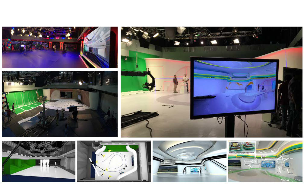
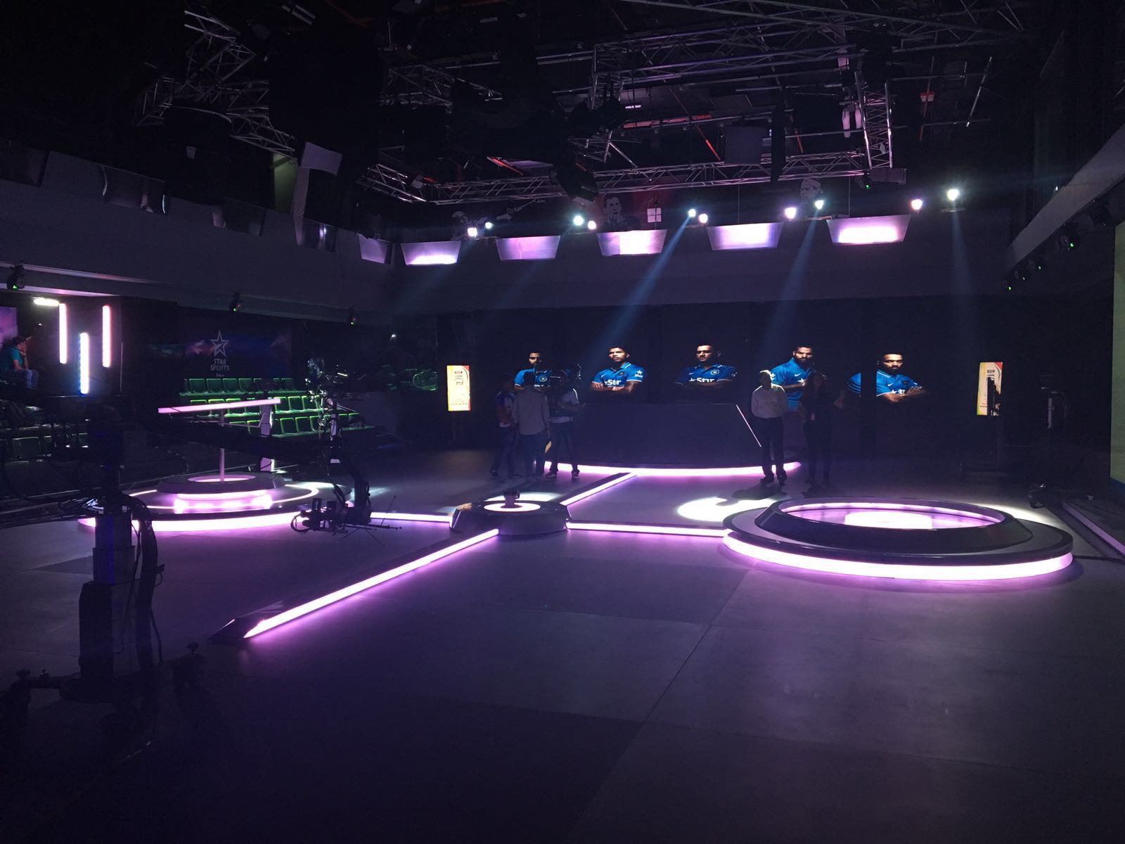
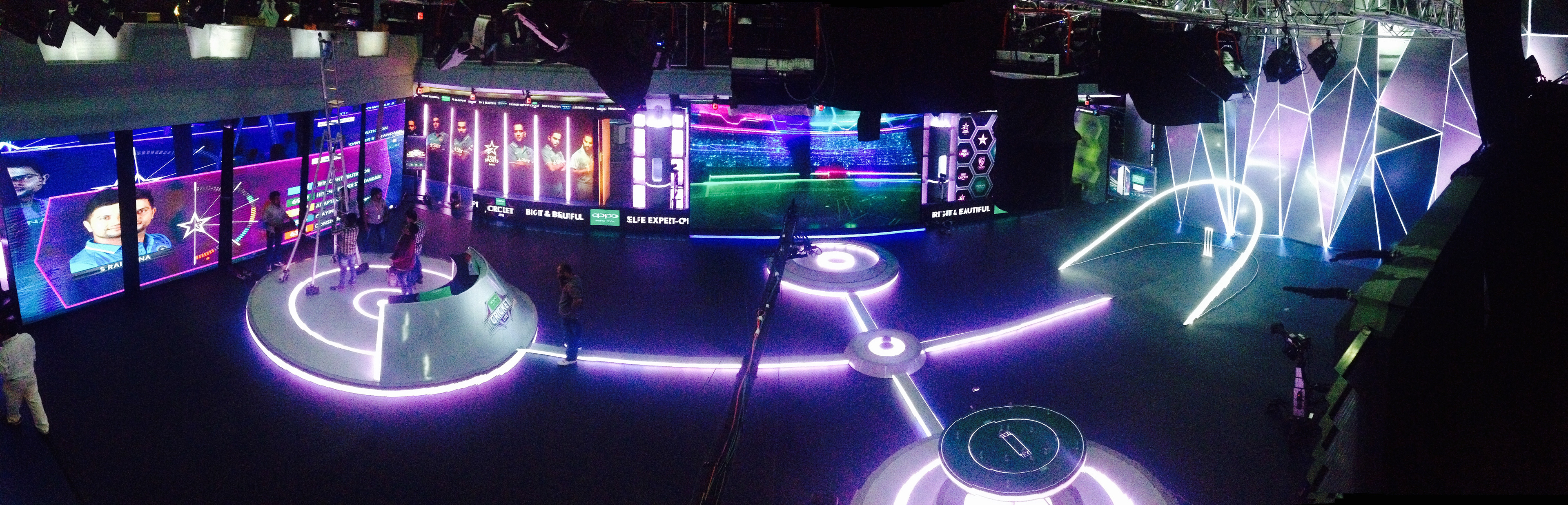
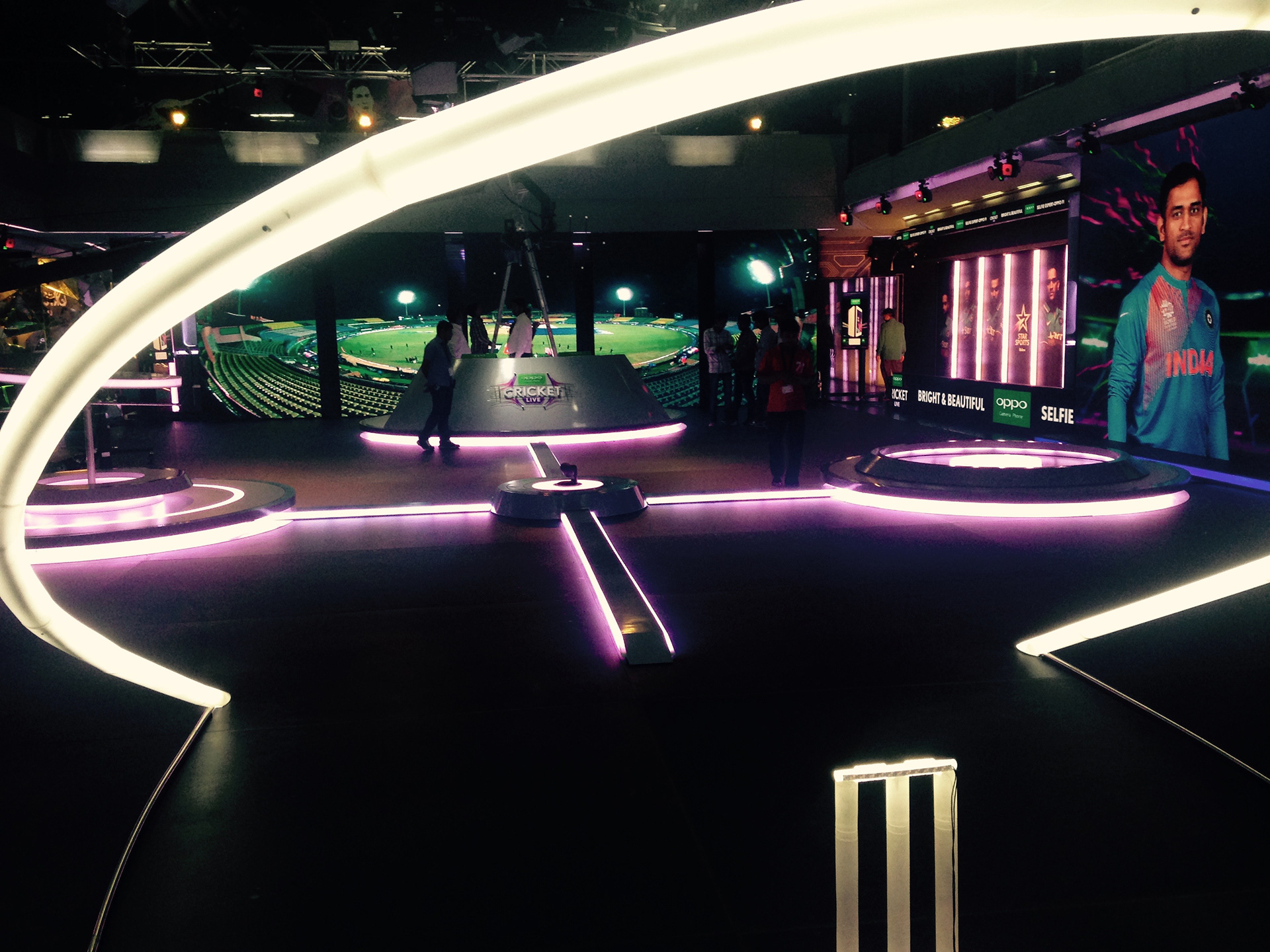
THE STUDIO BUILD, 2015
The project came as an inviting challenge to my background and skill sets. The enterprise decided to setup its own broadcast studio space at its headquarters, with the constraint of two floors within an existing high rise building. I was involved at the masterplanning stage to envision the look and feel of the studios and help develop the creative work flow to cater to the multiple business verticals meant to co-exist within the facility. I worked closely with a multitude of experts and agencies to arrive at a final design to align with building regulations, broadcast technology and design strategy. I was instrumental in setting the scenic design guidelines - being flexible, modular and self standing; durable to withstand multiple and prolonged usage. These had to be constructed remotely and assembled within the studio floors. Working hand-in-glove with technology, the facility is fitted with high end broadcast technology tools that saw a fair amount of automation and re-defined production techniques - thus learning to push boundaries of sports content presentation within the business objectives.
Hugely advantageous to start with an empty shell

Remotely planned production and setup

Modular setup and production sequencing

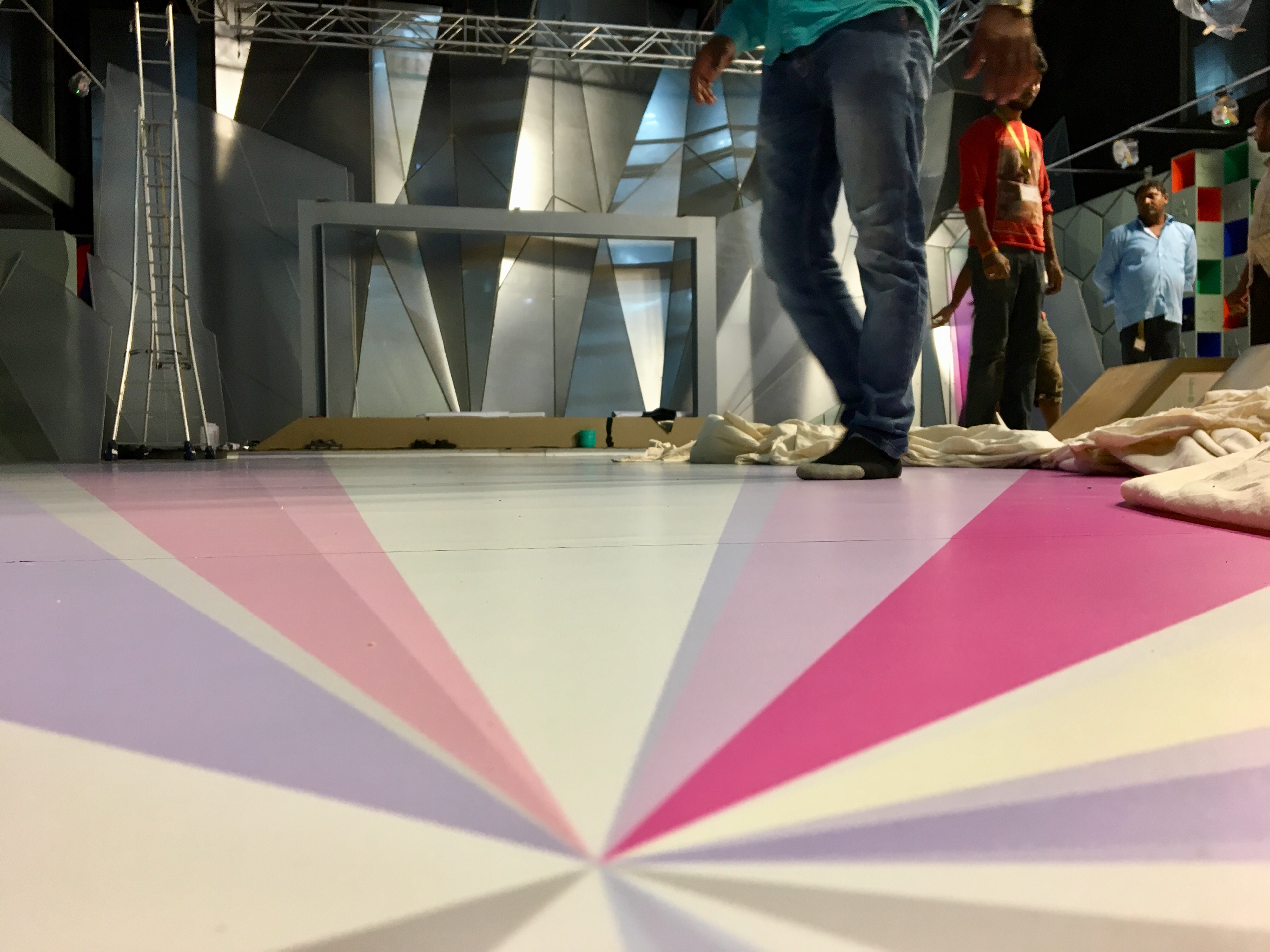
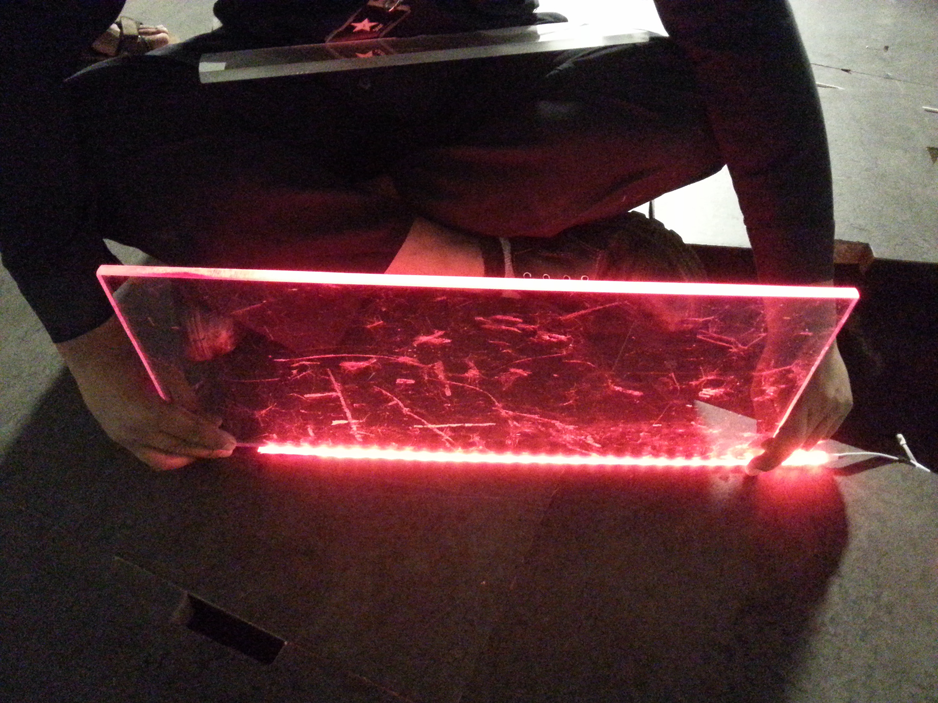
The glorious glass flooring with automated multiple sport line markings

Final phases of surface skinning

Fresh out of the oven, the multiple presentation areas on one common floor

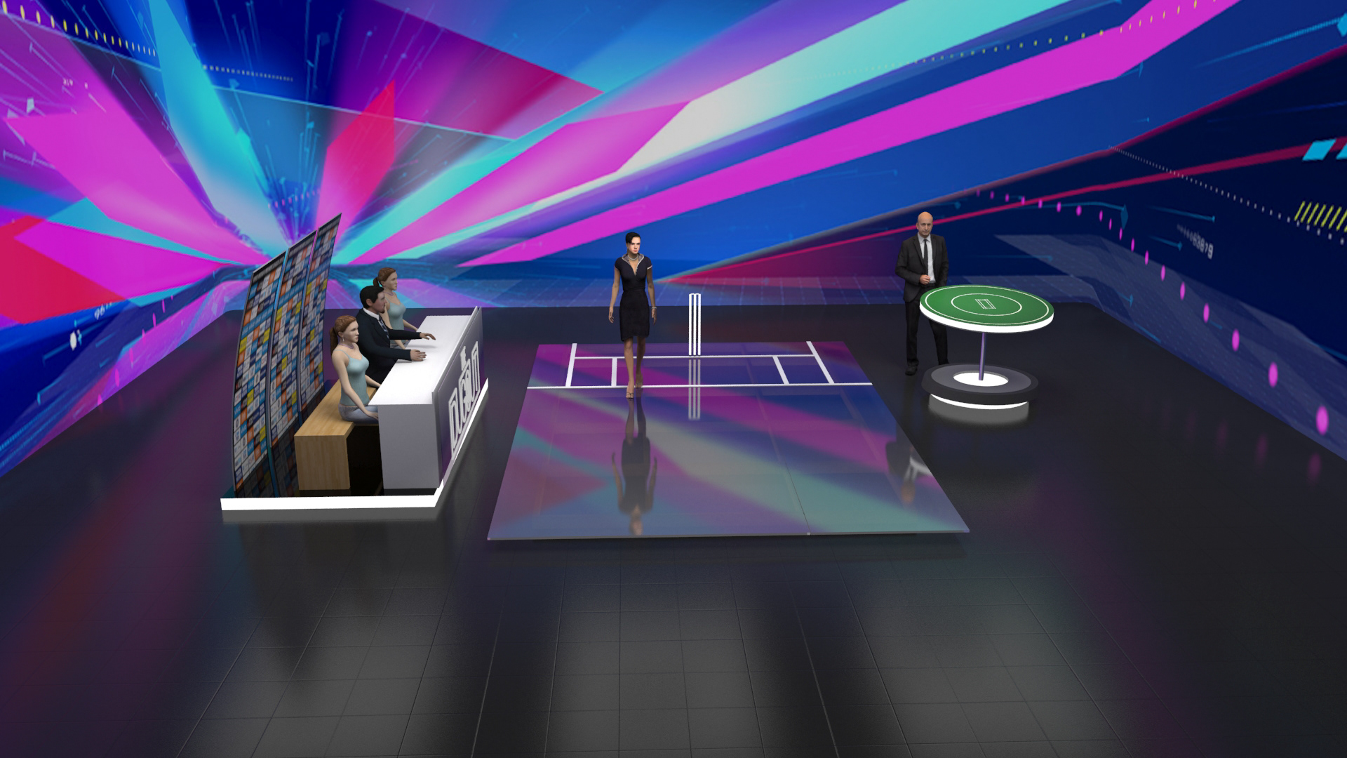
Live Demo Area

Exploring newer styles and presentation formats

Shared studio floors with quick turn around time proved to be a key feature going forward

The complex world of calibration and wiring

The projection mapping setup

More calibration and lighting, as we understood the lighting and movement challenges within the setup

The more immersive background experiments

The merging hard set elements with an animated background

Understanding content requirement that marries the tech...

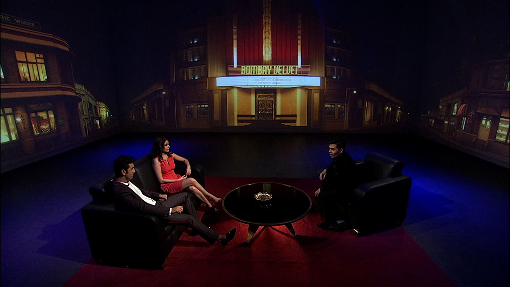
Like the scene ref for a movie promotion was recreated to retrofit the studio, working within the limitations that technology brings with it.
Every setup got me clarity of the do's and don'ts with the system.

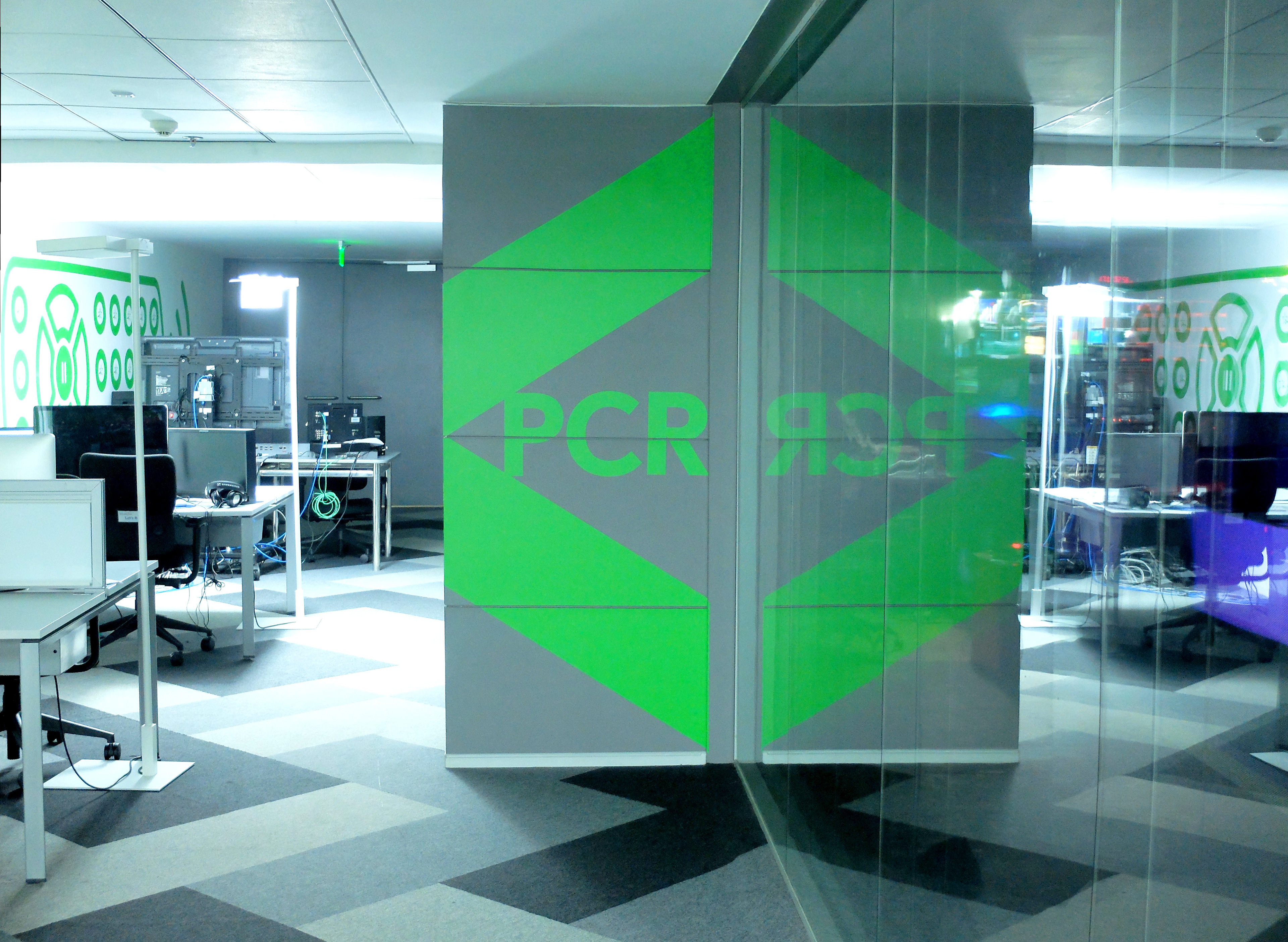
Interchangeable logo wall display

Glass was used judiciously to keep the facility visually light and transparent
Custom made signs for every studio
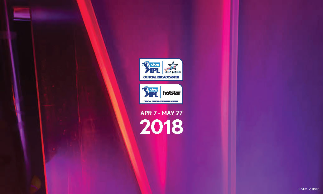
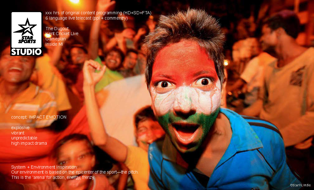
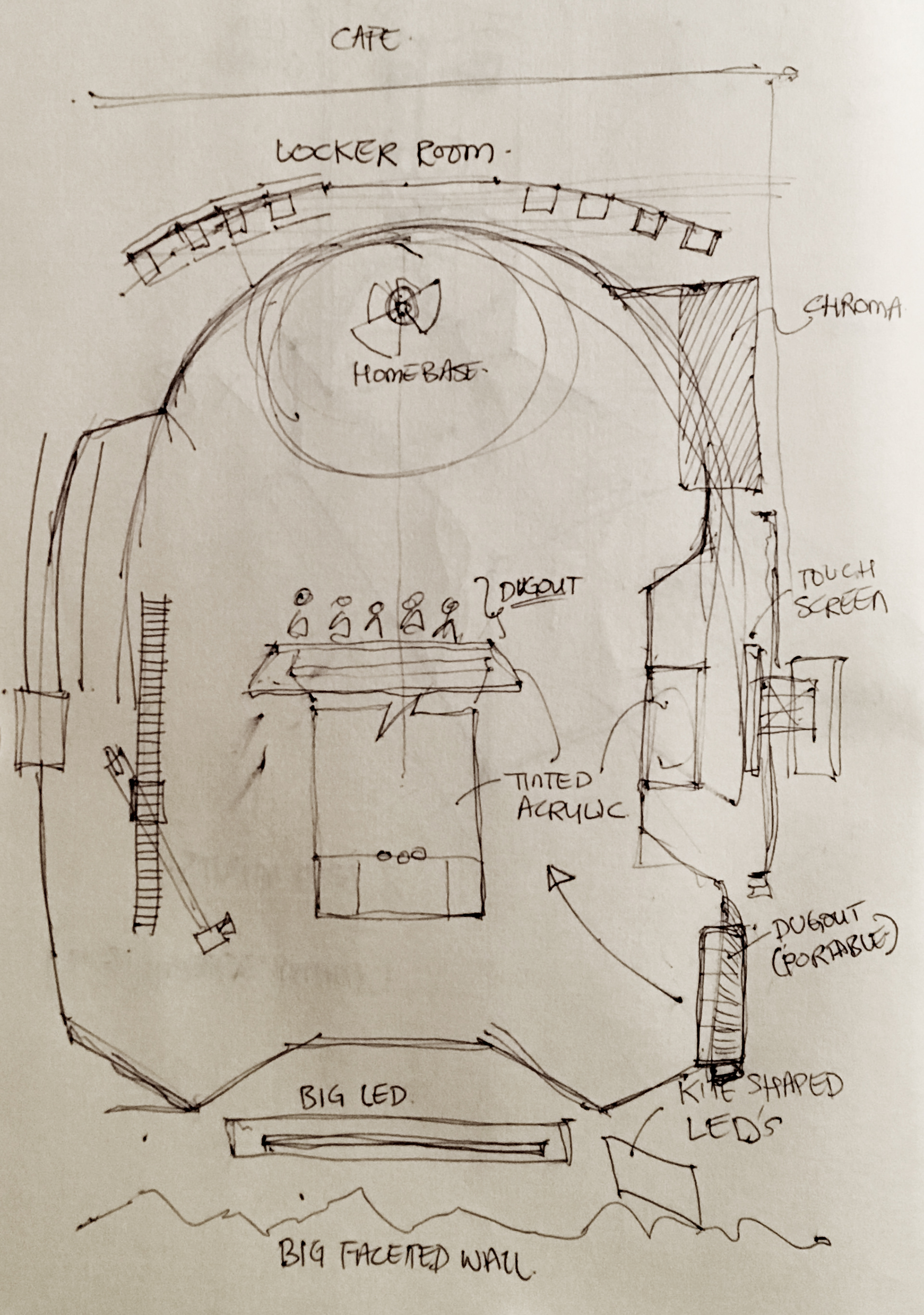
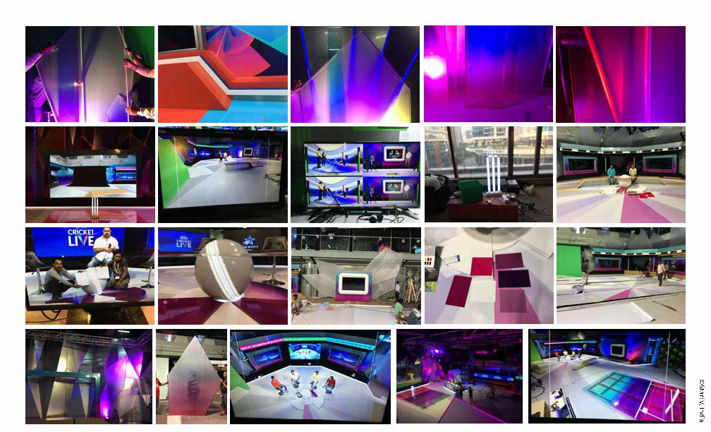
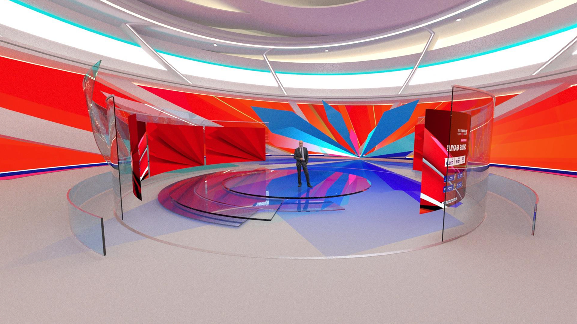
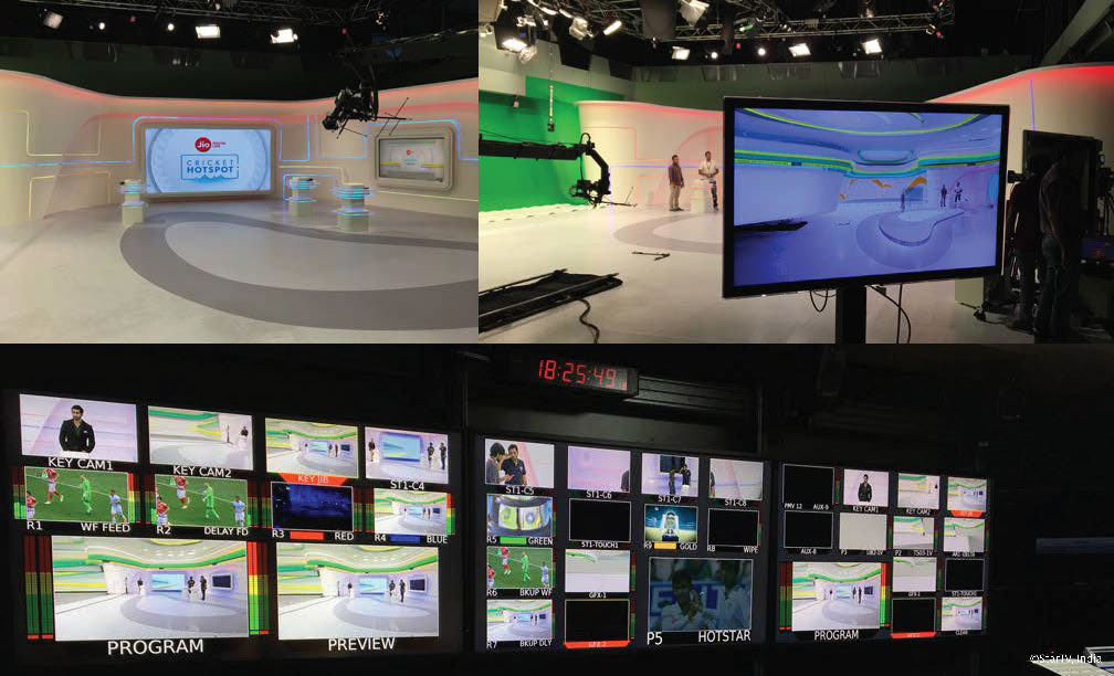
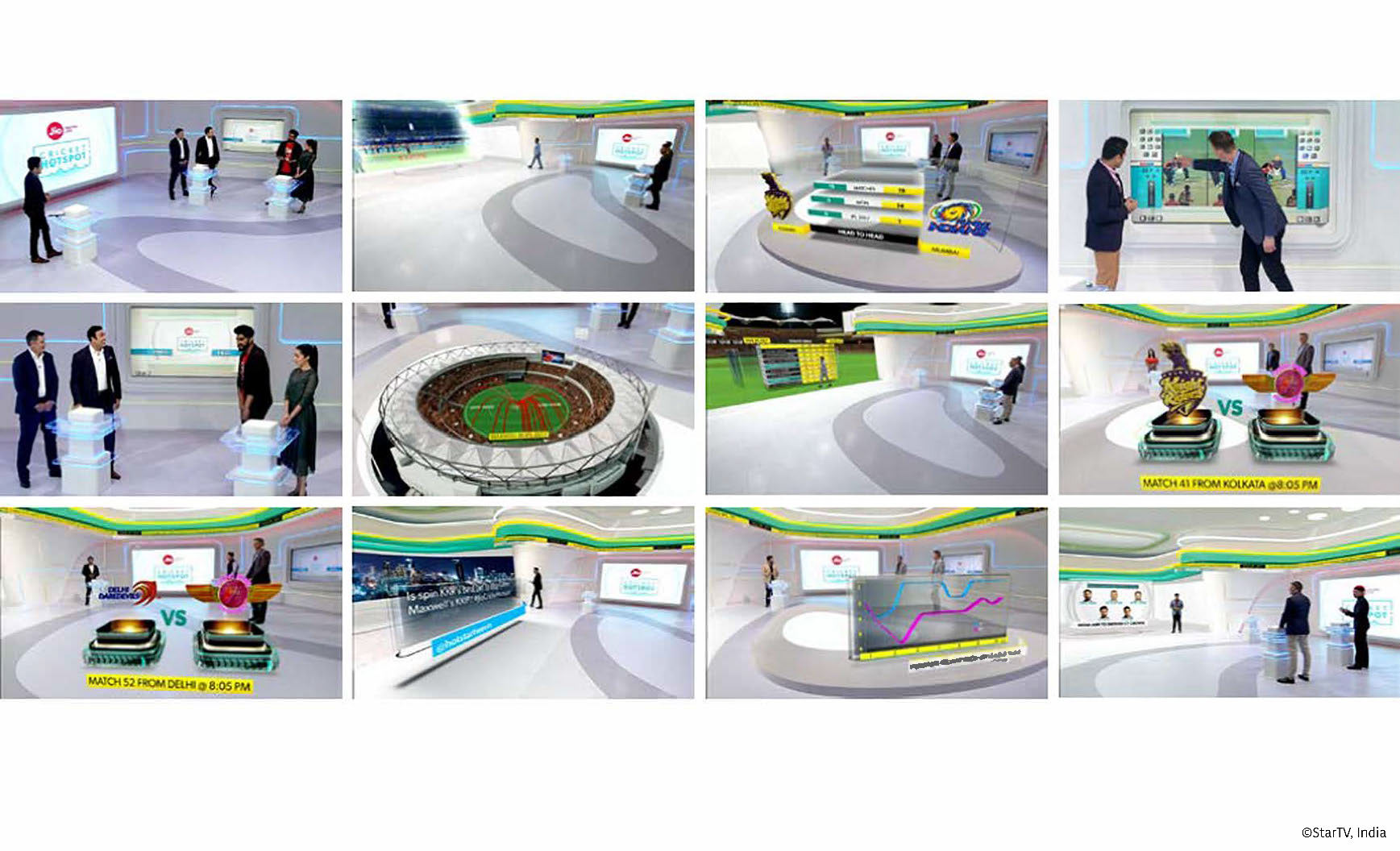
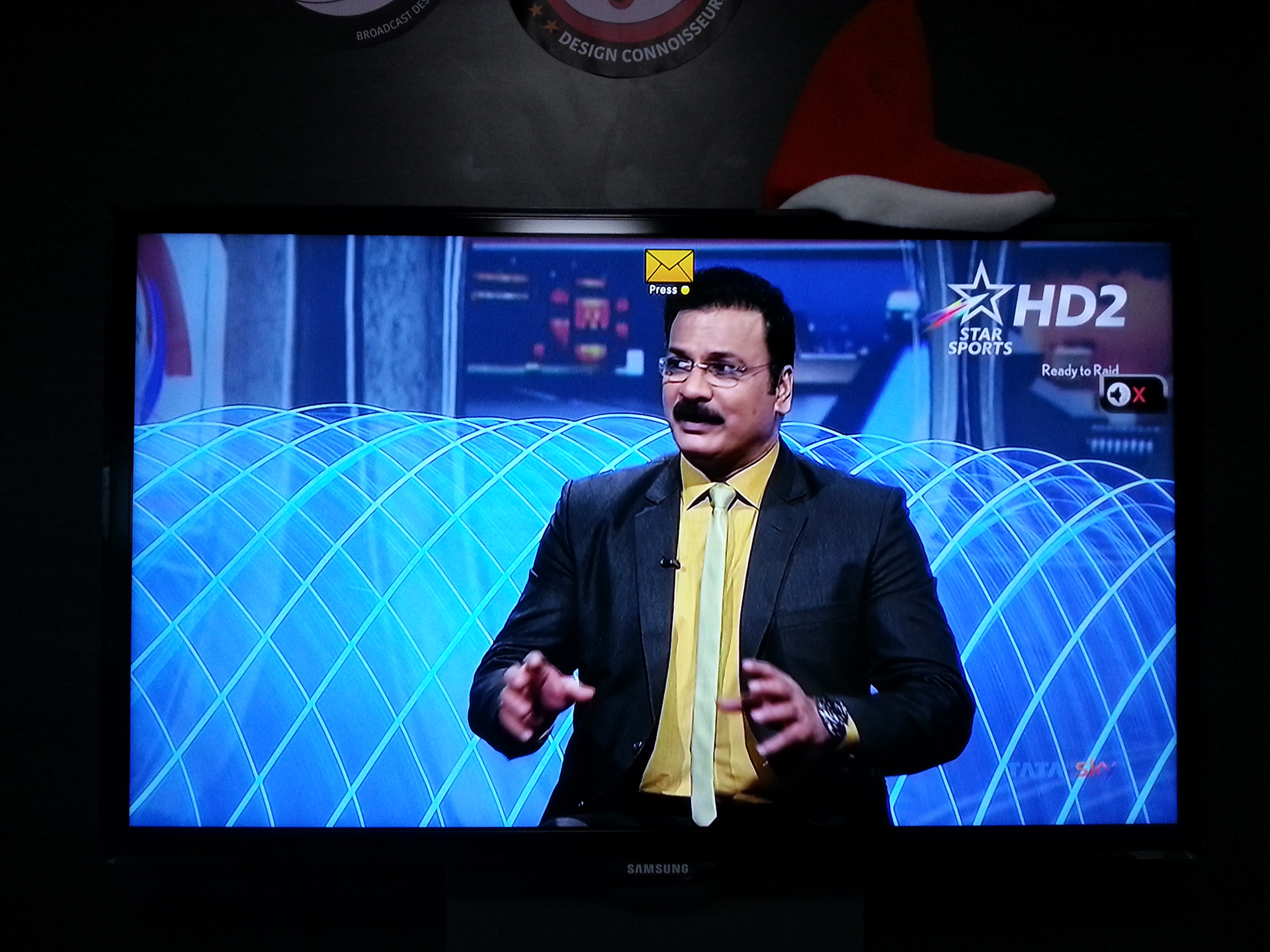
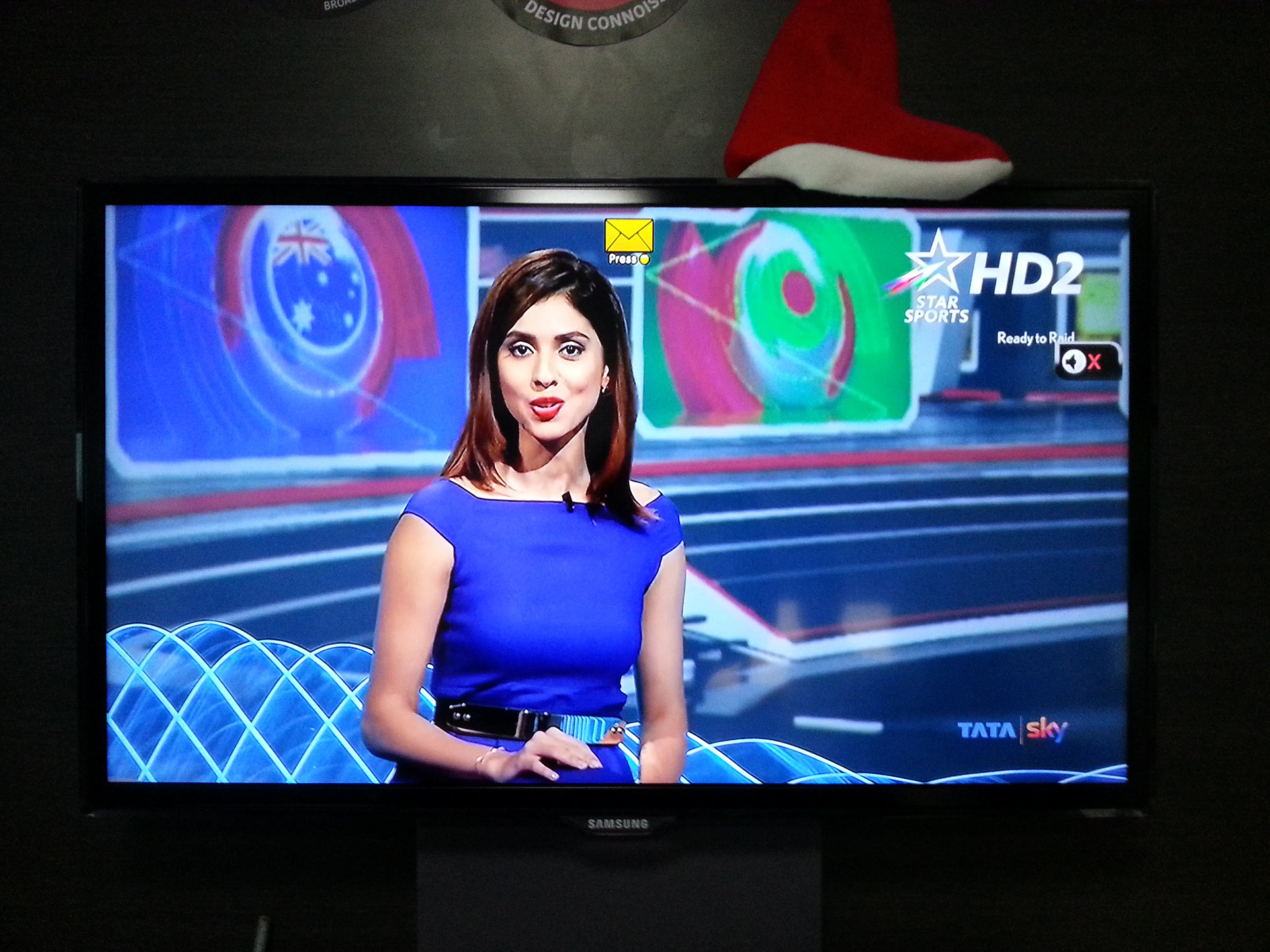
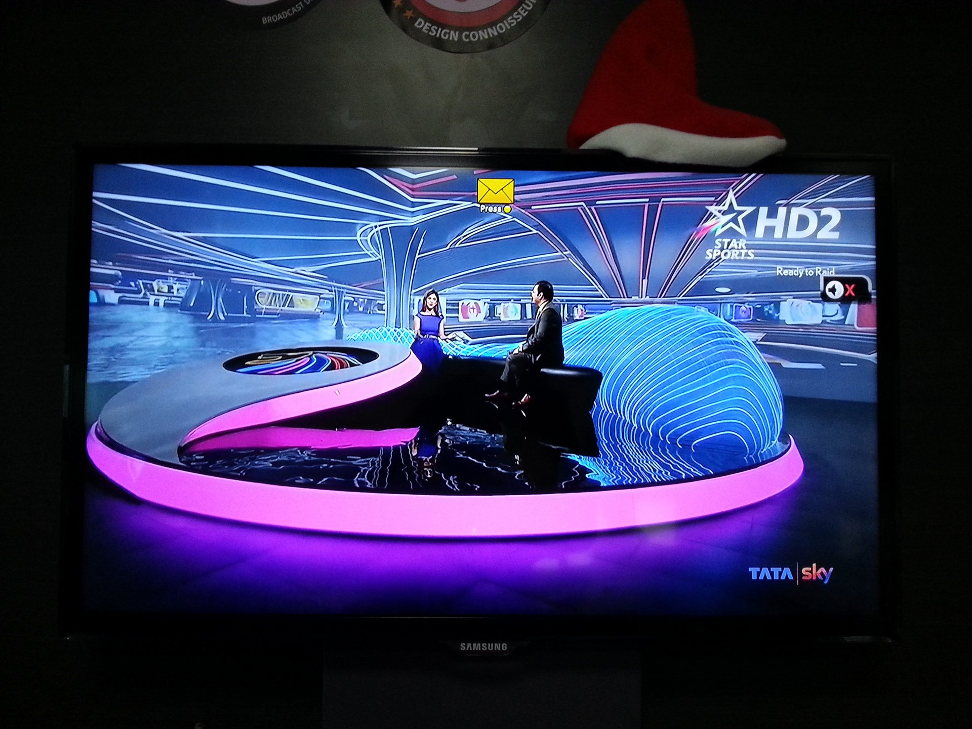
IPL 2018 STUDIO DESIGN
The studio design inspiration came from the overall packaging design language being developed specifically for the 'host broadcaster'. My intentions with combining tinted acrylic and wood gave shape to the spatial language. I built on the core concepts of 'the ignition' and the design elements of the 'kites' that developed to fit well within the spatial concept. The key highlights were the large multistage presentation areas, a dedicated virtual set, multiple language feed presentation setups and predominantly - one unified visual identity across all properties.
copyright StarTV, 2018.
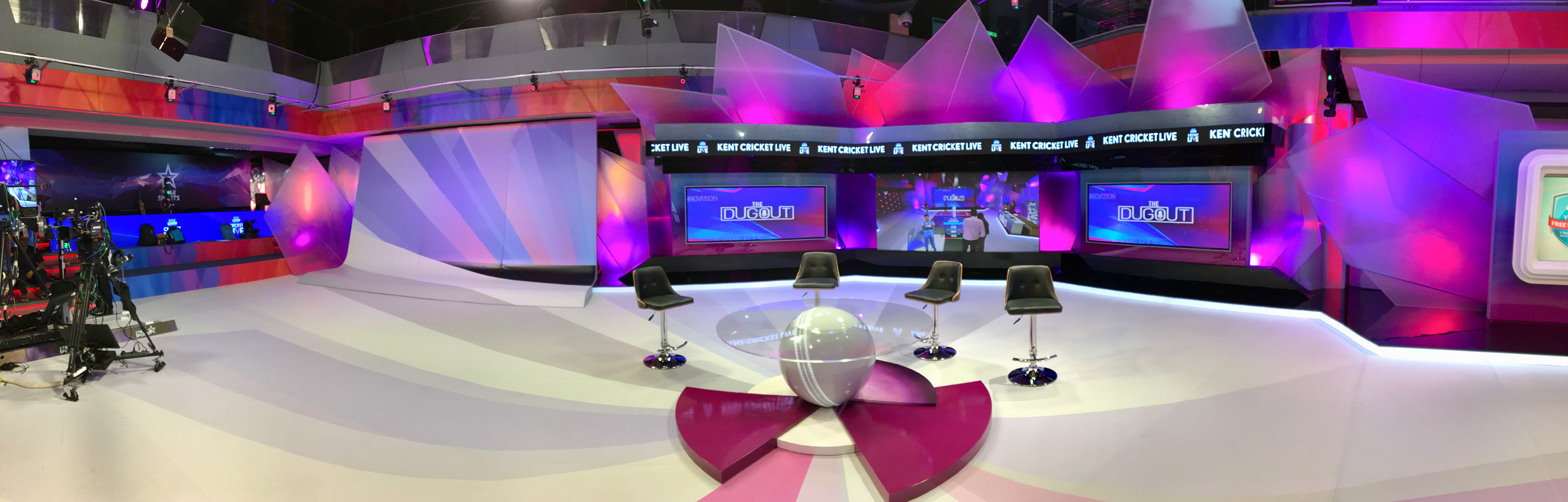
presentation area 1
IPL 2018 was to be bigger and better than all the previous years

presentation area 2 that doubled up for 'the dugout'
The set had to change colour as 'team affinity' was a key aspect
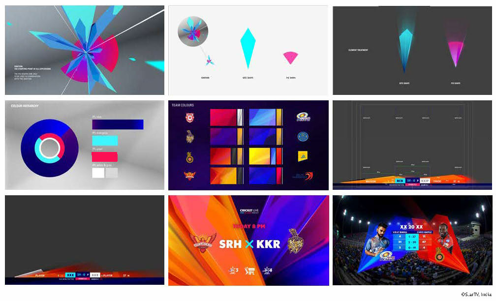
As the packaging design evolved with the help of an external agency I locked in on the key elements to play with for the set design

A customised display concept dedicated to each team
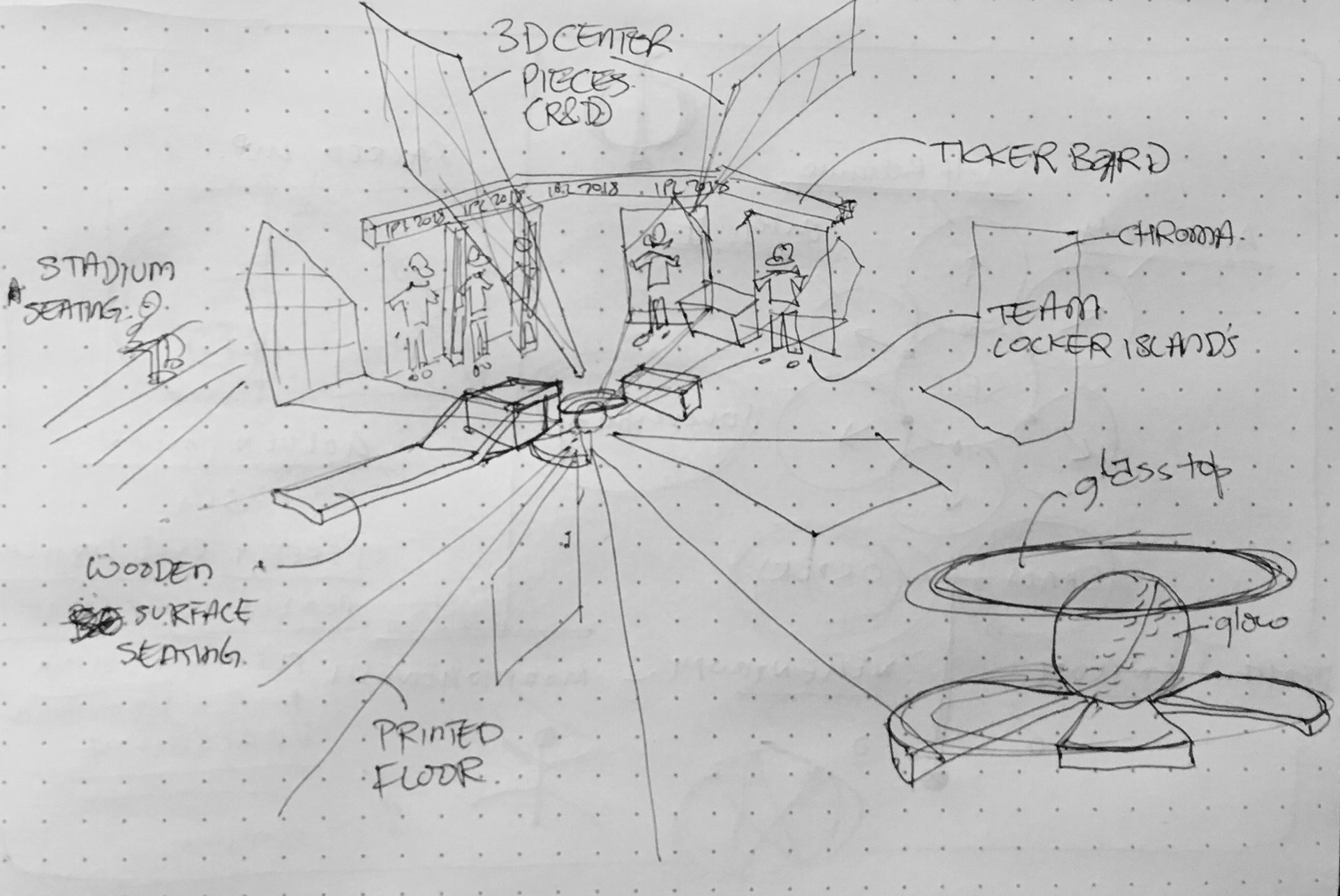
overall layout concept visualisation
planning and layout
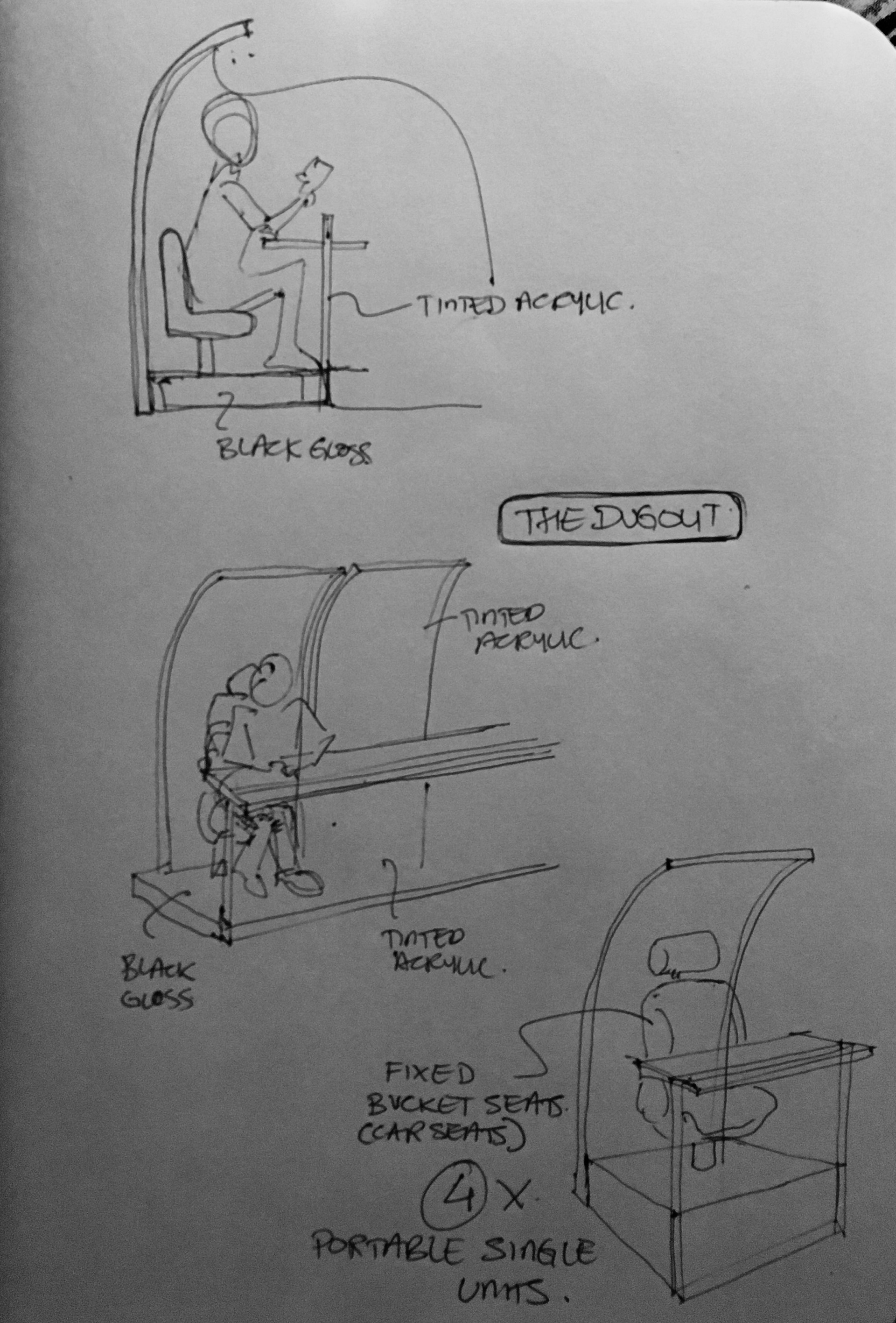
the dugout physical plugin
the design built-in the provision to interchange setups.
The final design concept locked!

The translucent 'kites' simulated from the packaging elements worked perfectly

'The Ignition' became the set centre and the floor graphic gave a unique sense of direction for the jib
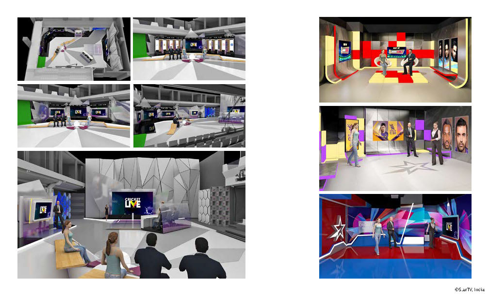
production summary


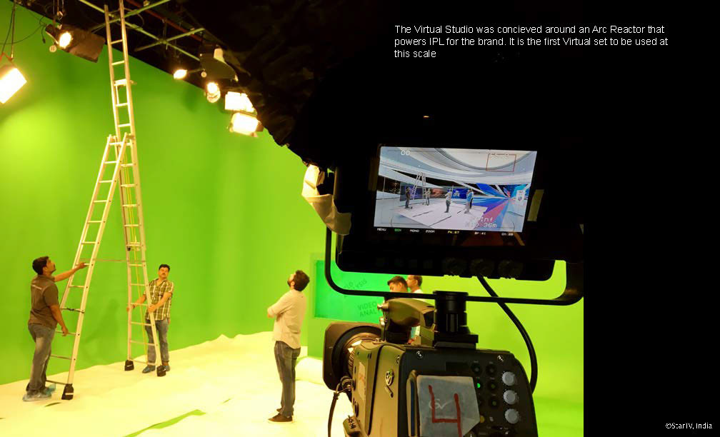
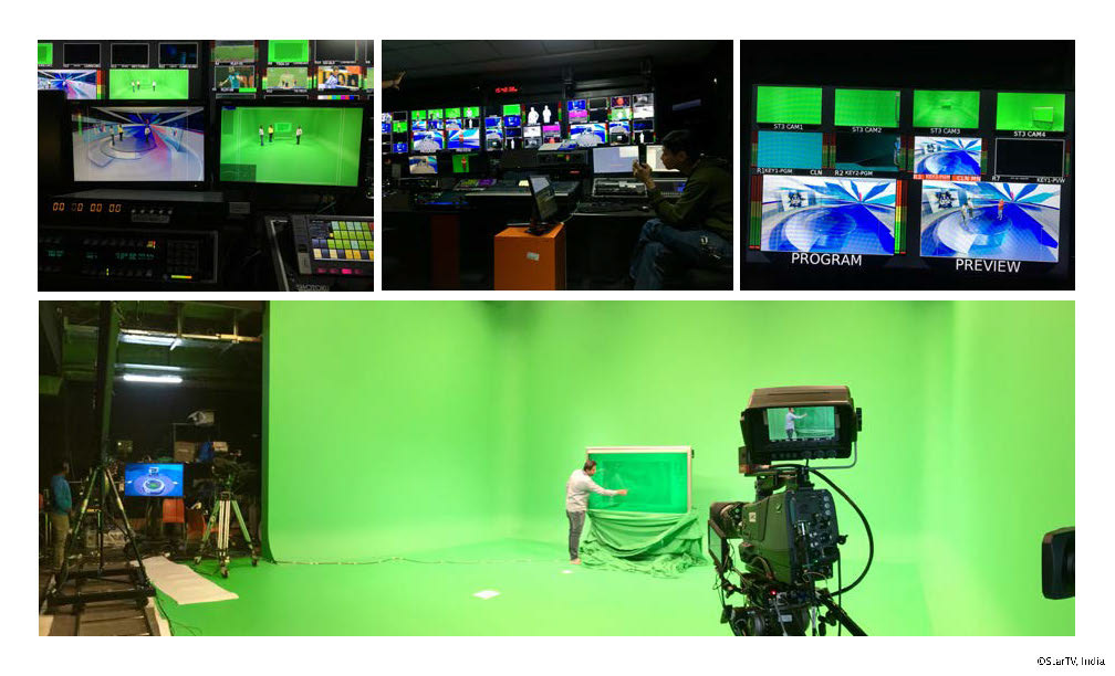
The first fully virtual studio plan
The in-house team took some time to settle in with the slightly 'different' way of execution
The adjustments can be endless!

...and more tests with the anchors
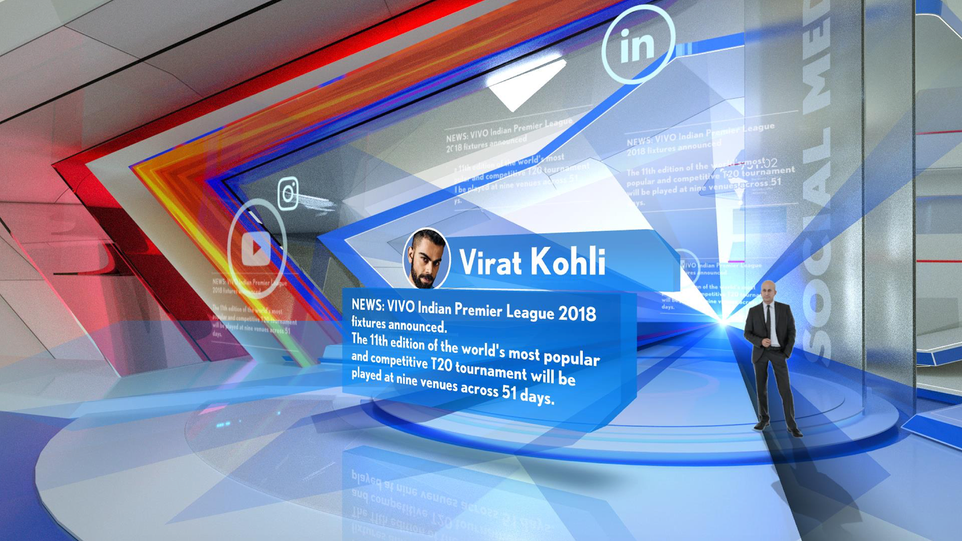
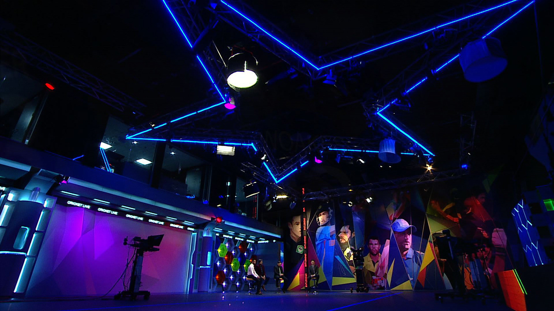
The social zone
There were distinct zones created for different segments of the show
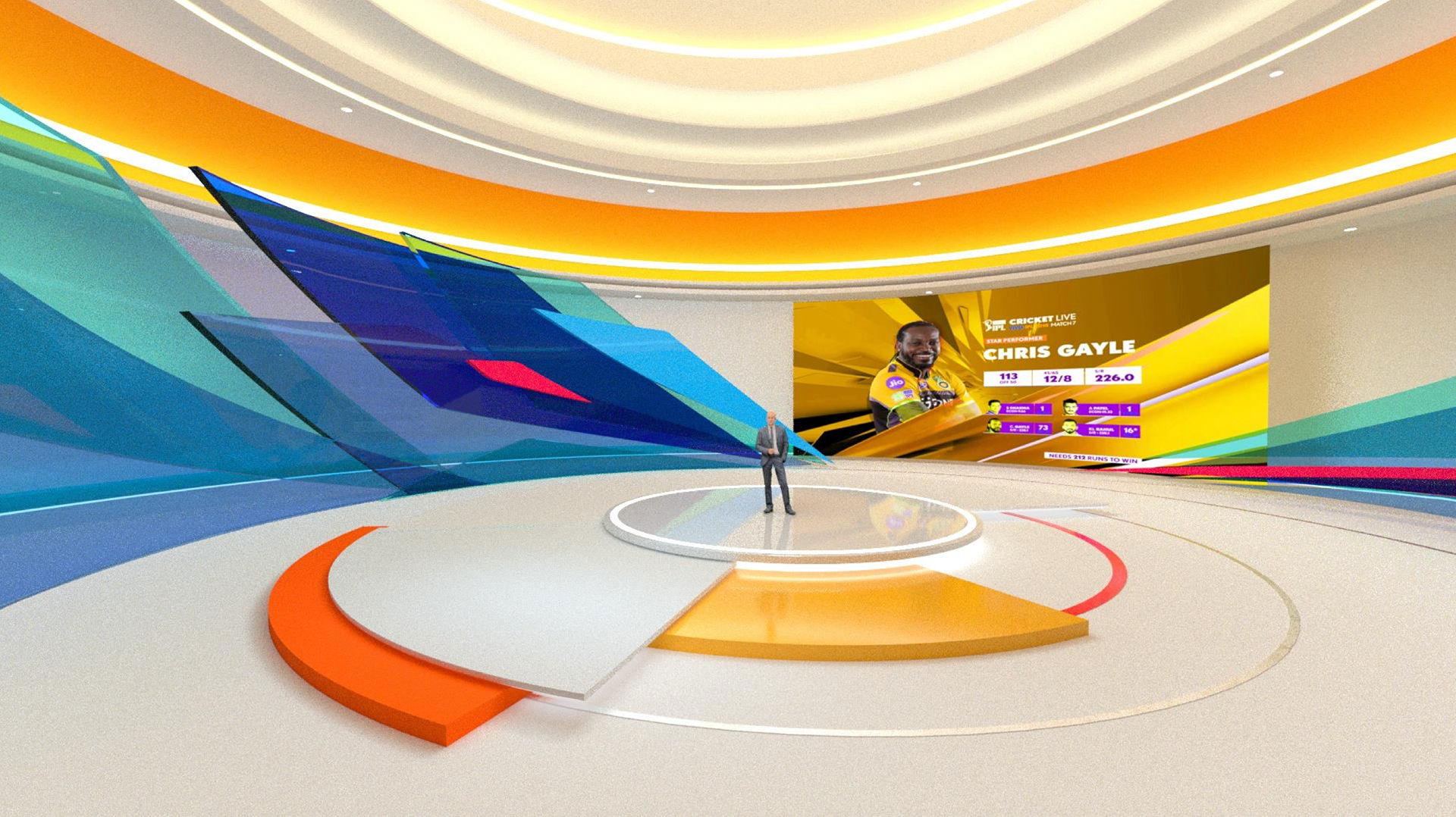
The set could be tweaked to suit individual team preferences
Virtual Studio concept development with wizard Kenneth Tsai ( from dot connector, Taiwan)
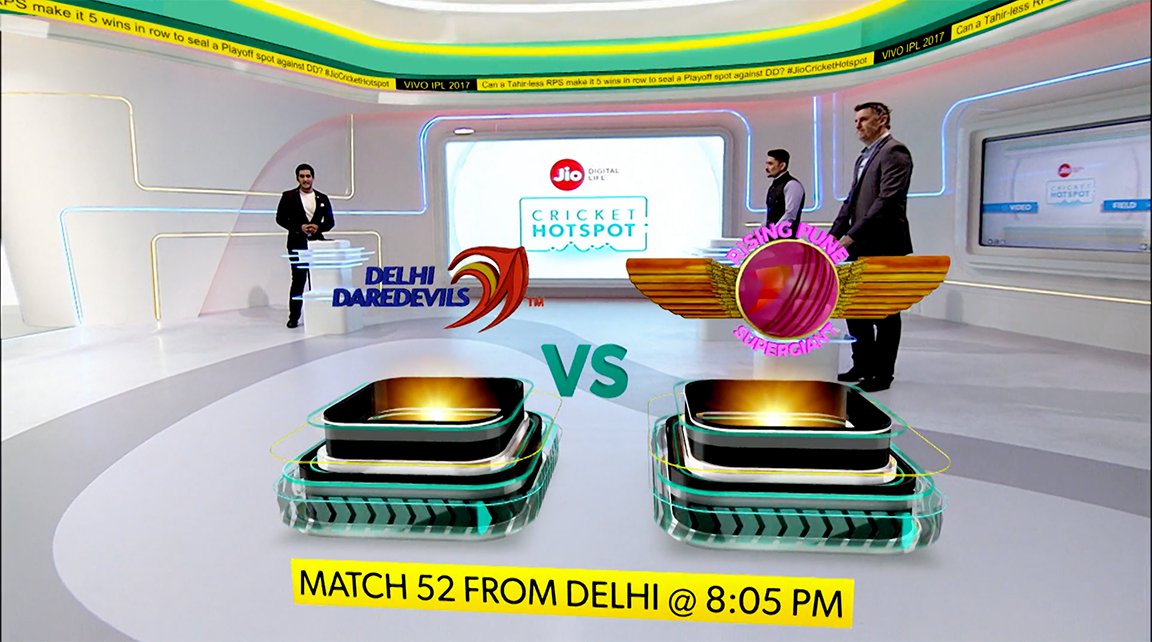
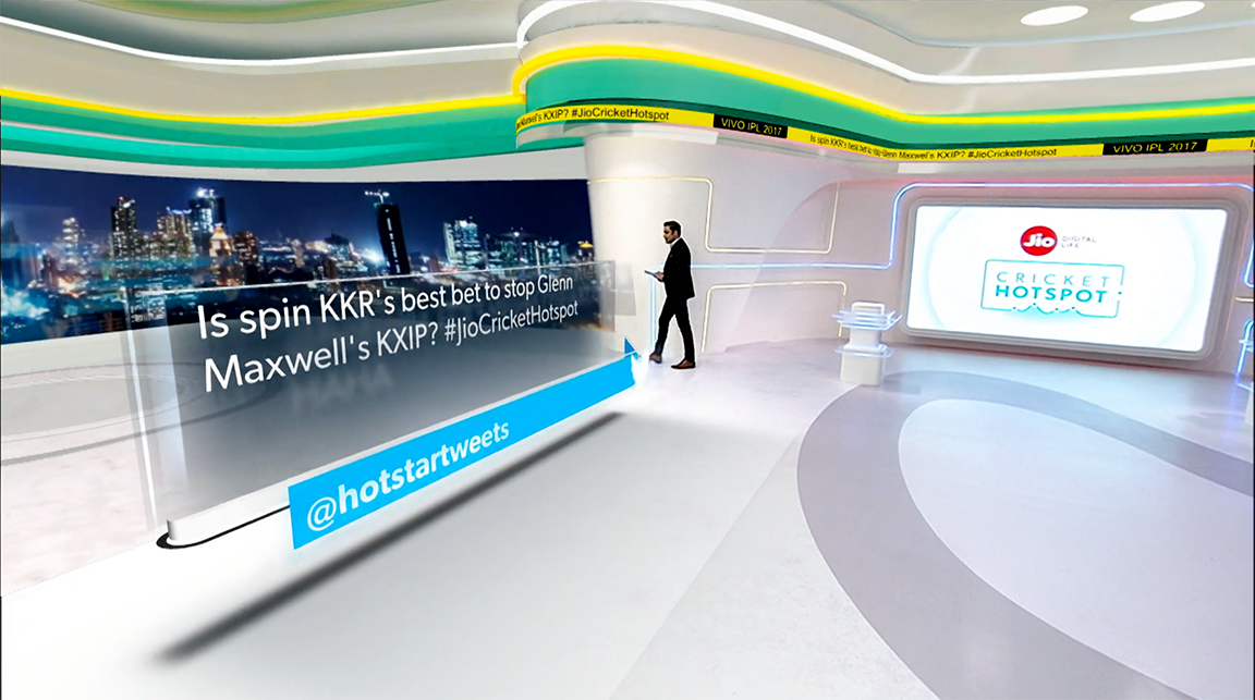
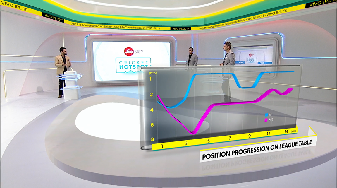
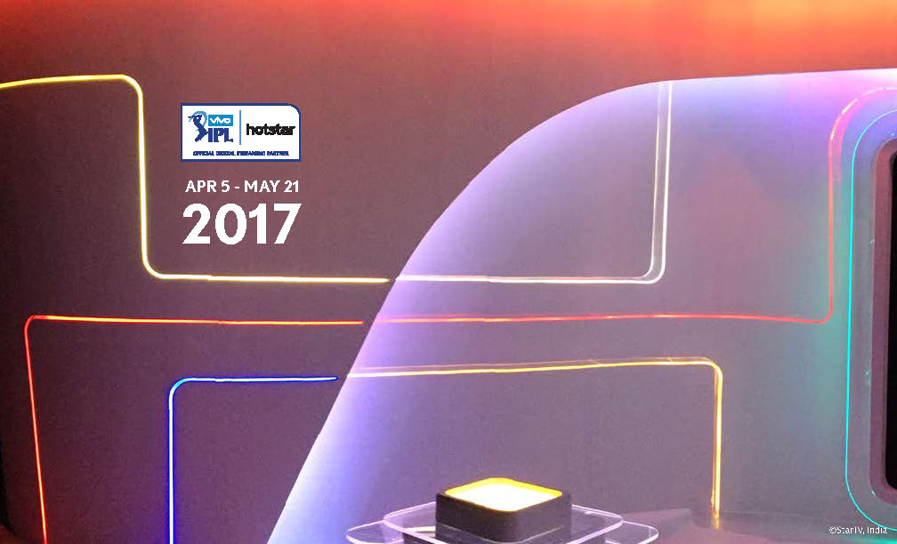
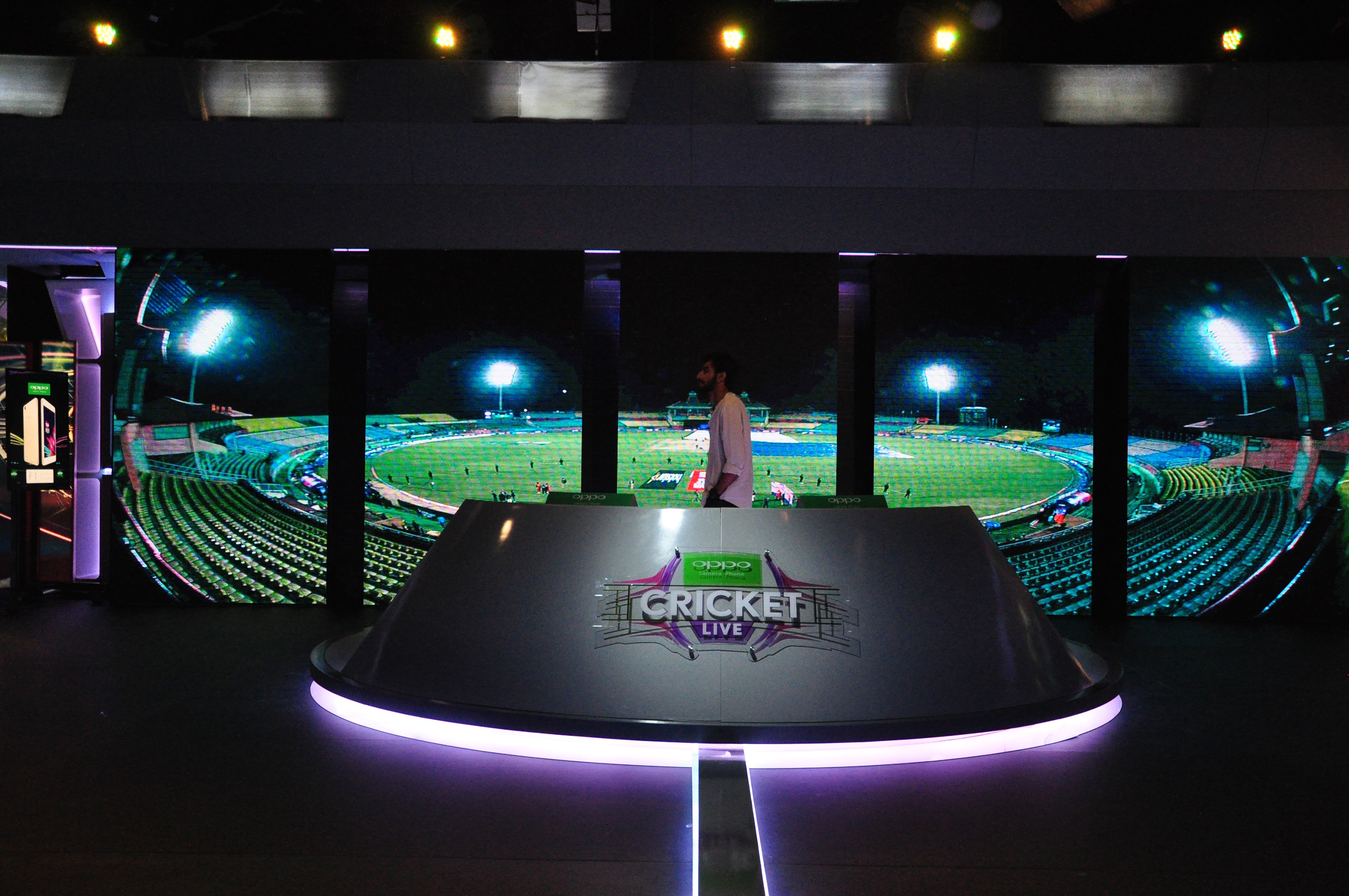
IPL 2017 ON HOTSTAR
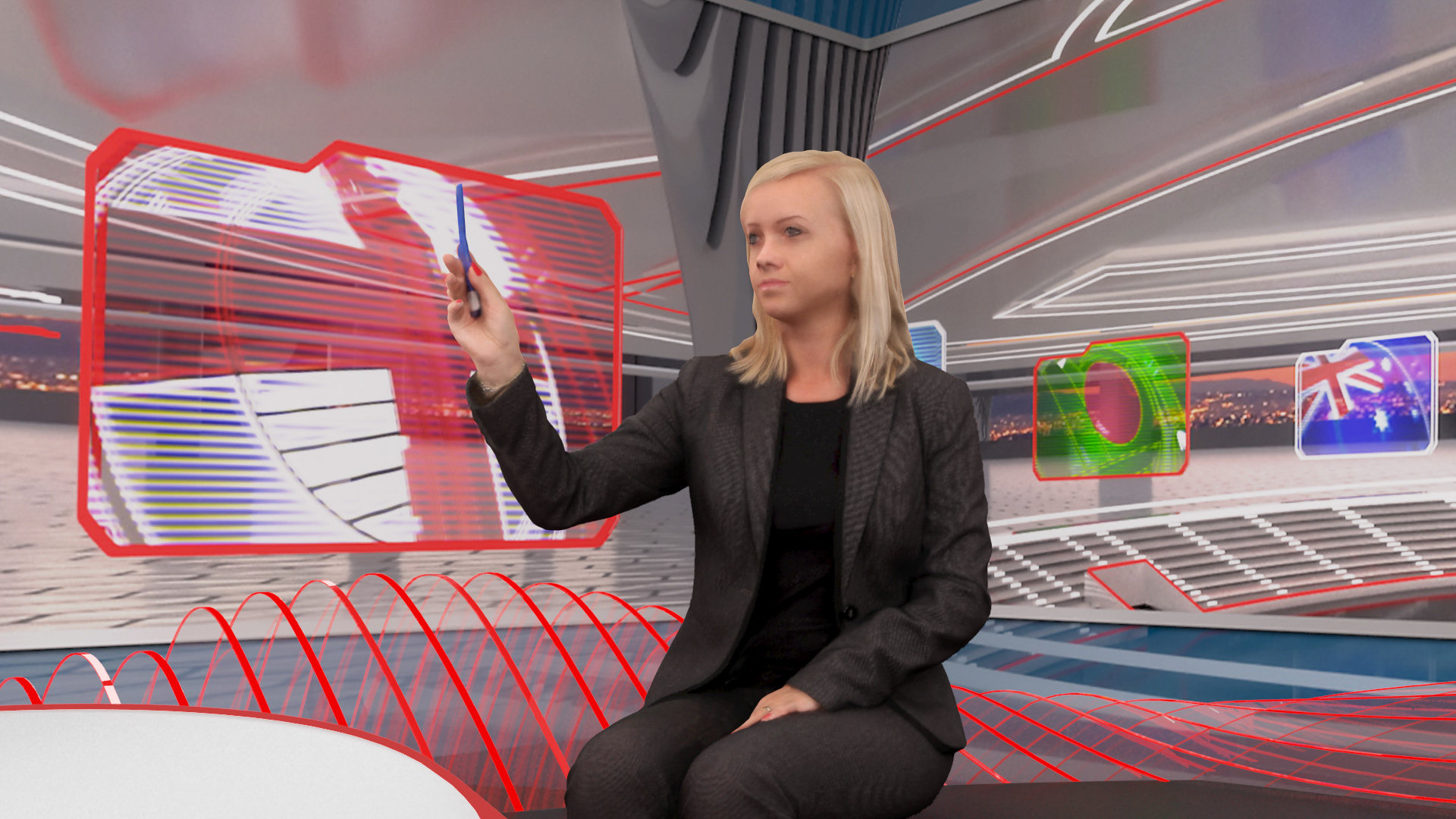
One of the first design solutions at the facility where I successfully merged hard set and virtual set to work together as one unified space. Hotstar had the exclusive digital rights for the season and surely wanted to make an impression hence taking on the challenge. I lead the design for the AR and VR elements making sure all elements would co-habit within the environment aiding to stitch the two worlds together seamlessly, as intended. This also set precedence to a content and presentation style new to the facility and aided immense learning for all teams involved.
IPL2017 on hotstar
The hard set and the virtual extension, not perfect but worked well
The design was definitely tuned to cater to smaller screens of the smart phone

Hotstar was open to innovation and impact. Based on two key words, technology and futuristic, the design process distilled it for all practical purposes
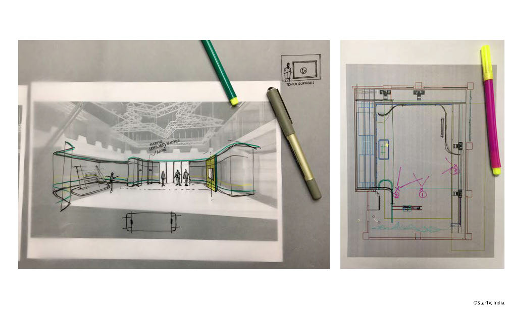
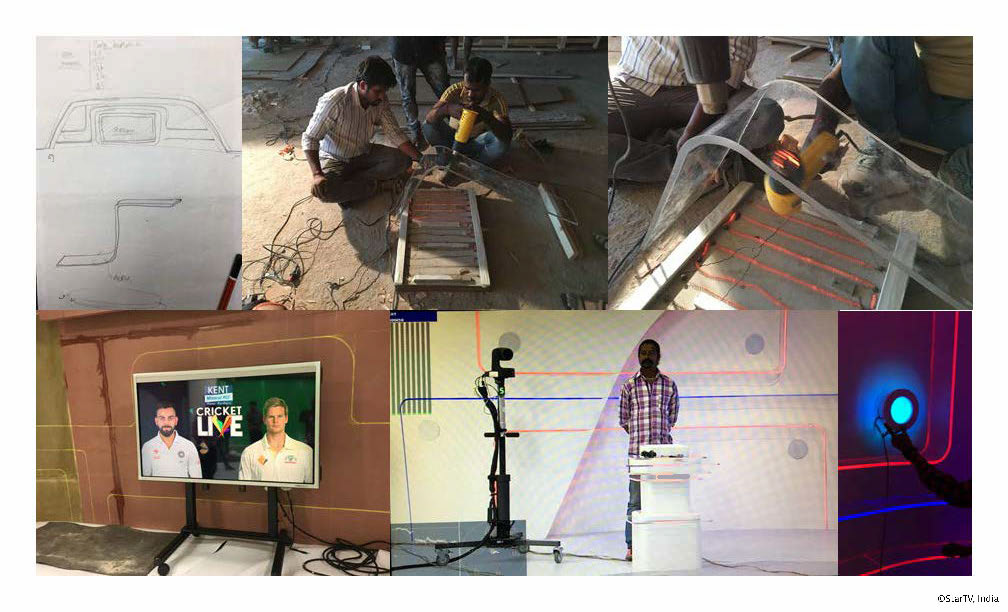
After much back and forth, the master sketch reference appeared! (along with a master plan)
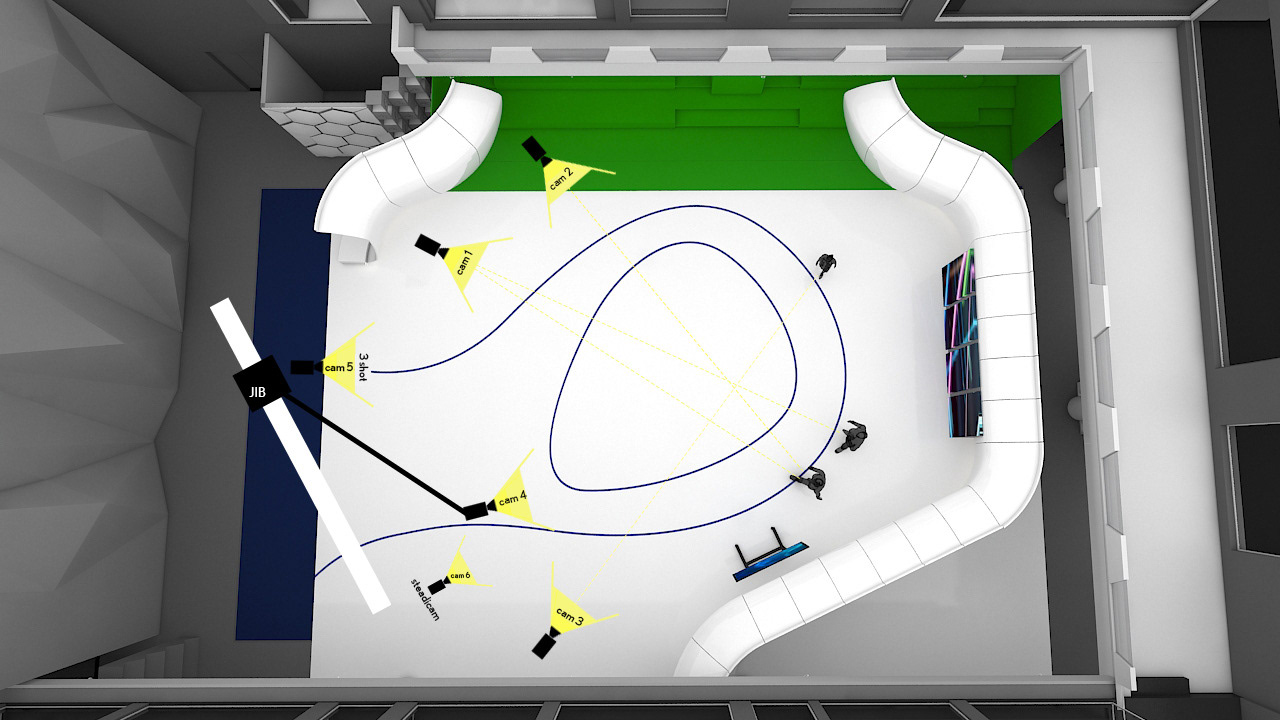
Camera and shot blocking played a crucial role in visualising the moves on live edit

Set center is the key reference point to get the tracking accurate

The mock drill for the final framing schematic

Setups of this nature have a certain way of working with them

Final shot blocks
It was complex work to plan the production for the curved wall!
The journey of an idea
There were quite a few iterations of the acrylic patterns. I sure didn't want to go too thin on the thickness so as to let maximum light pass through them

The colours were grouped at the controls so they could depict the team colours effectively
positive and negative
Essential cross testing process to make sure everything fit well wrt each other
The acrylic features were marked wrt frame and manually shaped. The overall effect worked as visualised (but chinese LED's were not very powerful)
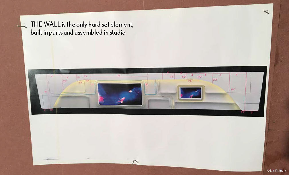
The tapering and curved continuous wall housing two separate screens was a challenge in itself. It had to be modular so it can be portable too
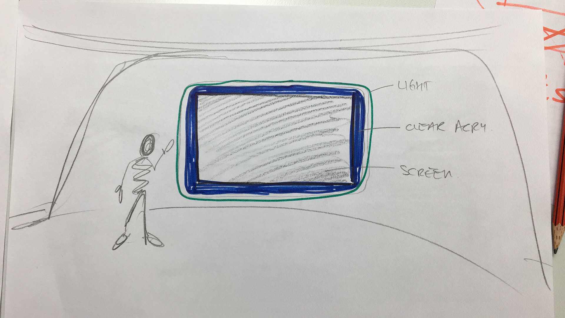
obsessing over the housing for the screens

the housing detail worked perfectly with the cut marks as visual elements
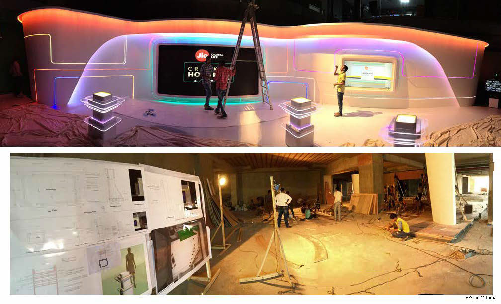
The final checks. The technology team were seriously sleep deprived by then!
I sure was happy with what we achieved, considering this was the first of its kind, but far from satisfied.
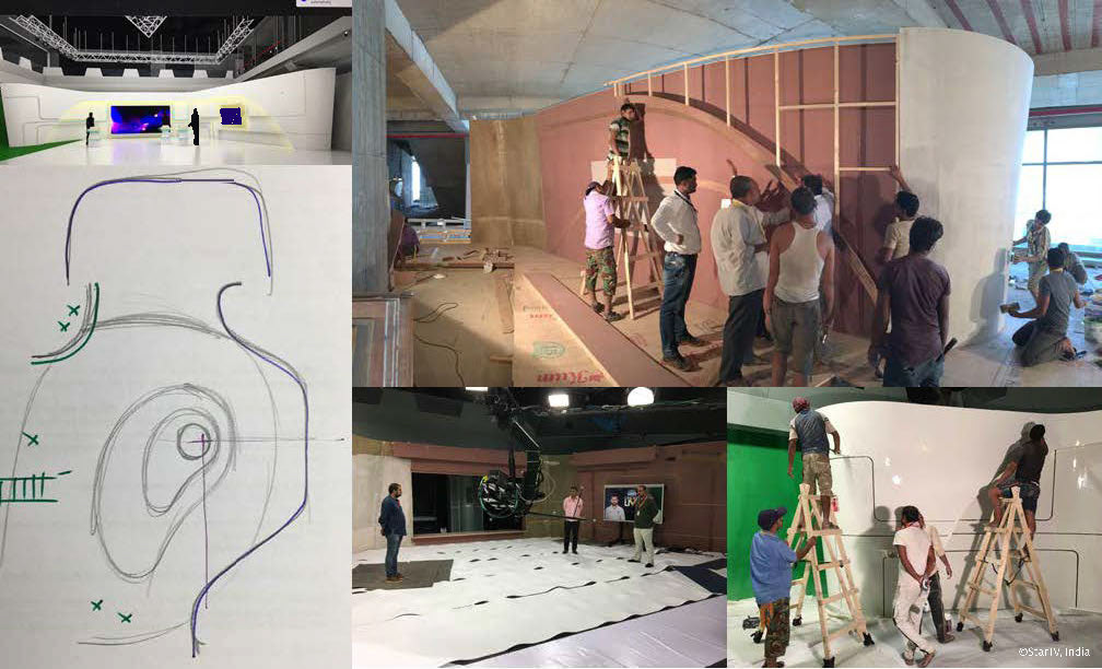
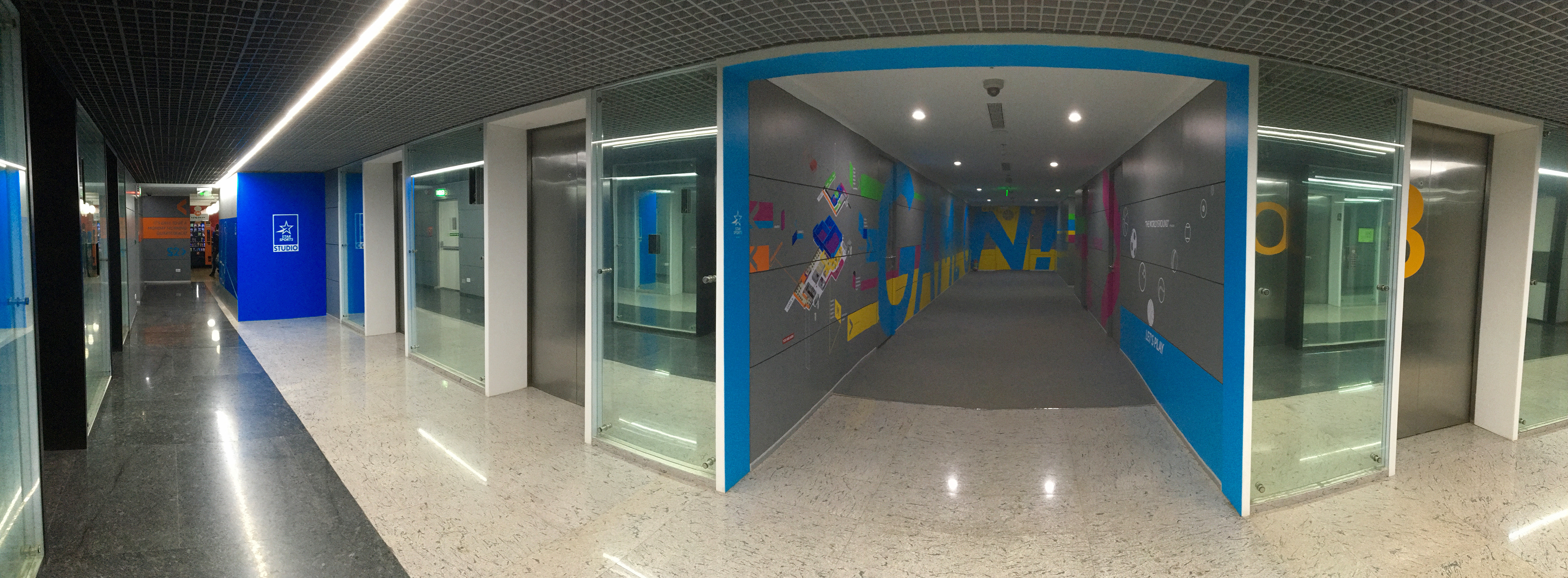
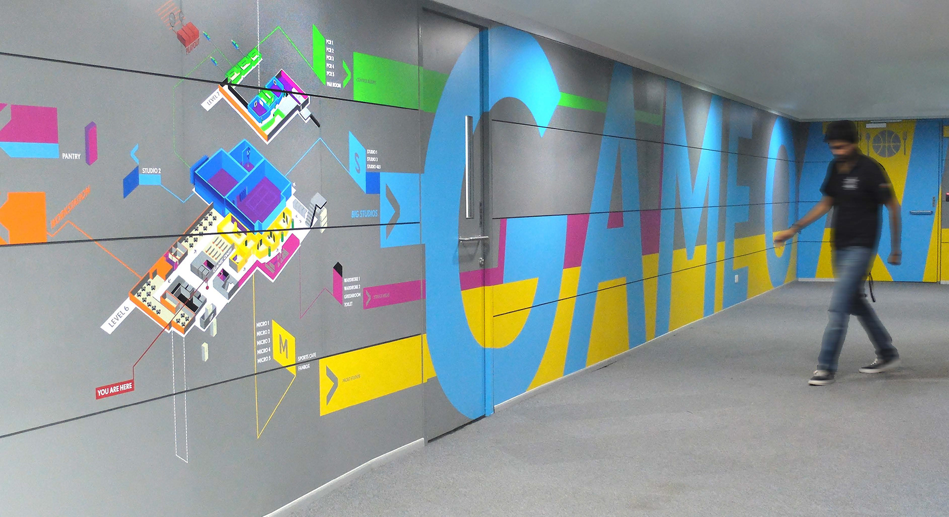
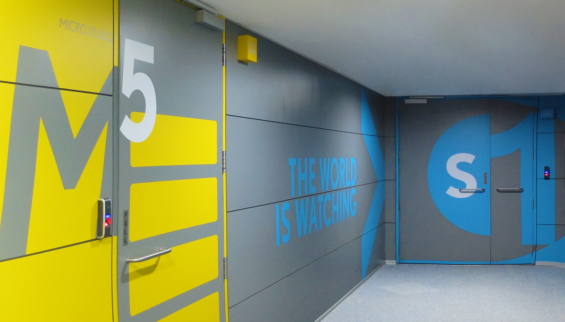
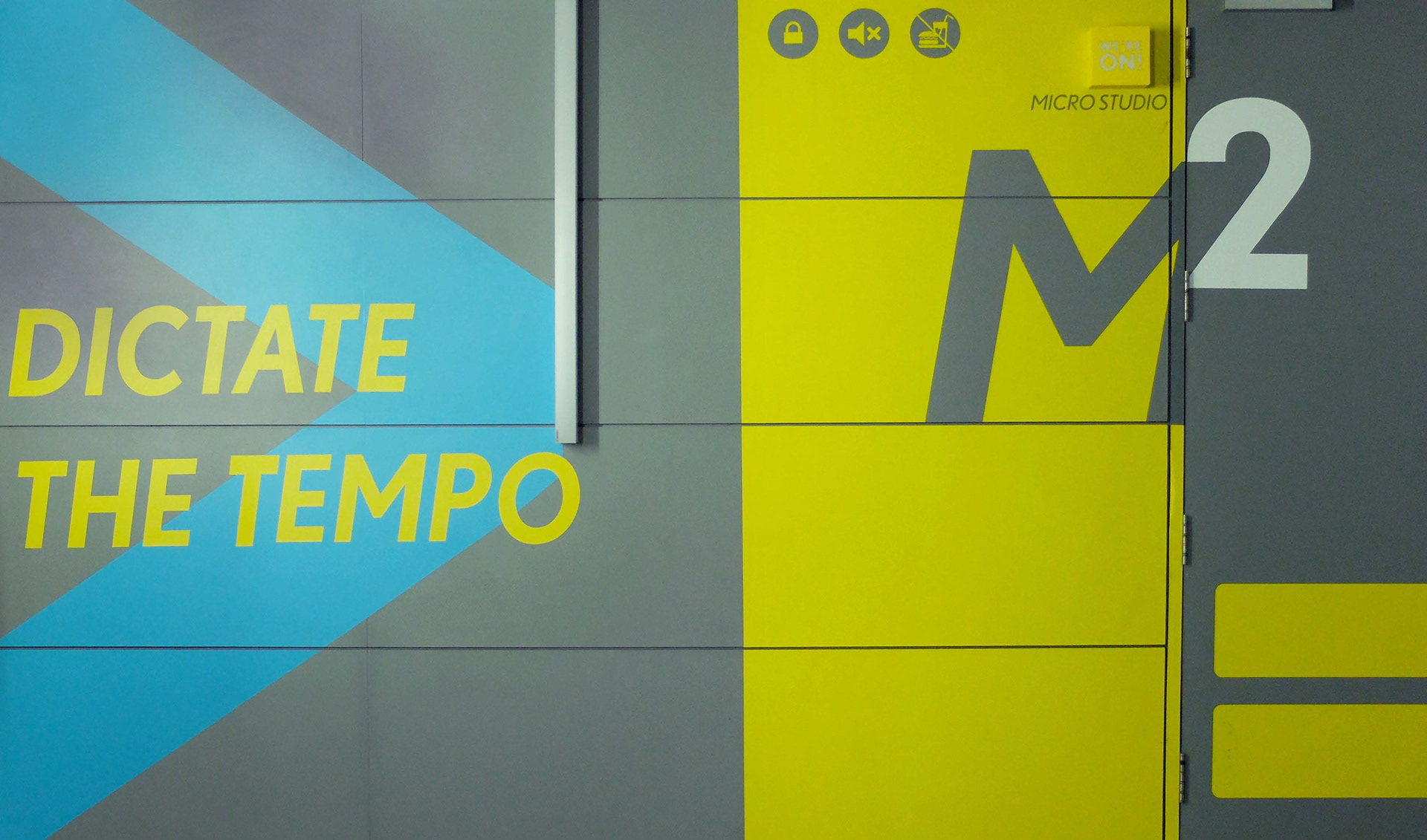
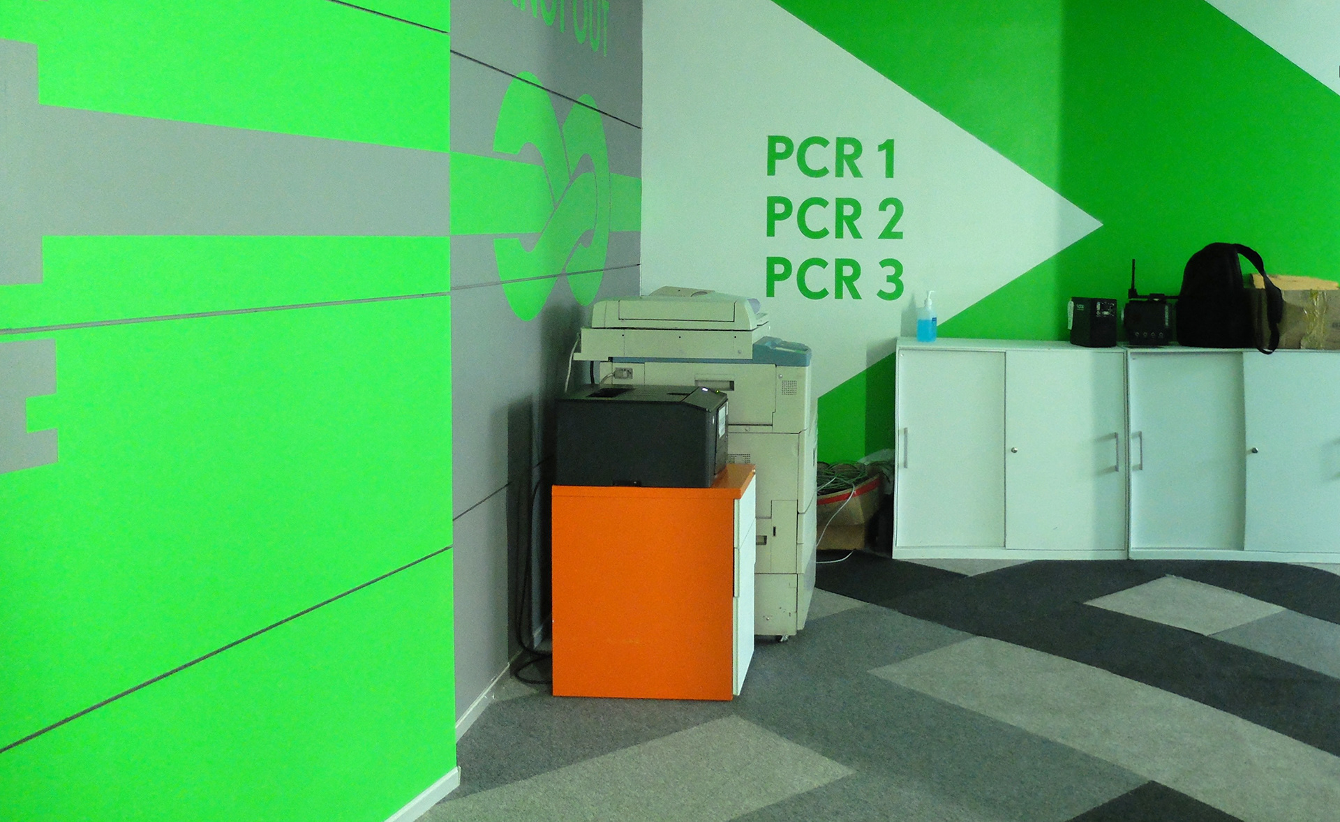
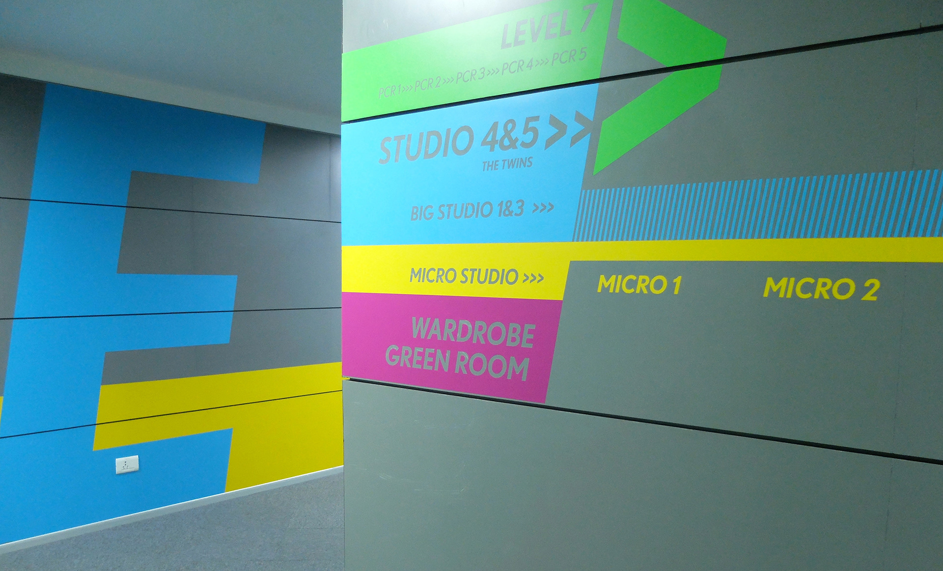
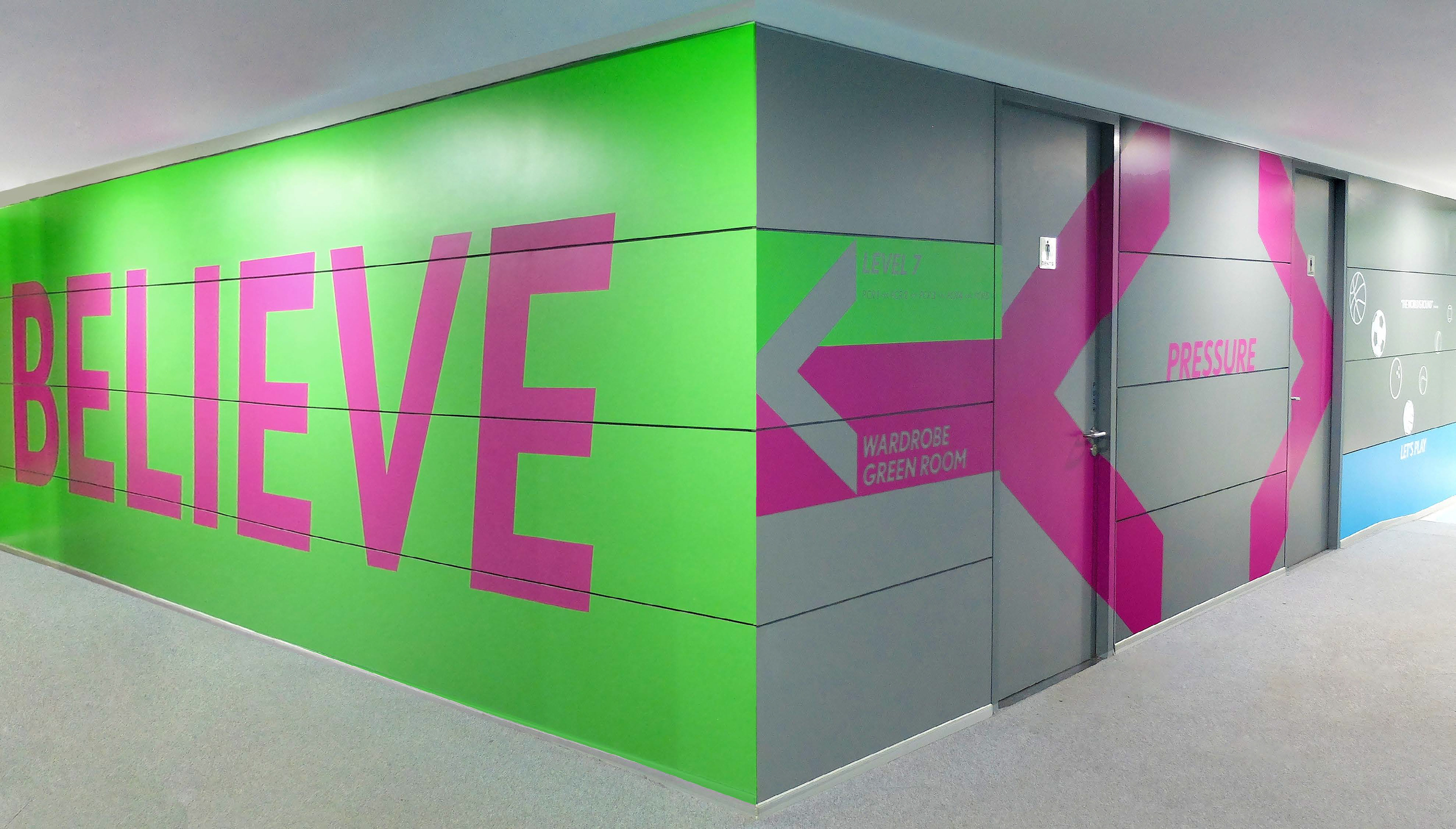
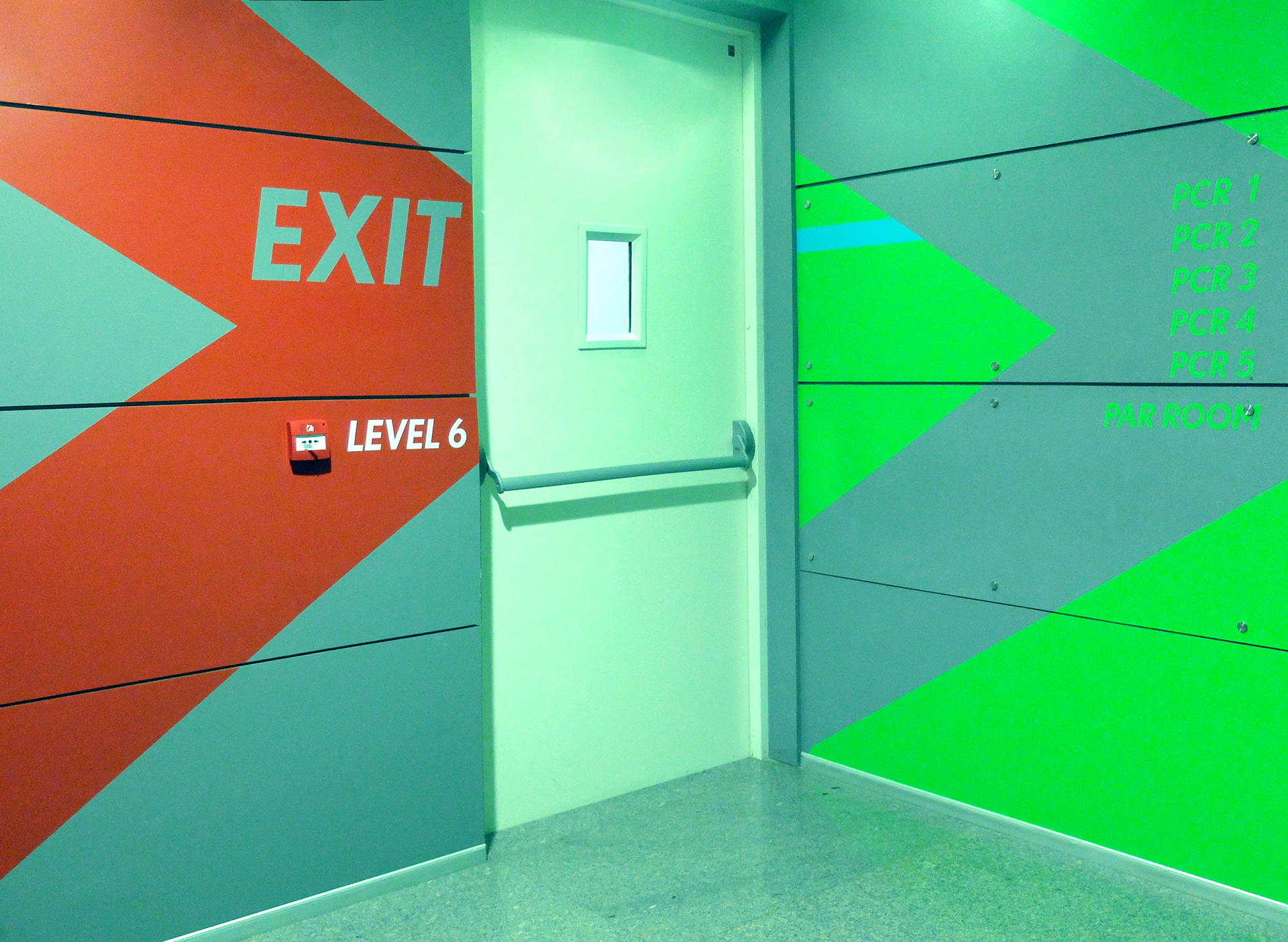
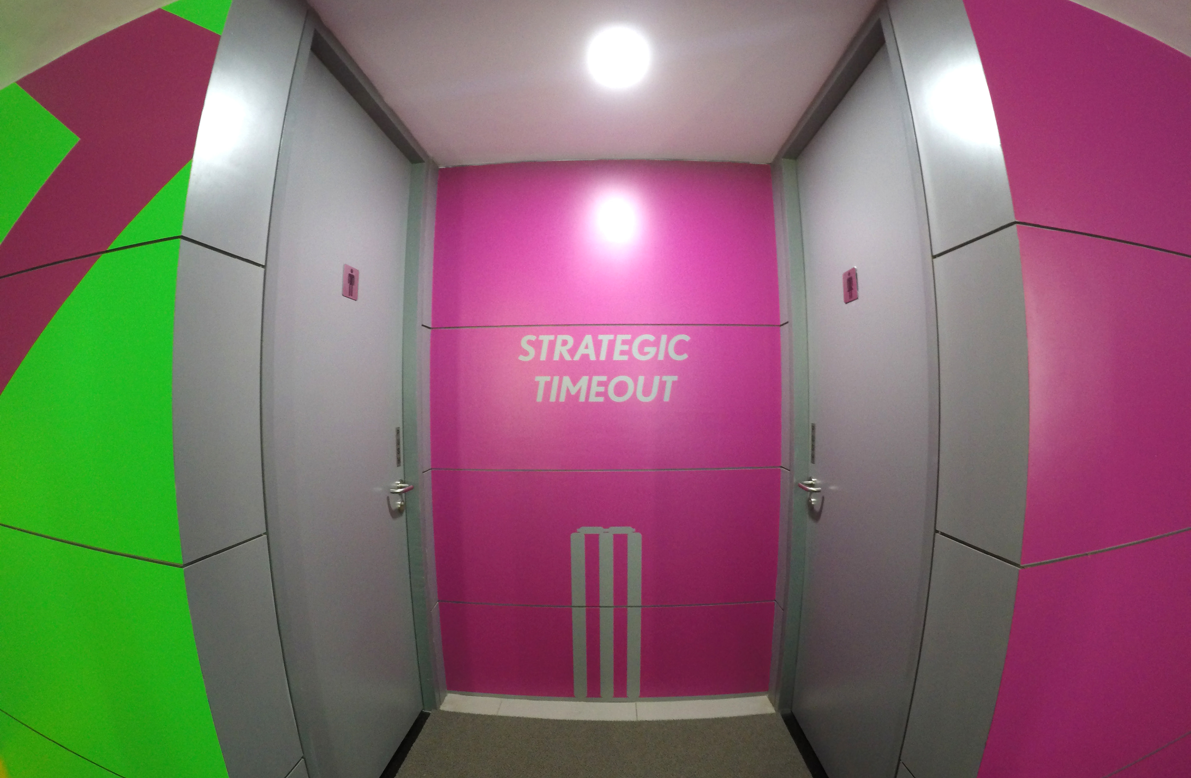
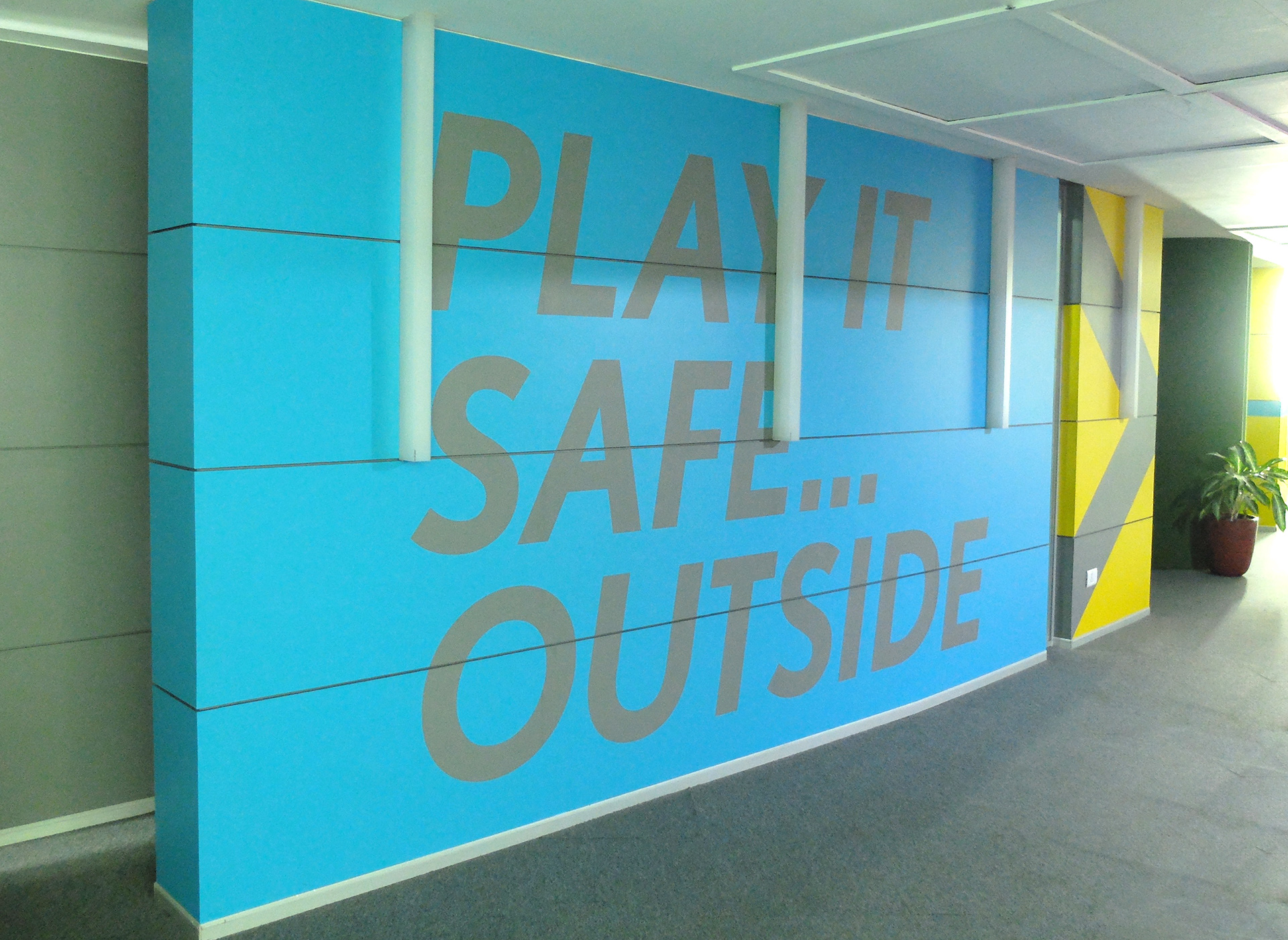
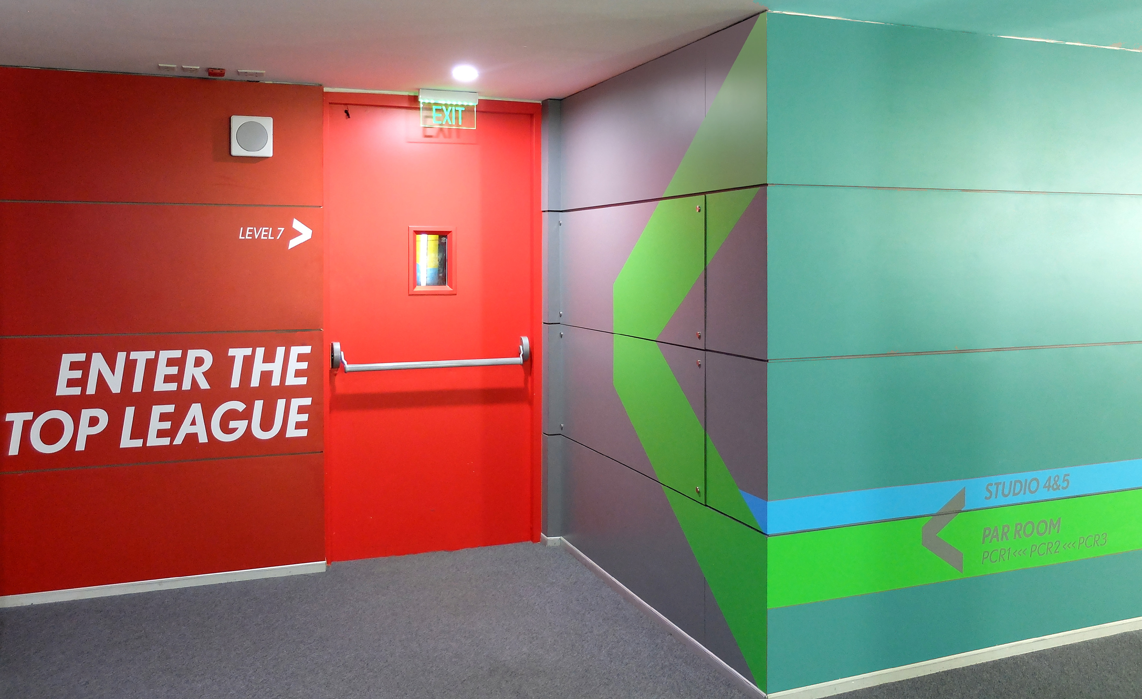
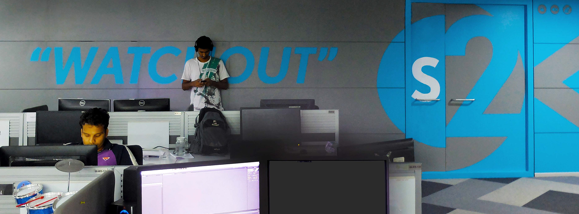
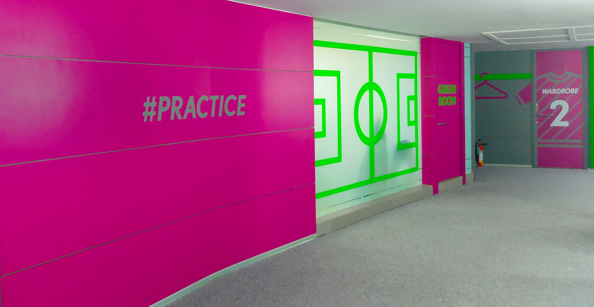
THE STUDIO SIGNAGE PROJECT
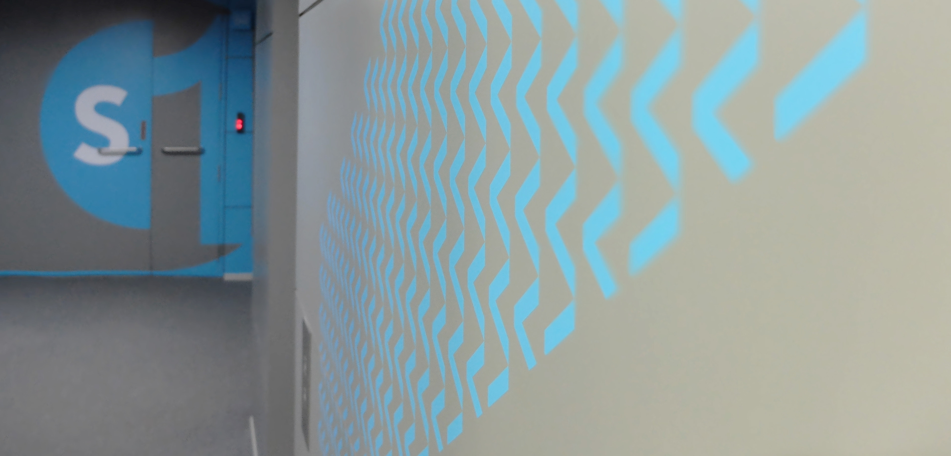
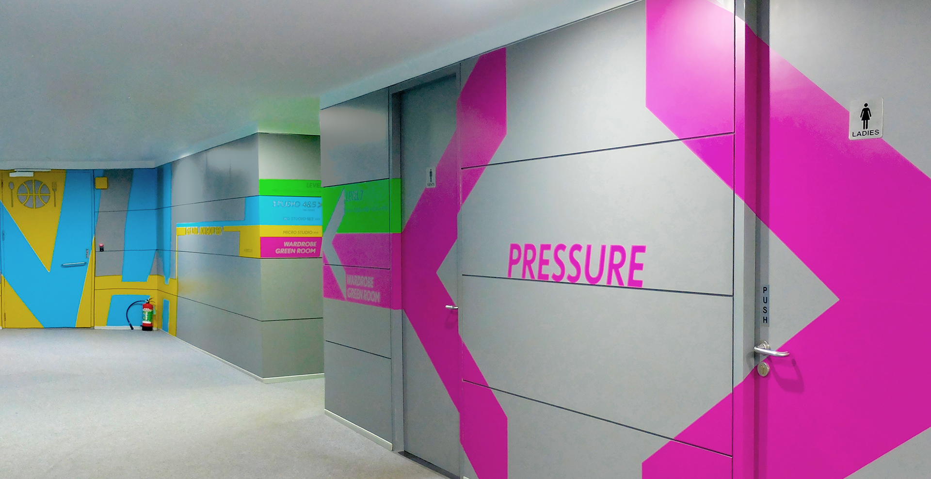
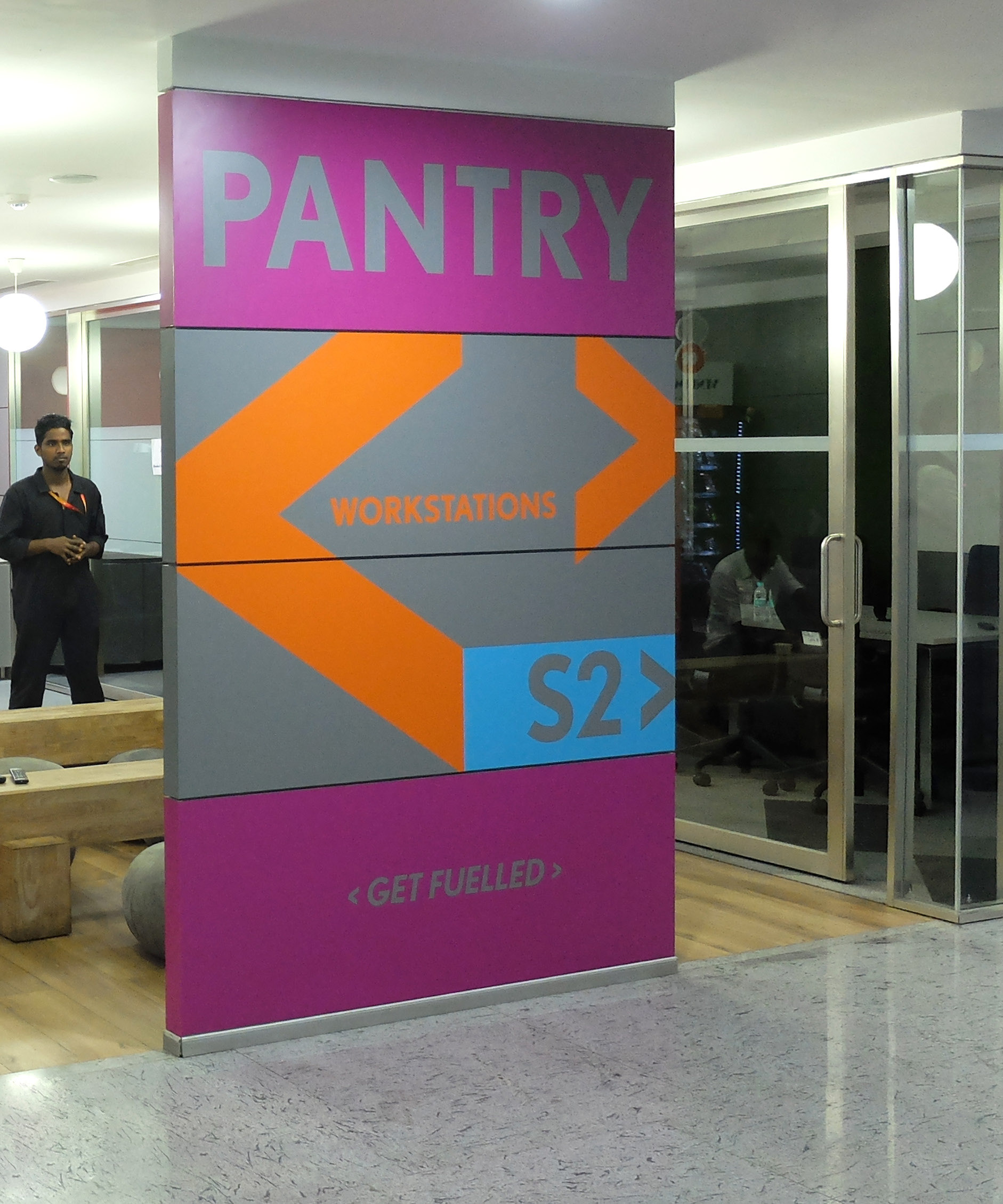
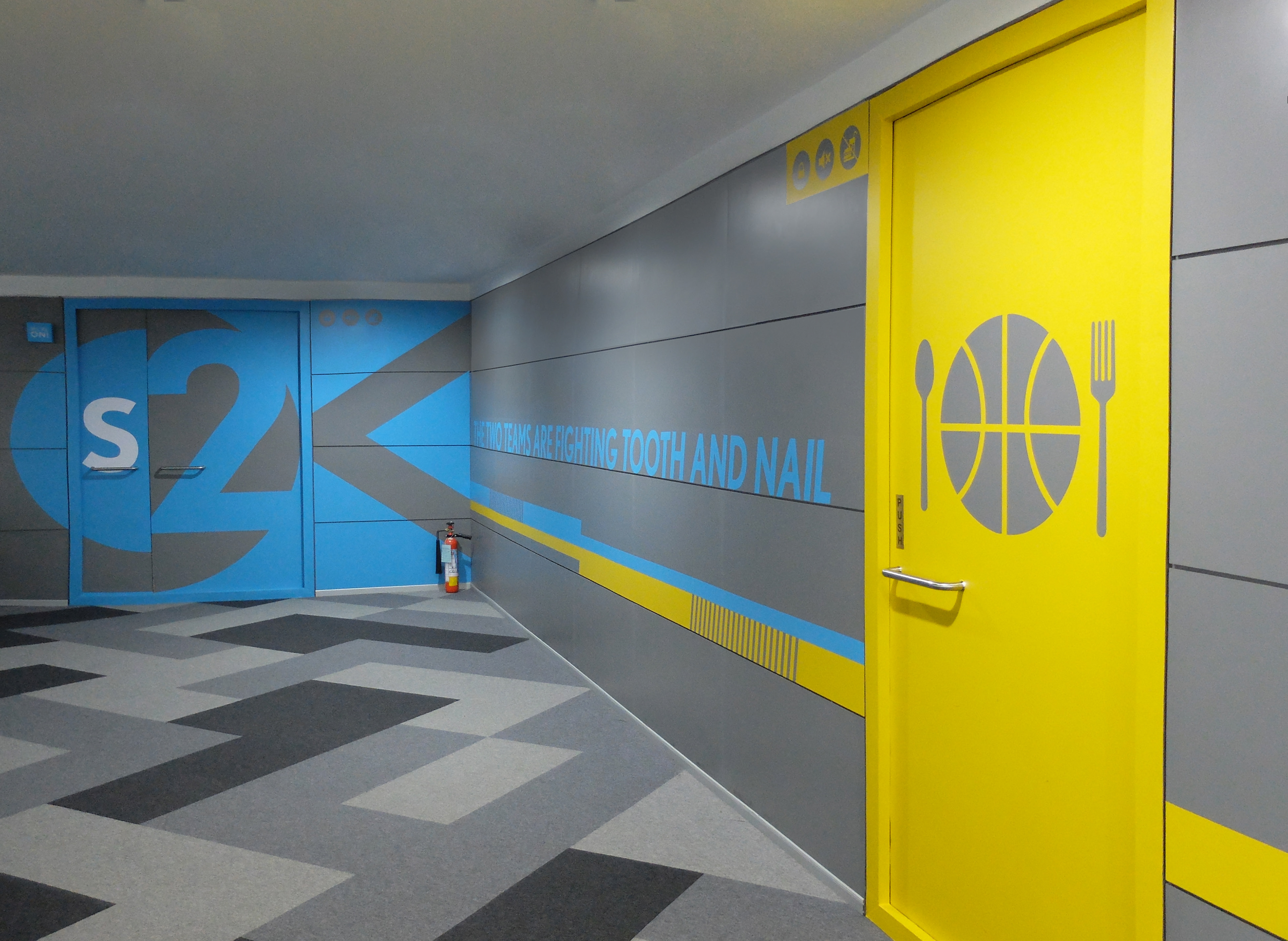
As the facility was warming up with its operations, my immediate focus was two critical aspects, namely brand presence and way finding. The default grey wall texture was the default starting point. The corridors needed colour, needed to reflect the tone of the business objectives too. Meeting budgetary limitations with a functionally finished outcome dictated the selection of the material and process. The nature of the space was like a maze and the colour coding along with the graphic system was a constant check for a visitor throughout the space.
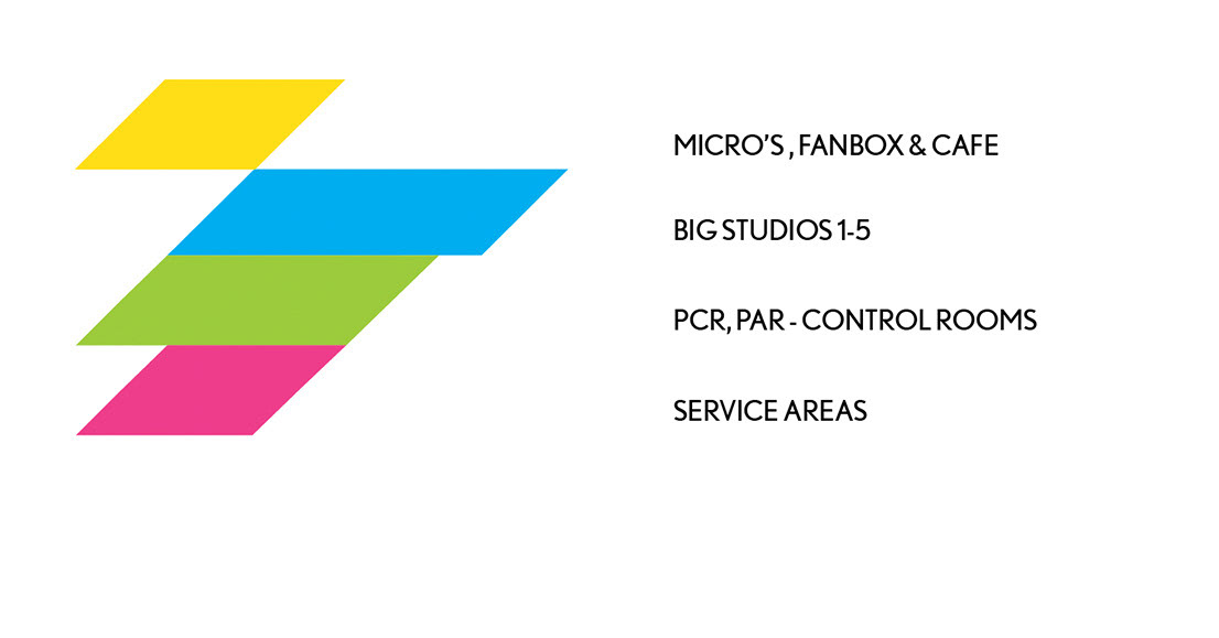
Colour coding from the parent brand colour palette
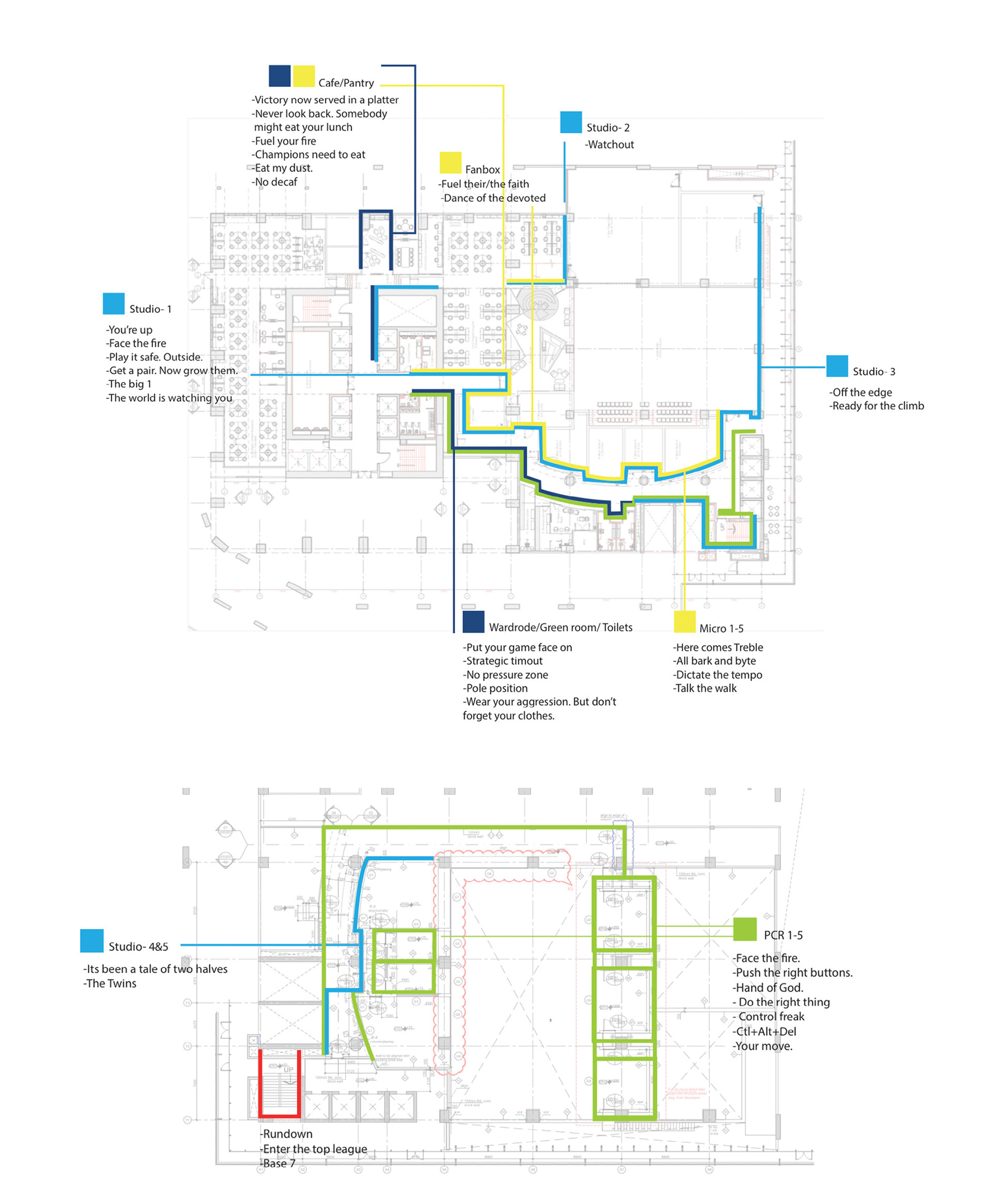
Master schematic
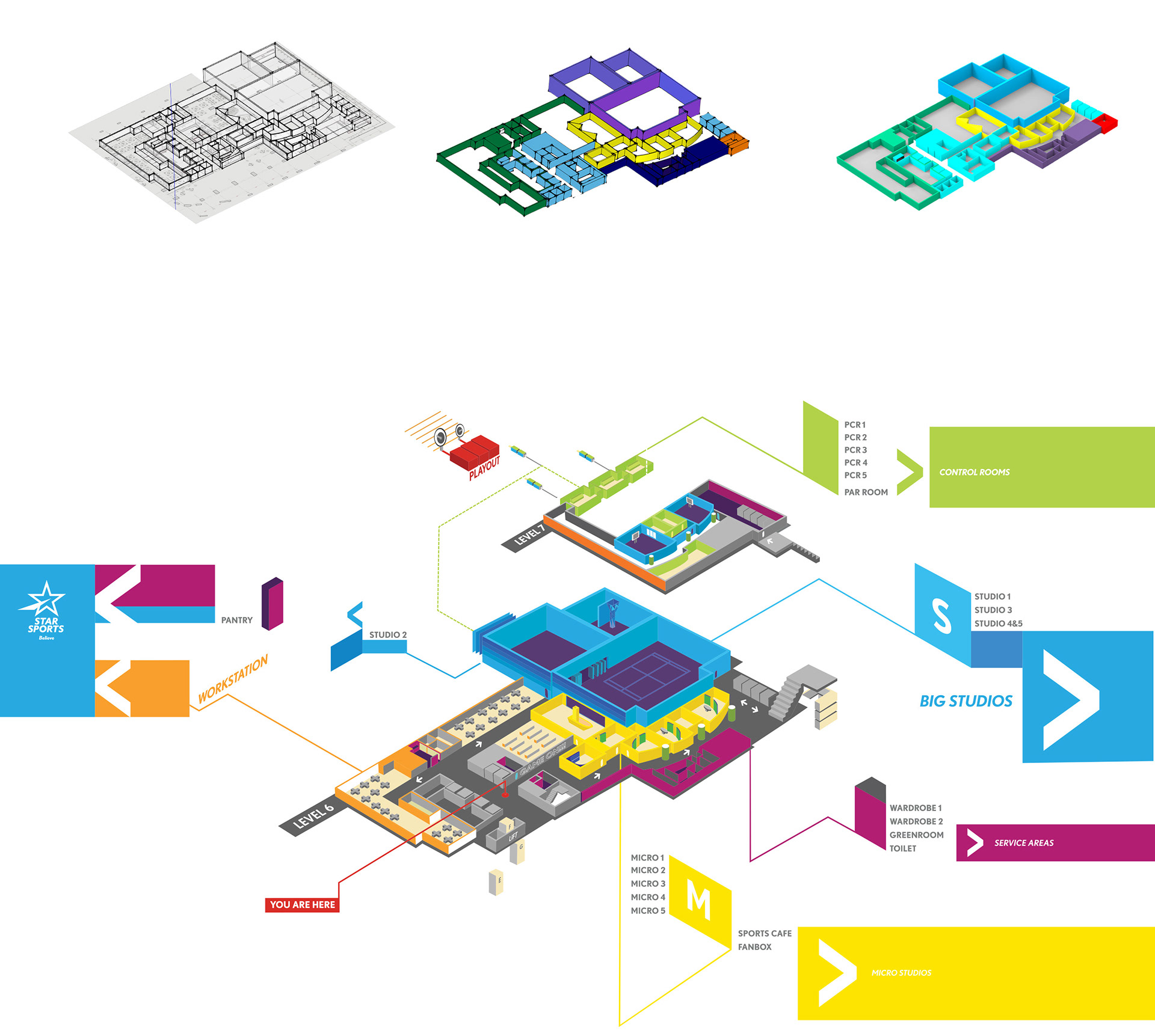
Isometric place map
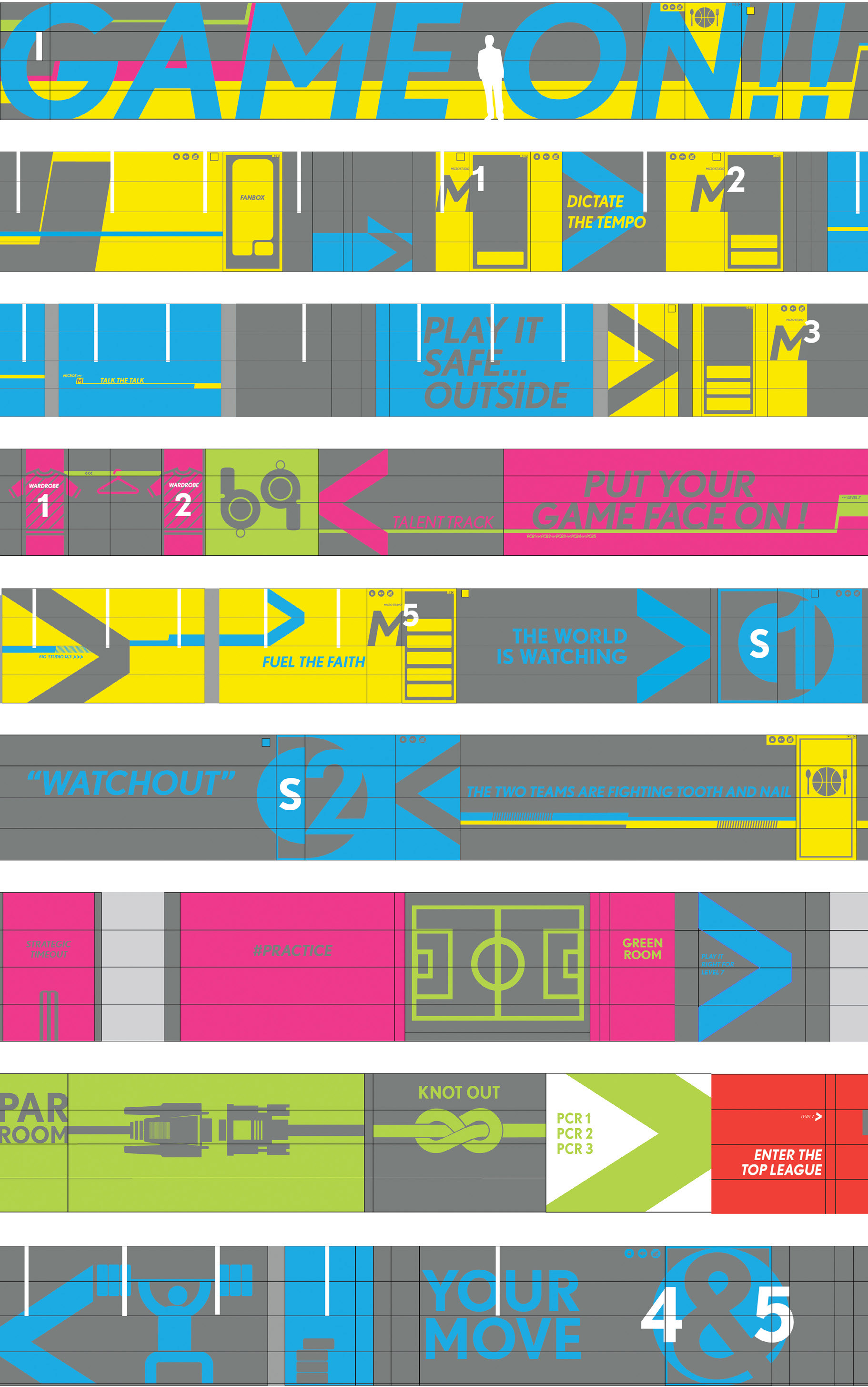
The final concept


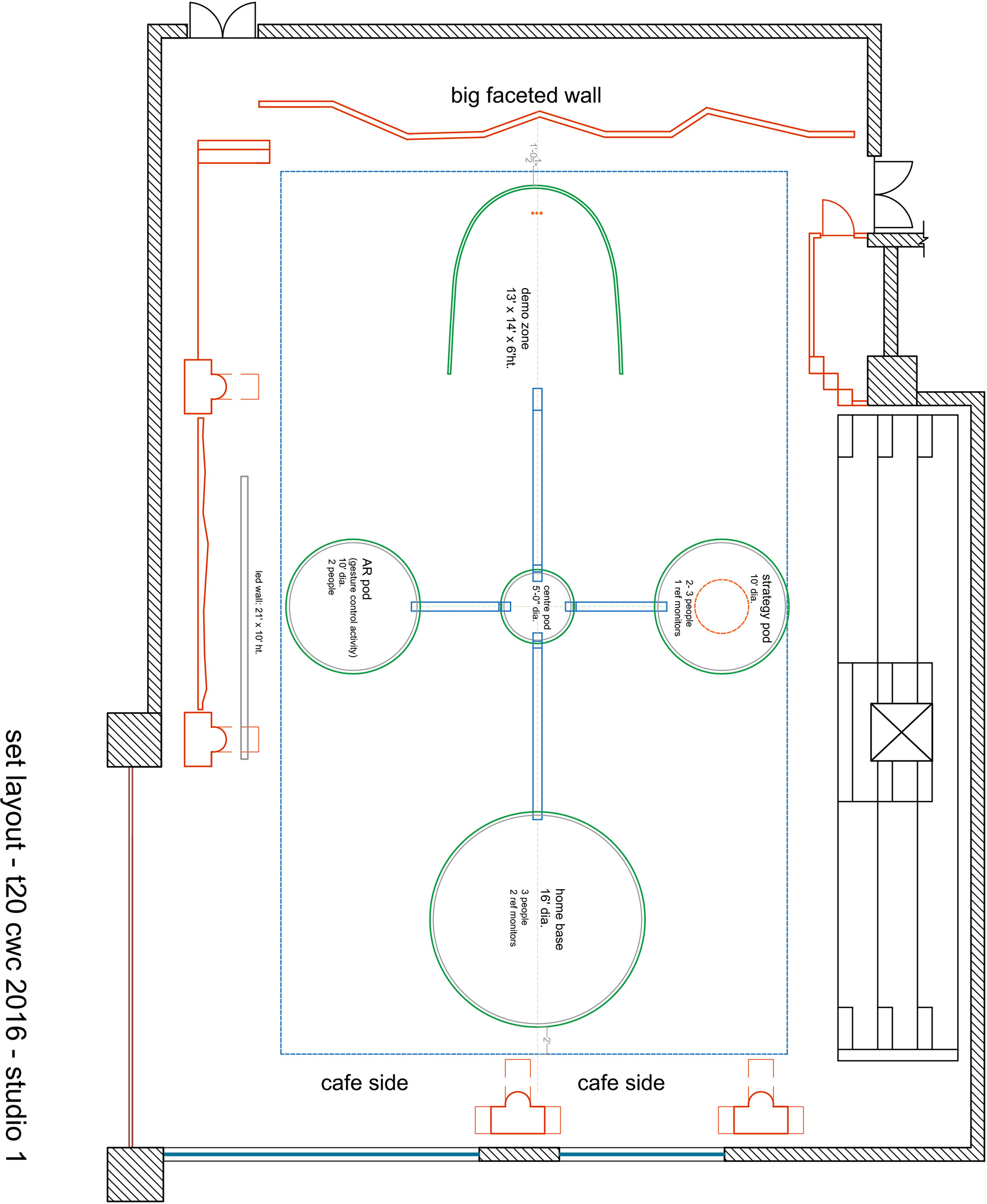
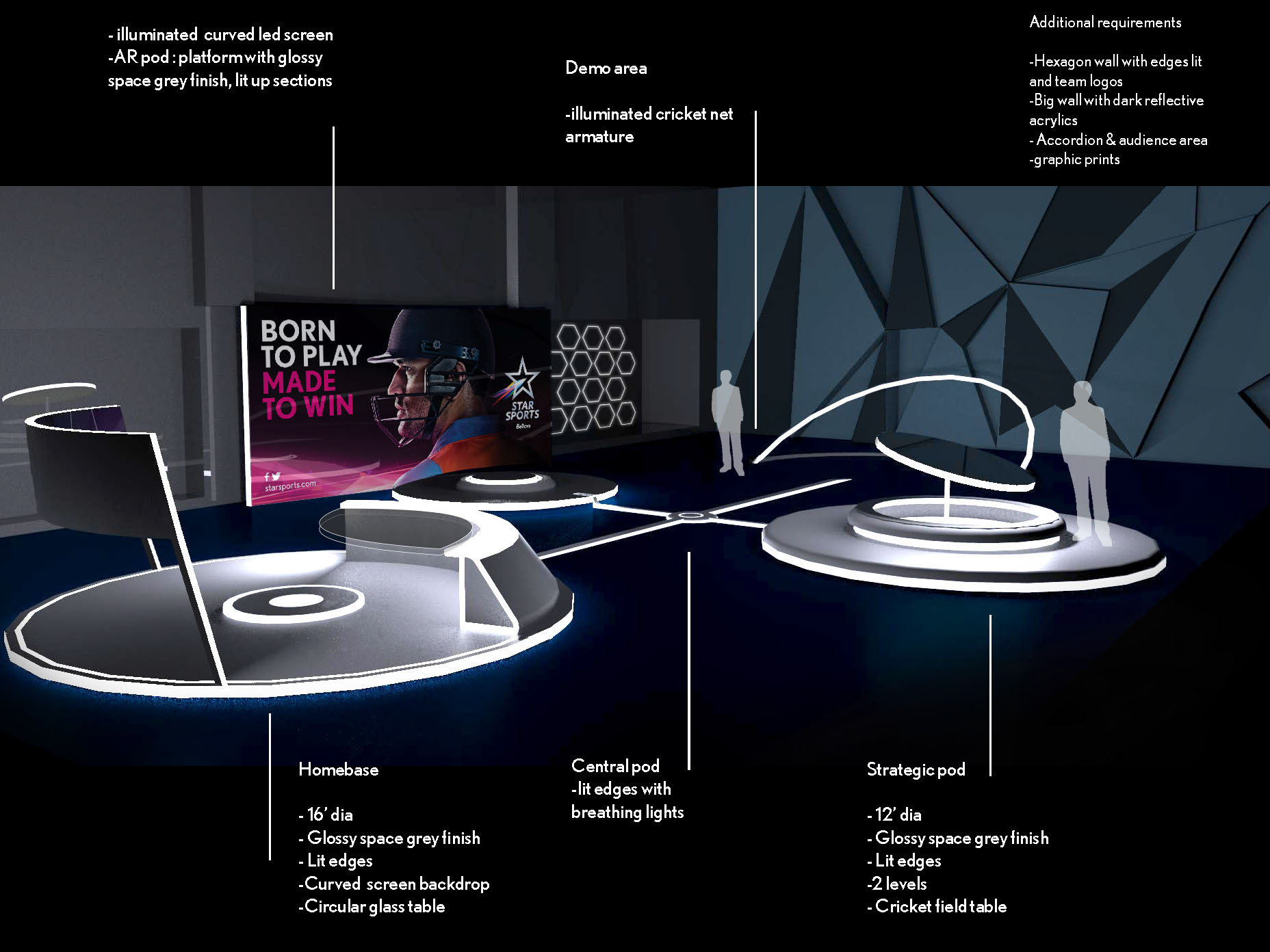
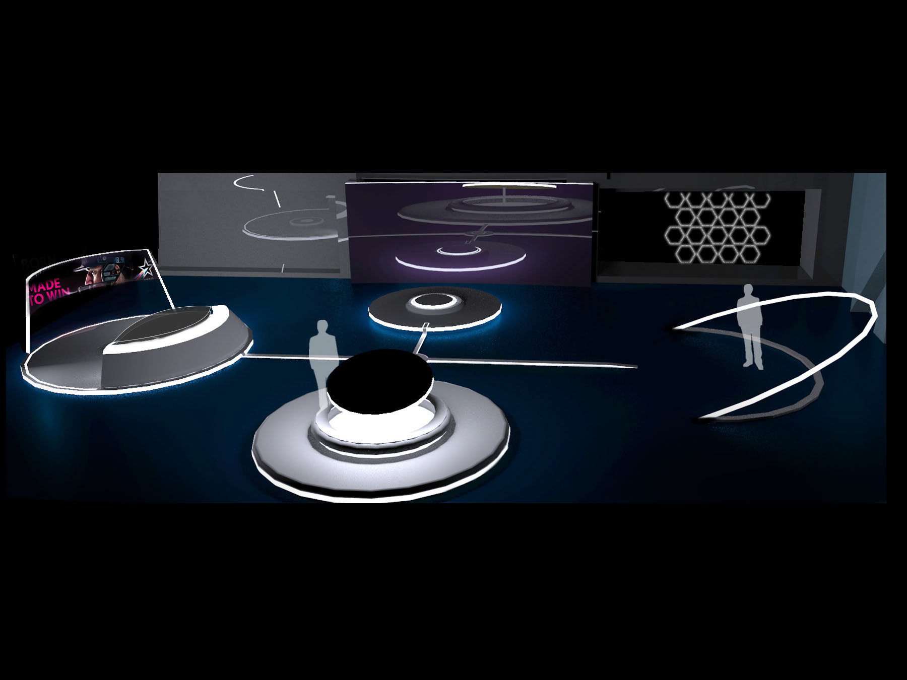
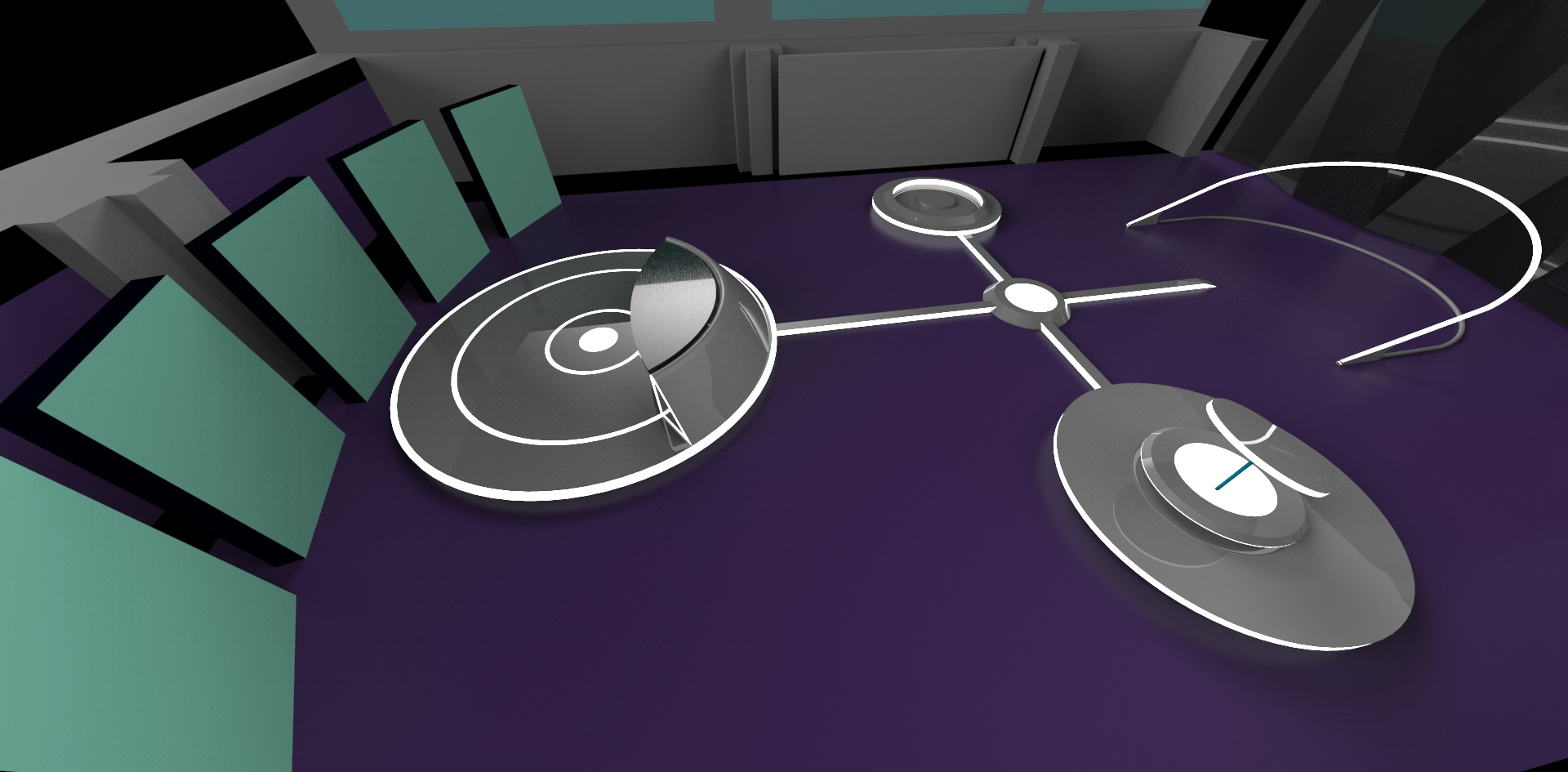
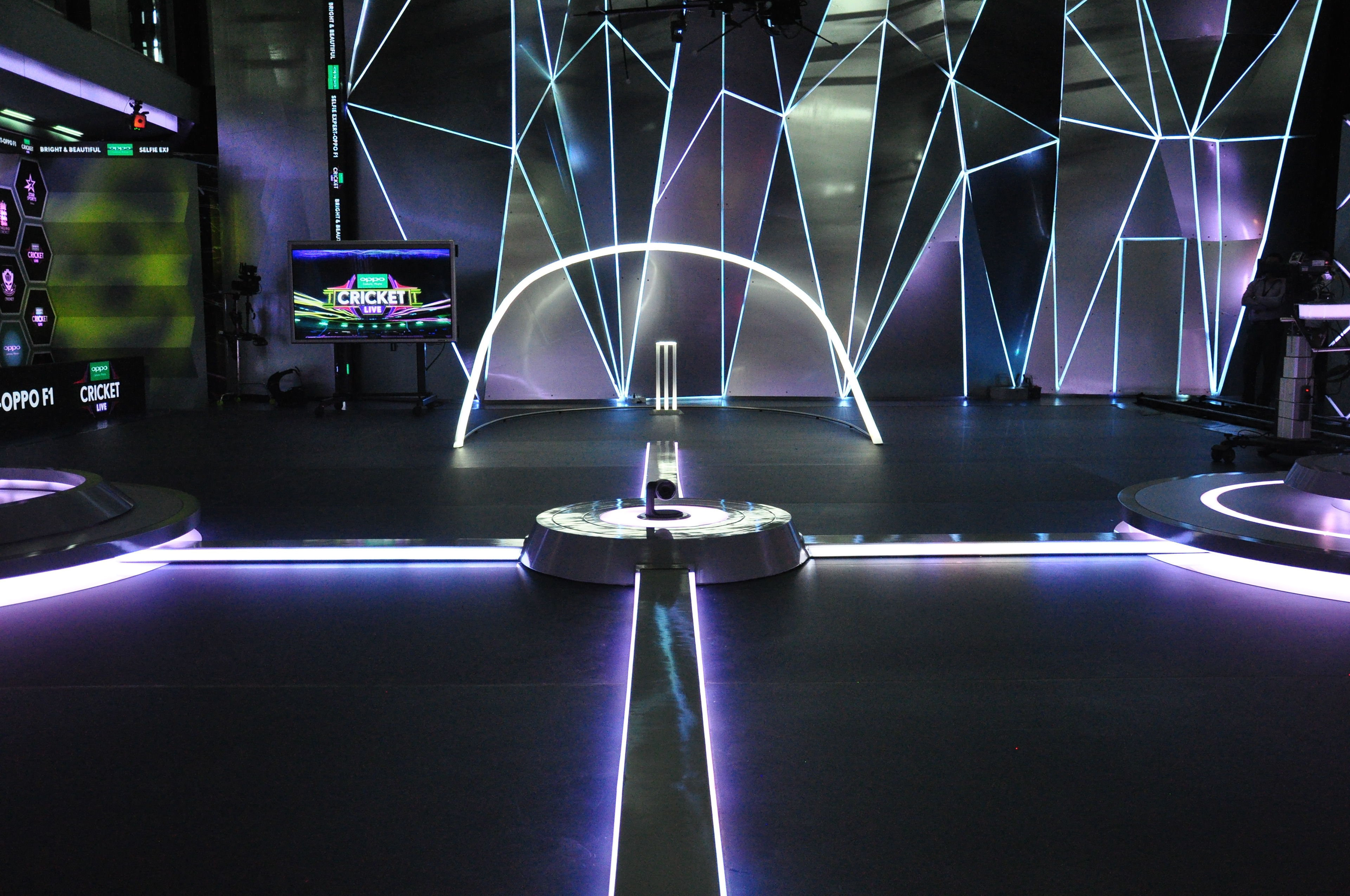
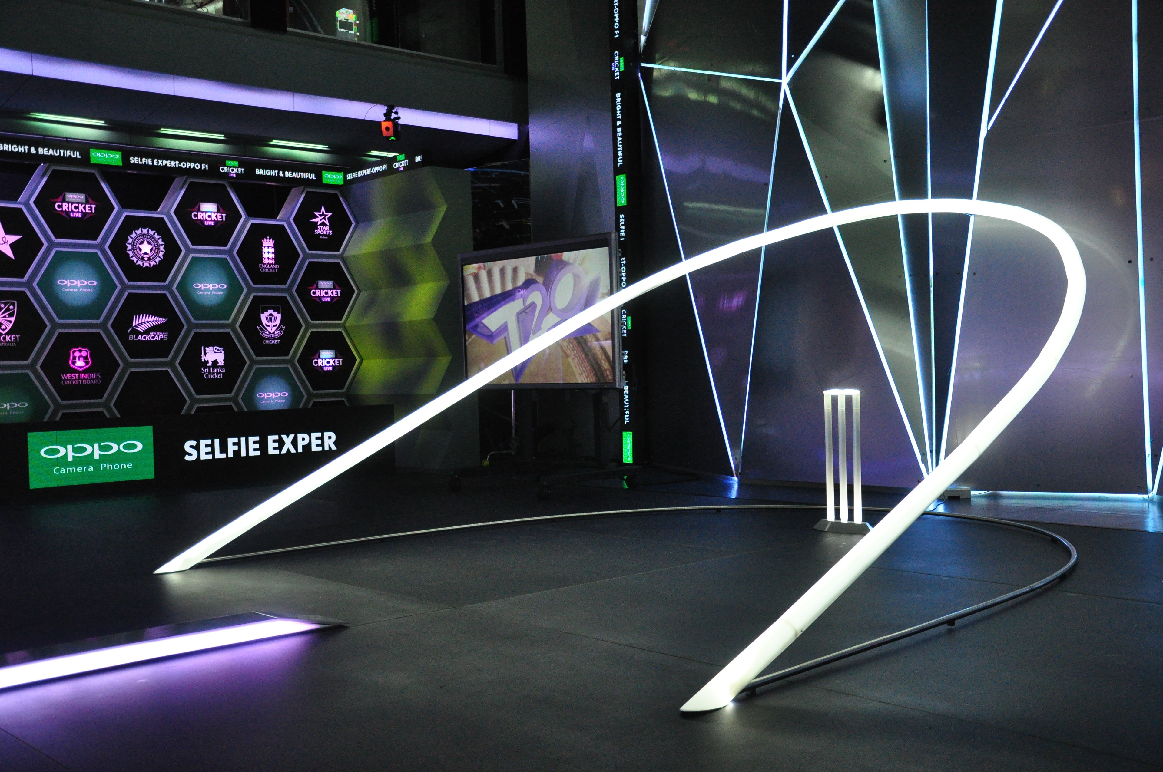
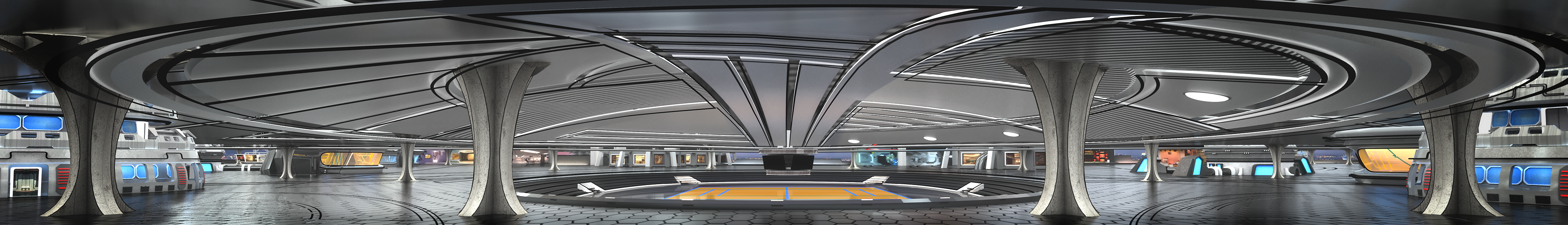
CRICKET WORLD CUP T20, 2016
The project gave me the opportunity to explore the unified multi-stage presentation concept to its fullest. The content structure was broken down into its basic functions and allocated 'pods' that were designed to be modular, 'futuristic' and seemingly interconnected. The elements were designed and constructed so they could be laid out and packed away multiple times efficiently. The project also cemented my understanding of the interdependence between studio lighting, set elements and what 'looks good' on camera.

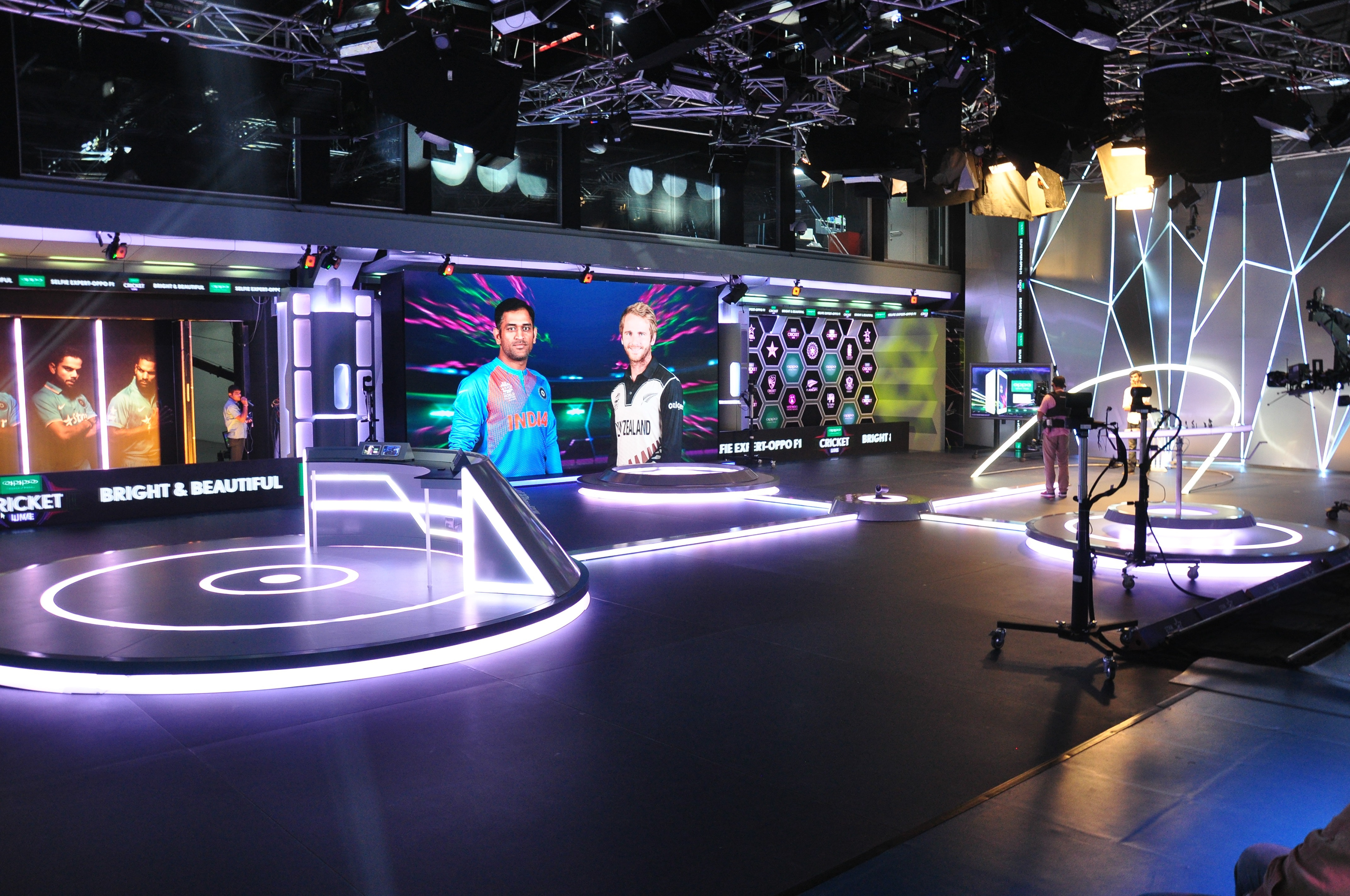
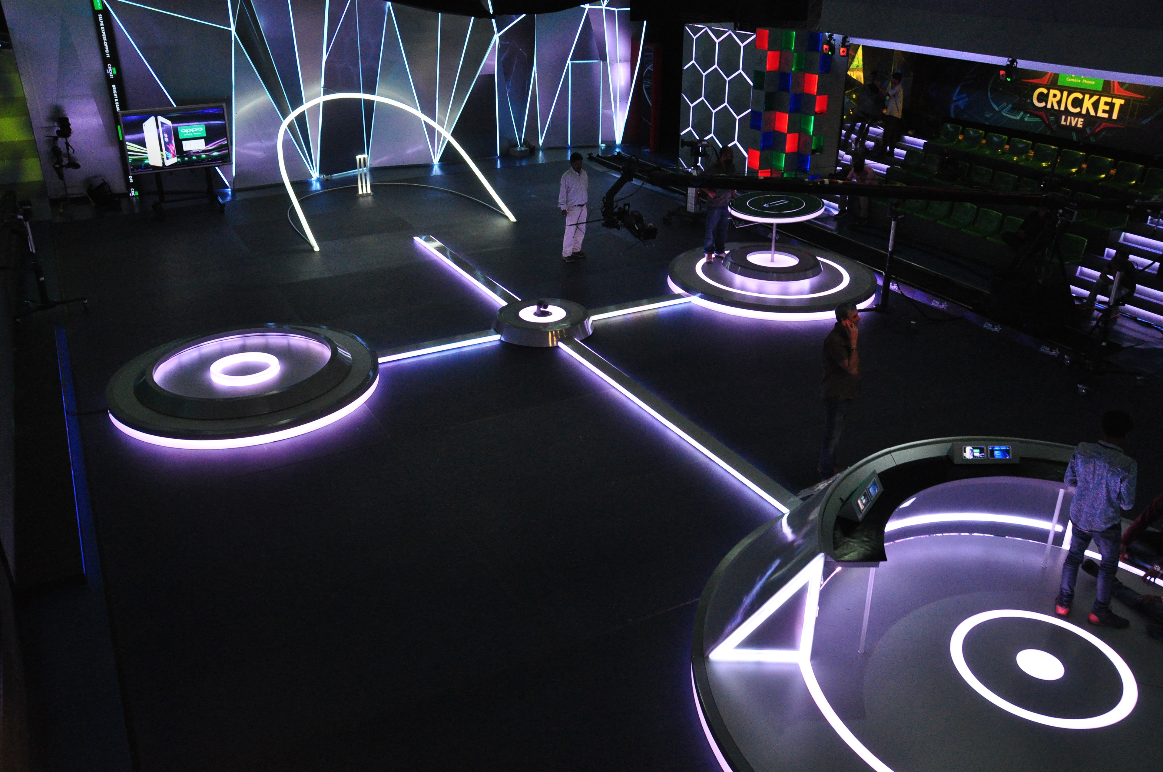


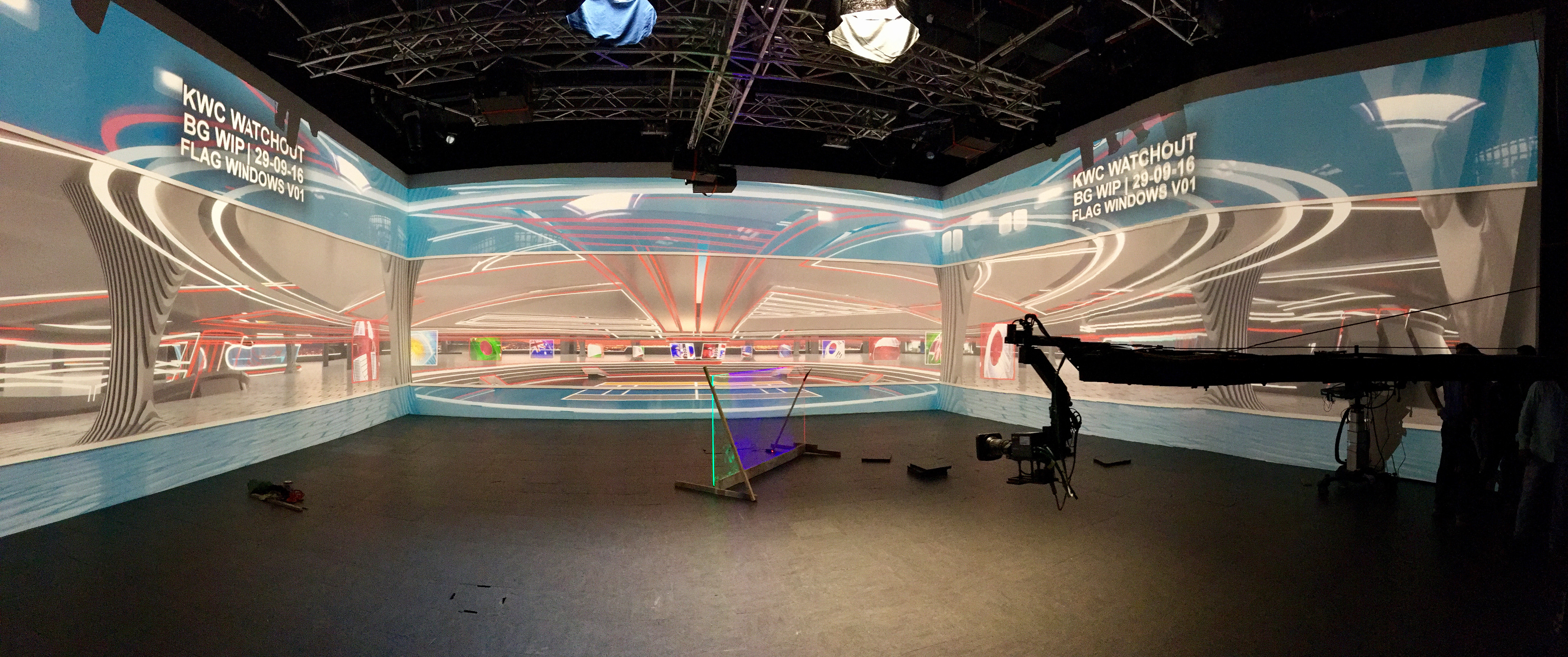
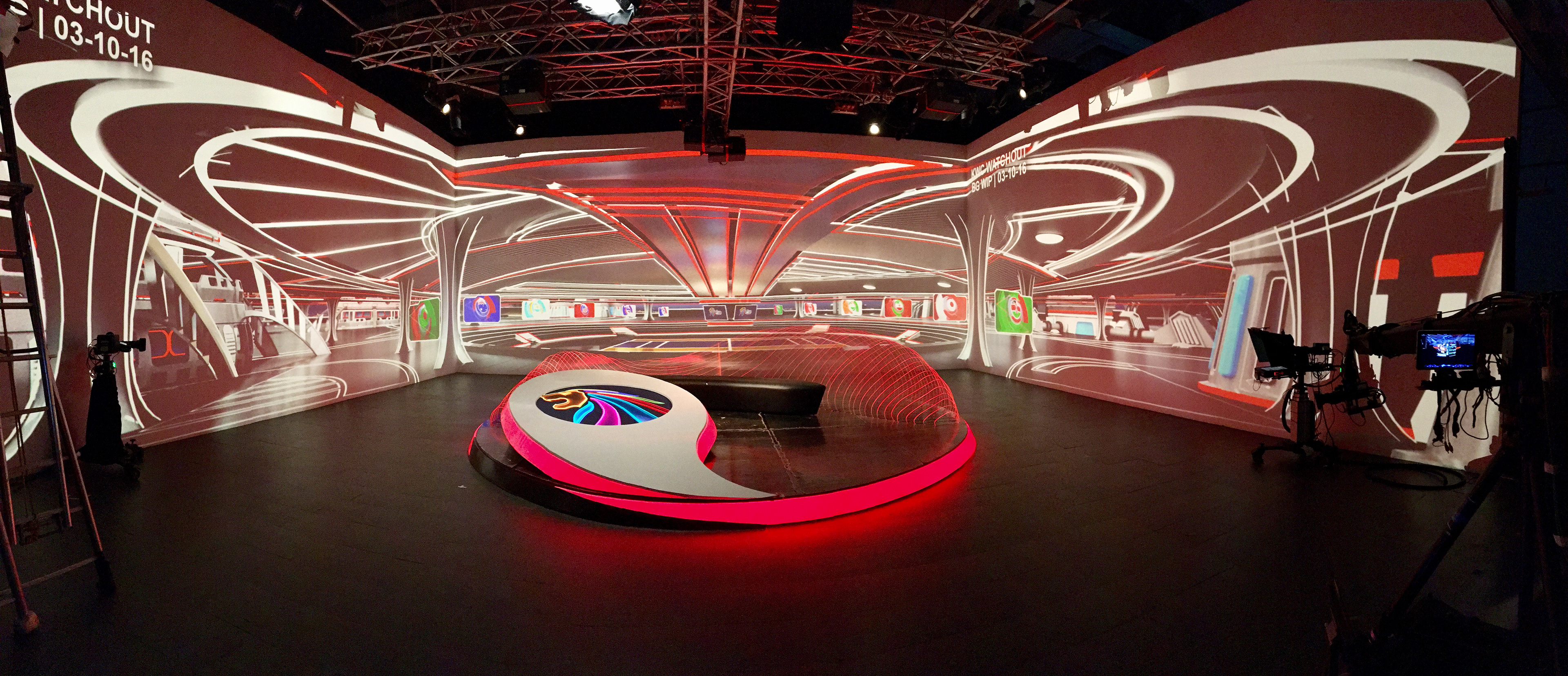
KWC 2016
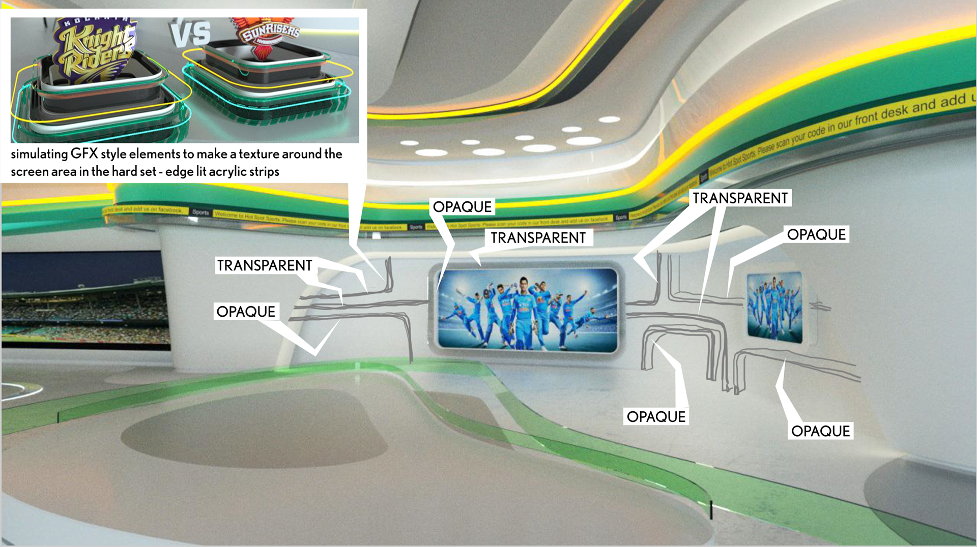
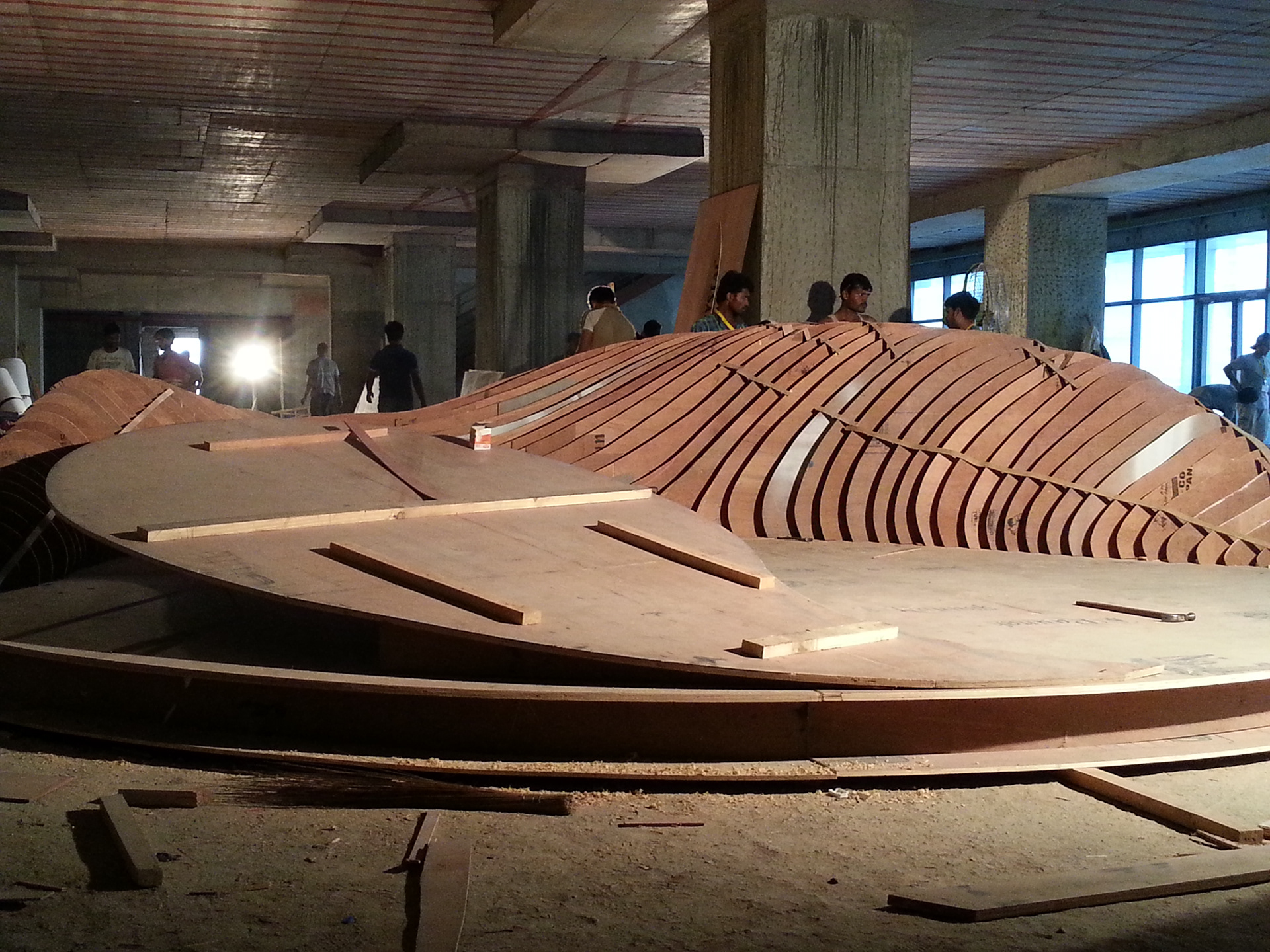
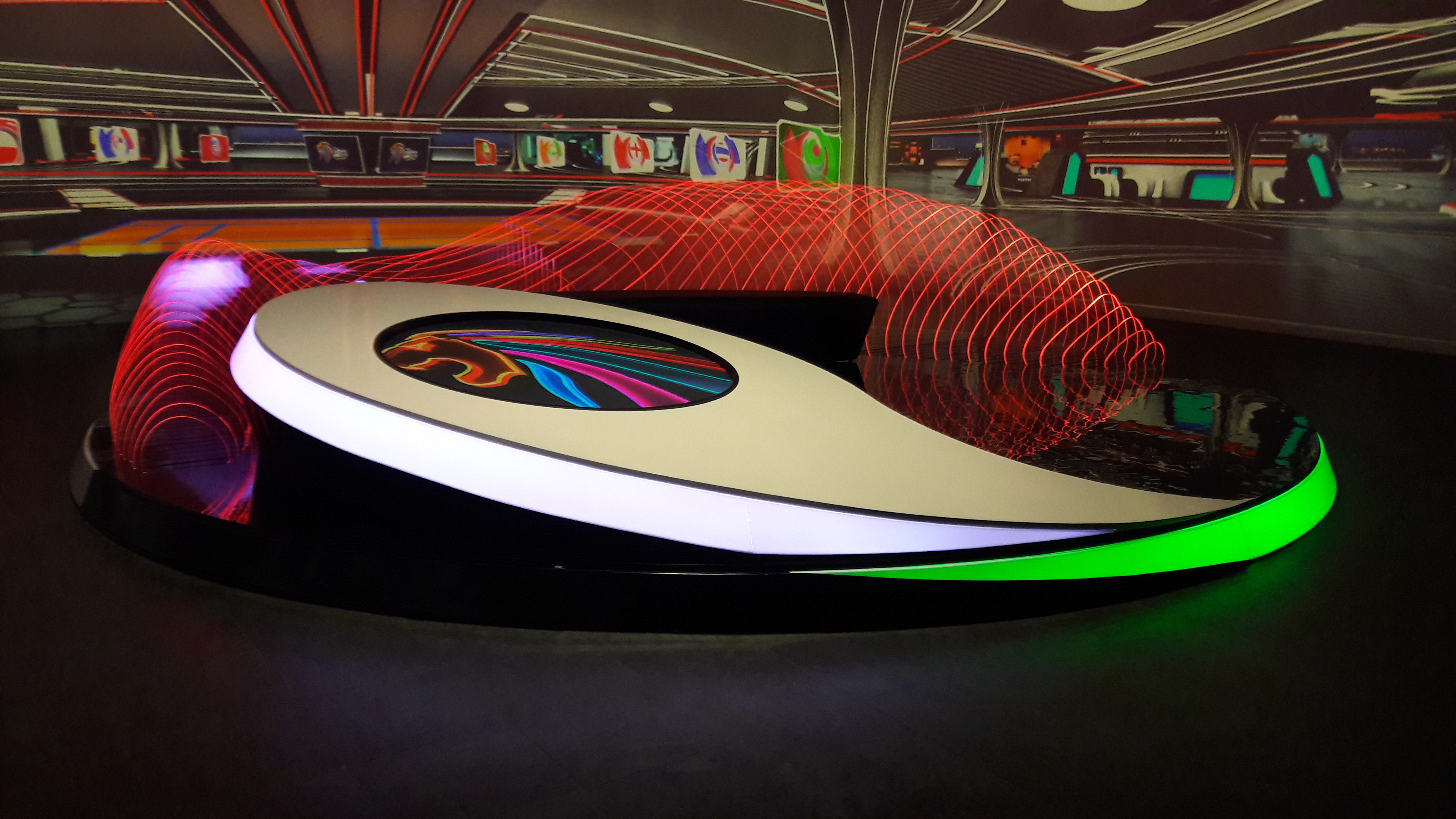
Kabaddi World Cup had been proposed for the first time and I was told to make it look 'international' and 'cool'. Working with the projection system I wanted to use transparency as a tool to merge hard set elements with the background and the GFX style. The indoor stadium was constructed digitally with controlled animated loops and the foreground 'presentation pod' held this light form created with edge lit acrylic profiles edge-lit with RGB LED lights
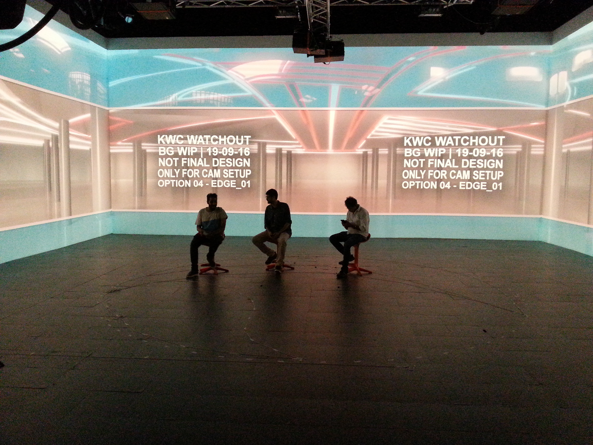
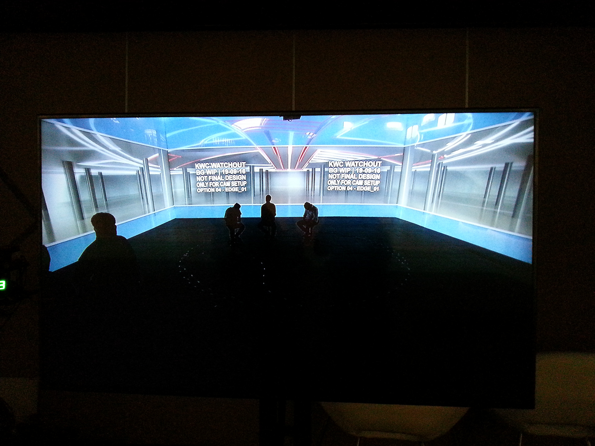
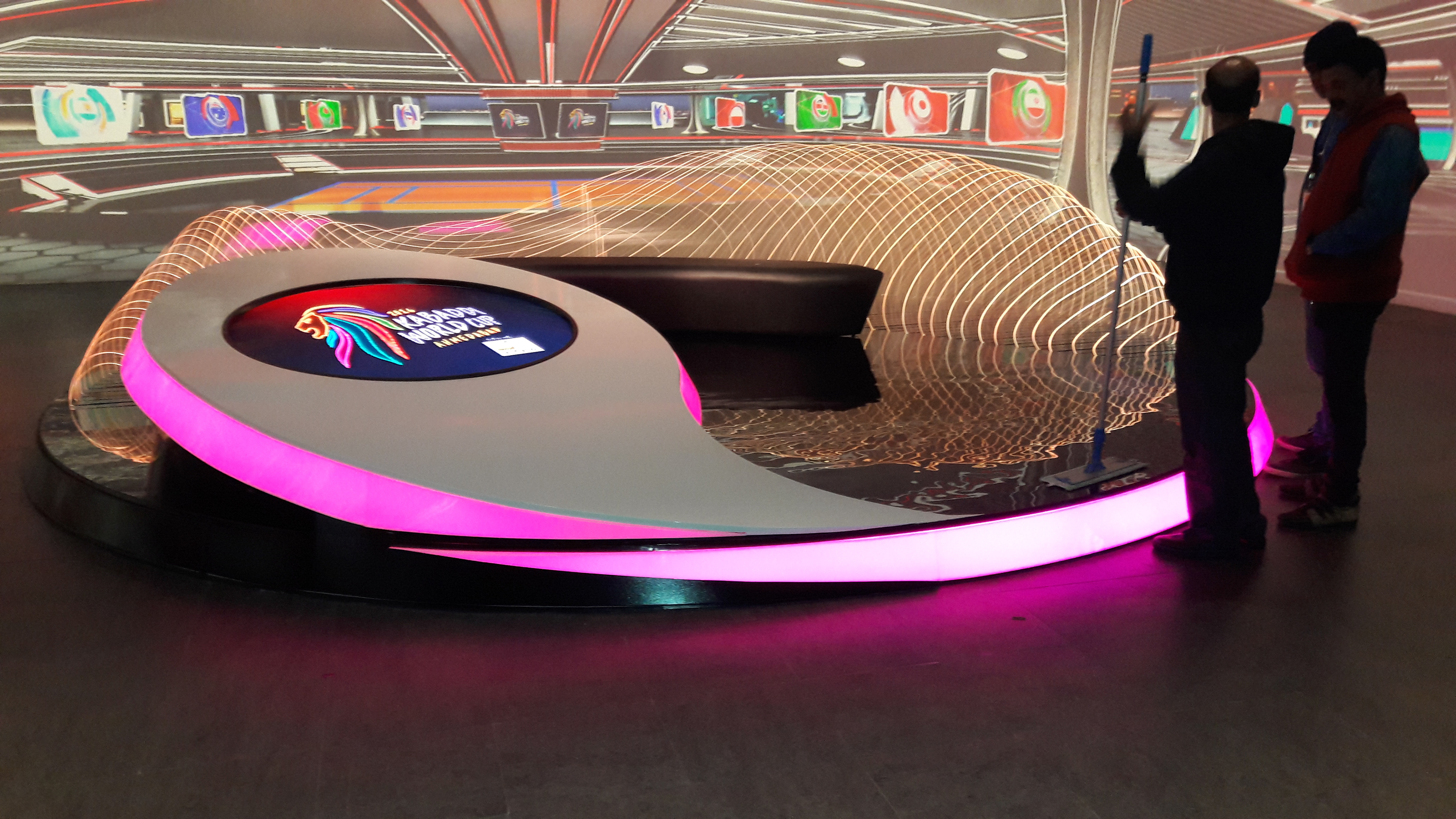
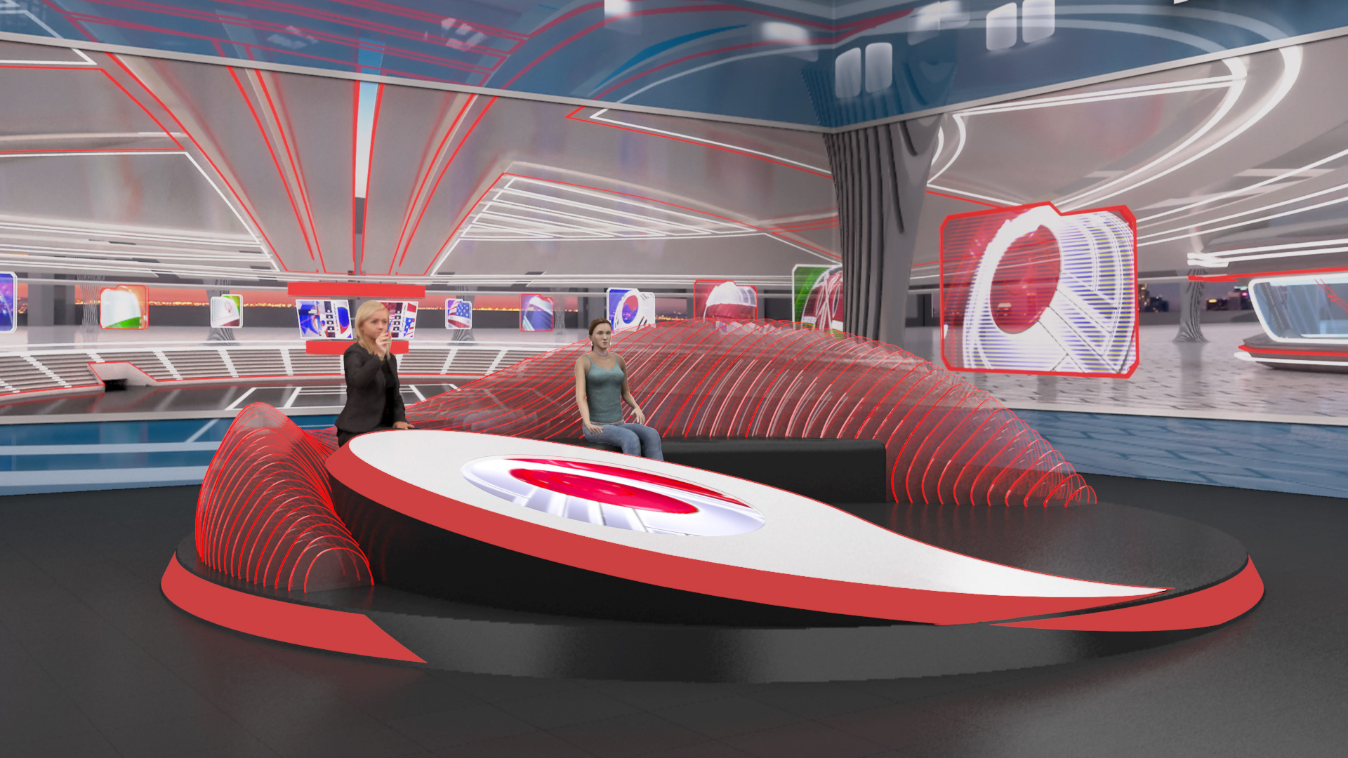

I worked with options for the roof, pillars and layouts till we got consensus on a locked design
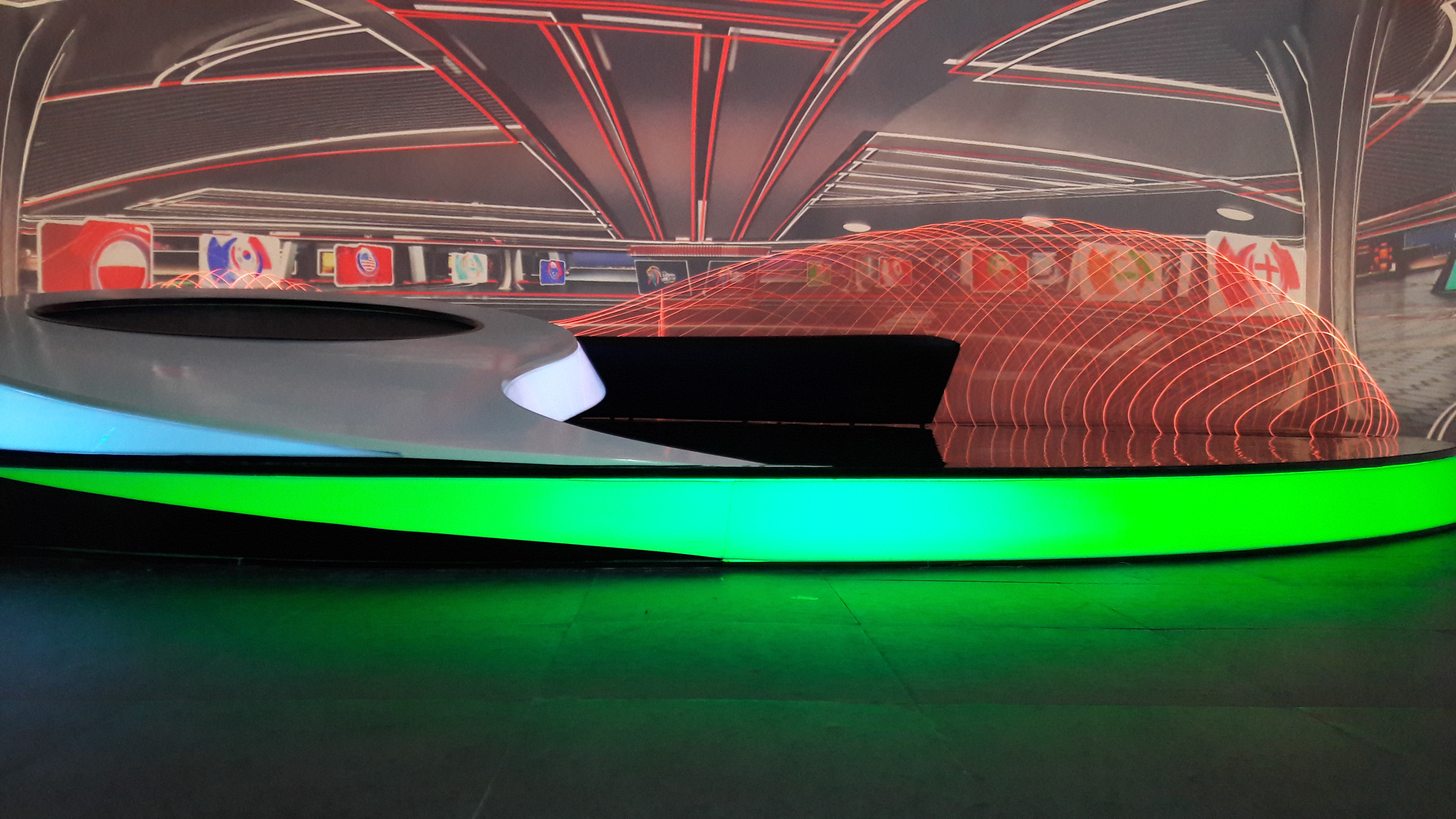
The ability to play with the colour combinations worked exceptionally well.


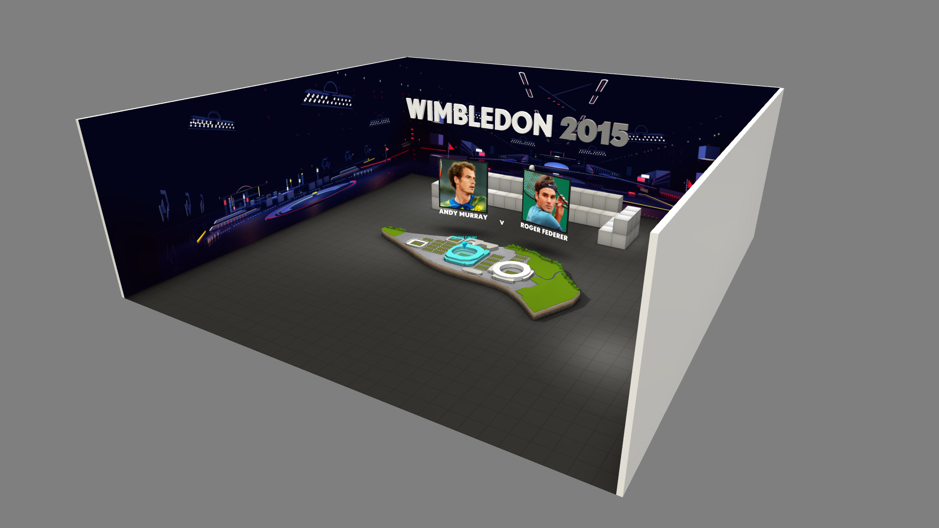
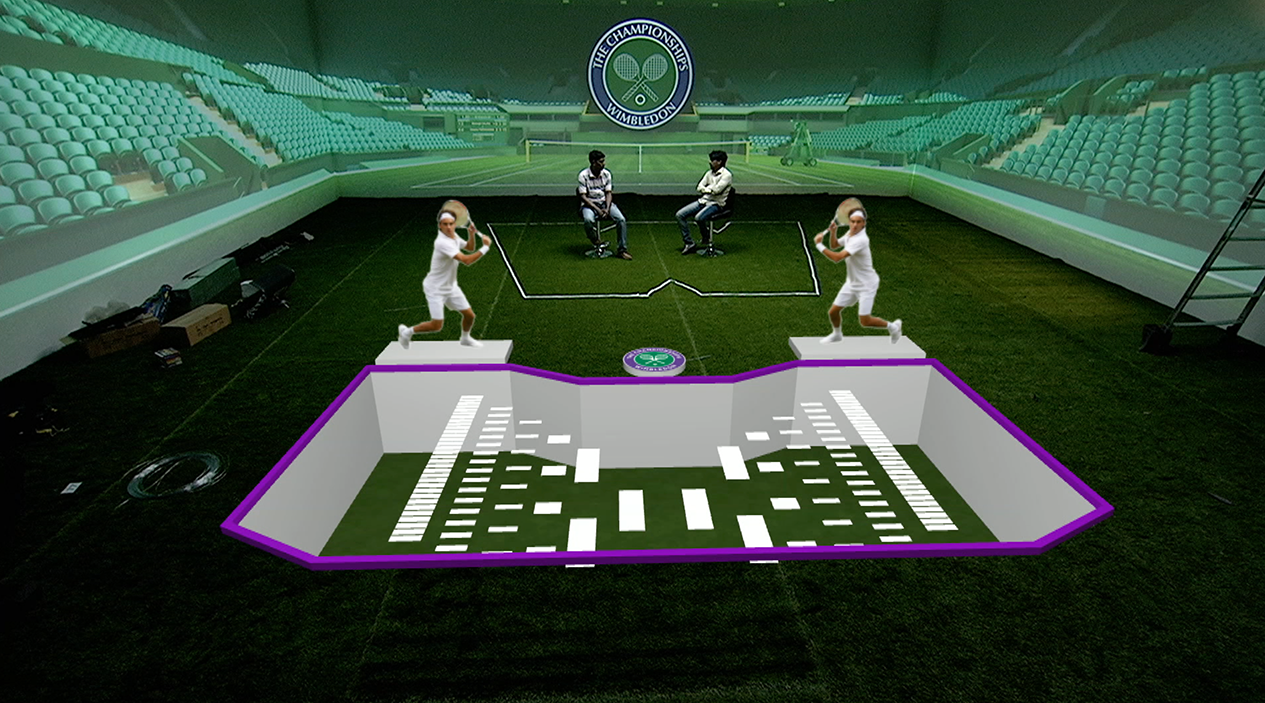
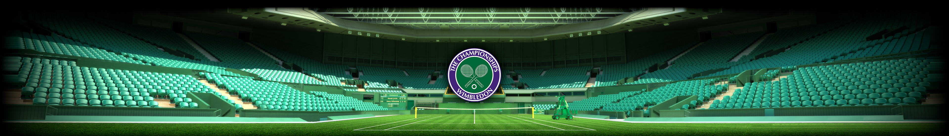
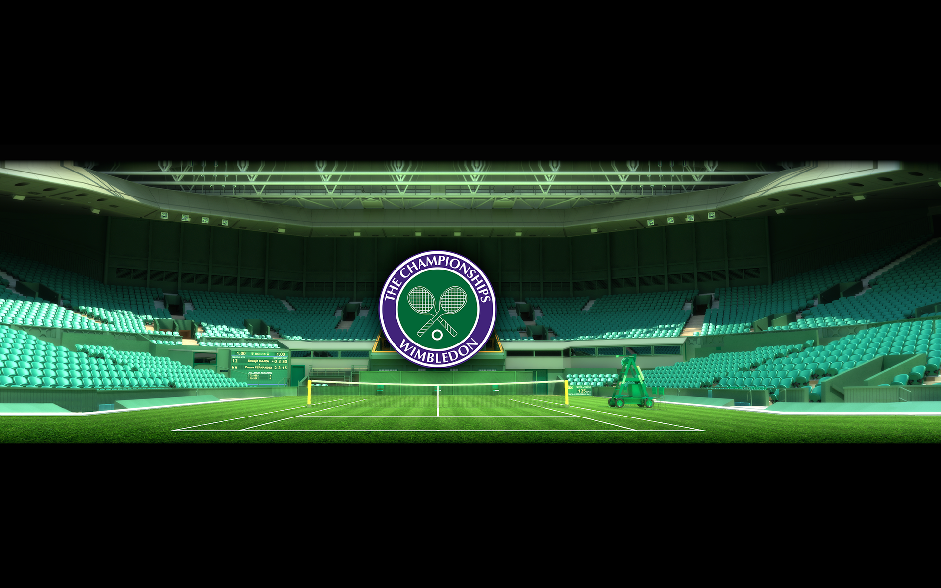
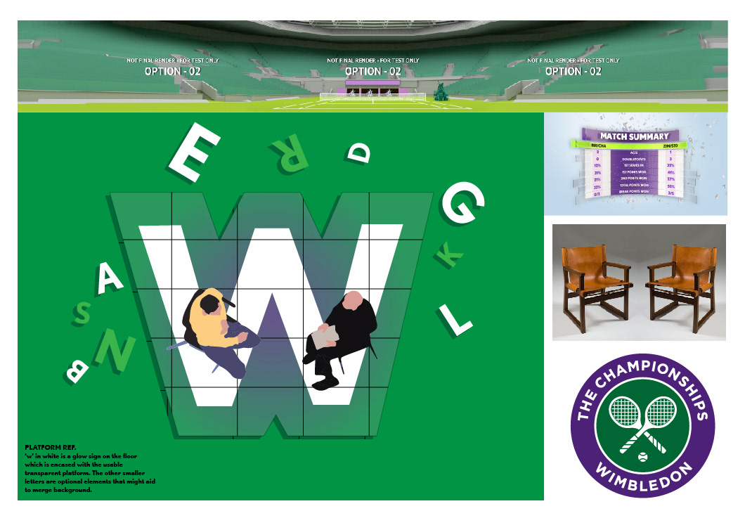
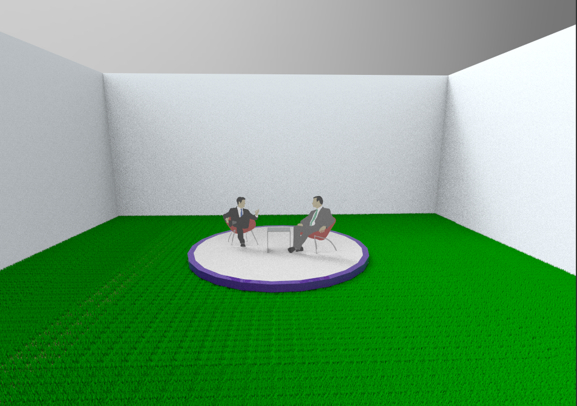
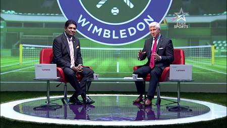
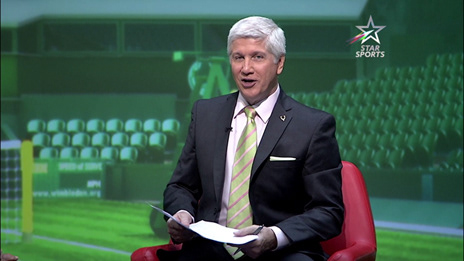
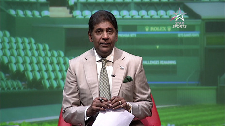
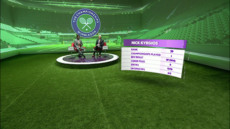
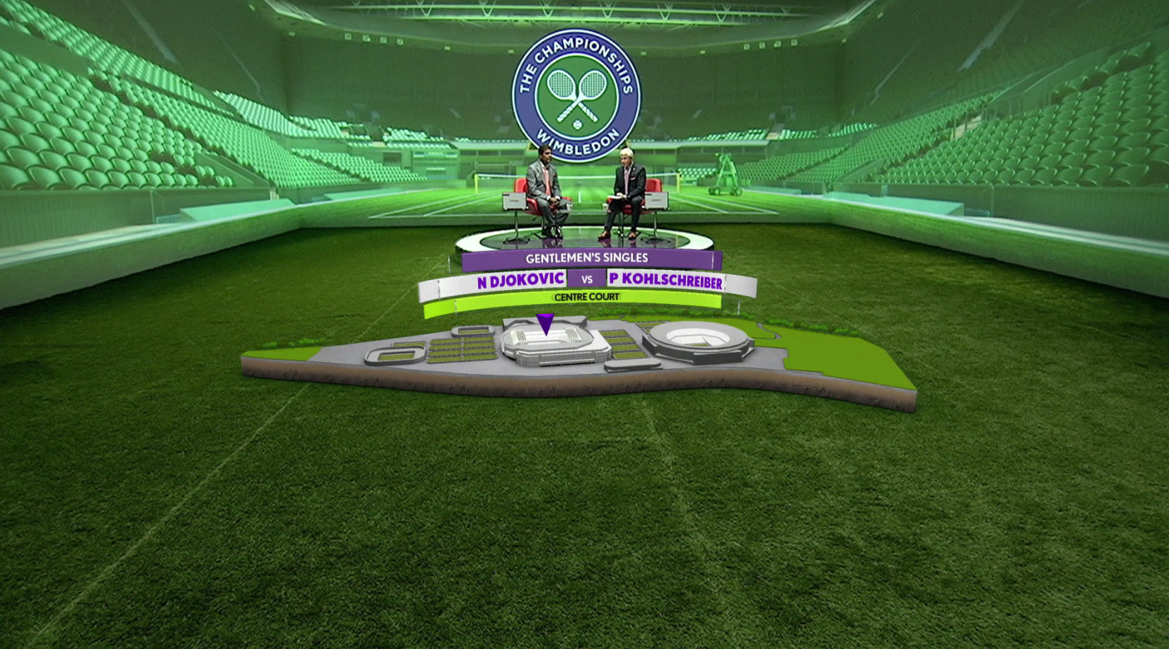
WIMBLEDON 2015
I wanted to use the immersive potential of the projection system and set out to build the 'centre court' experience for the show. It was specially challenging to align the team as this was one of the first in scale and quality demands. I was confident of the results through regular tests and frame tests.


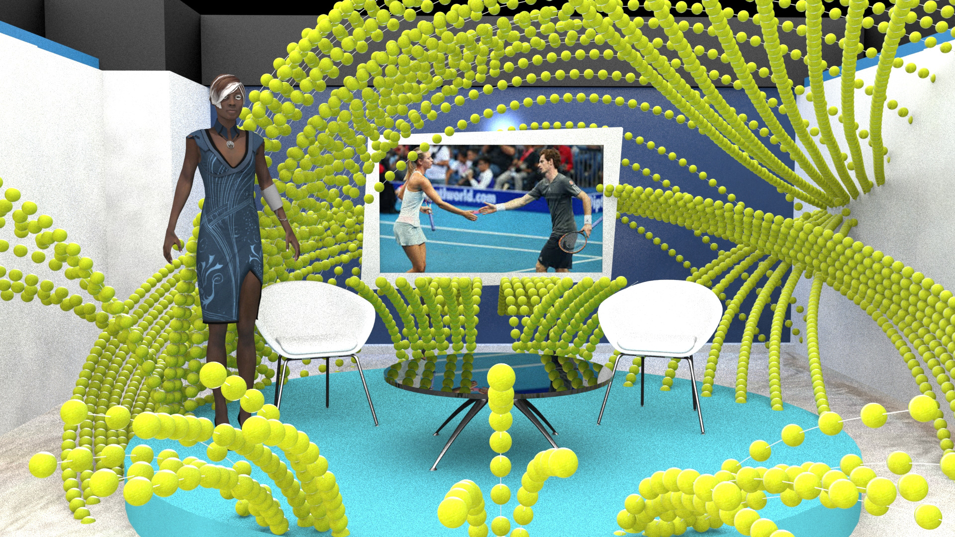
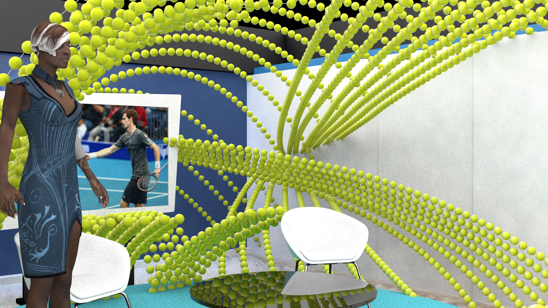
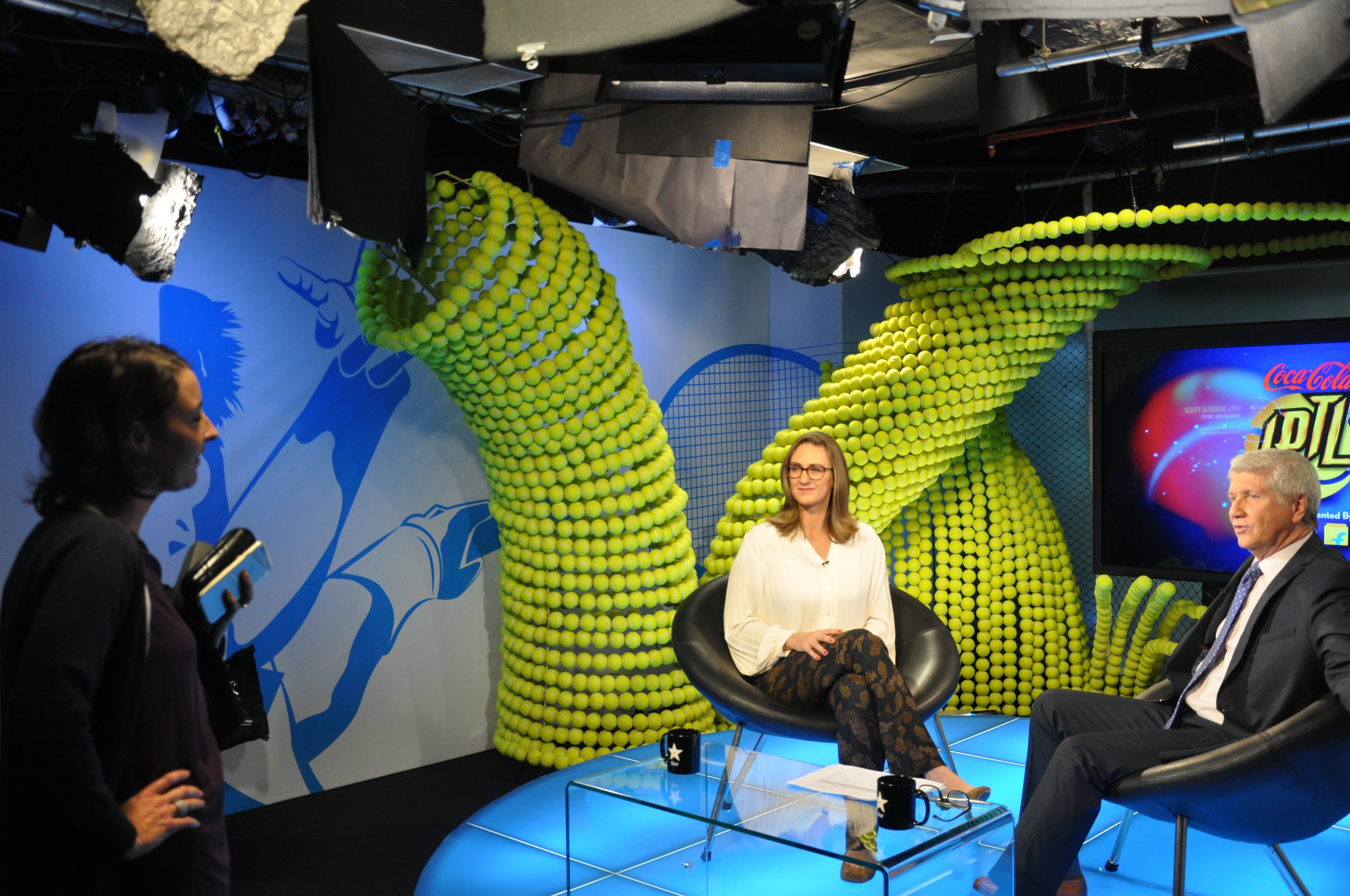
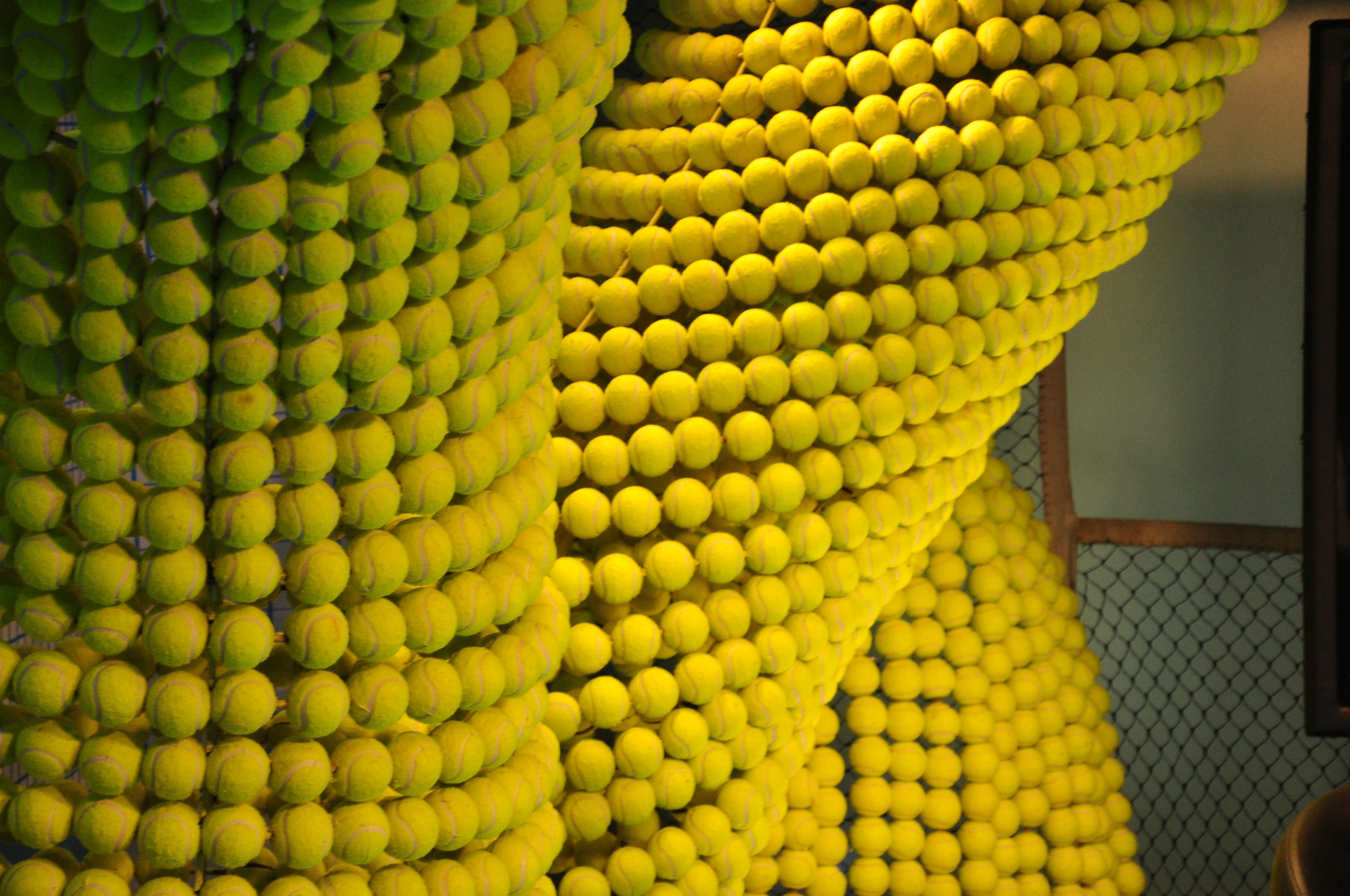
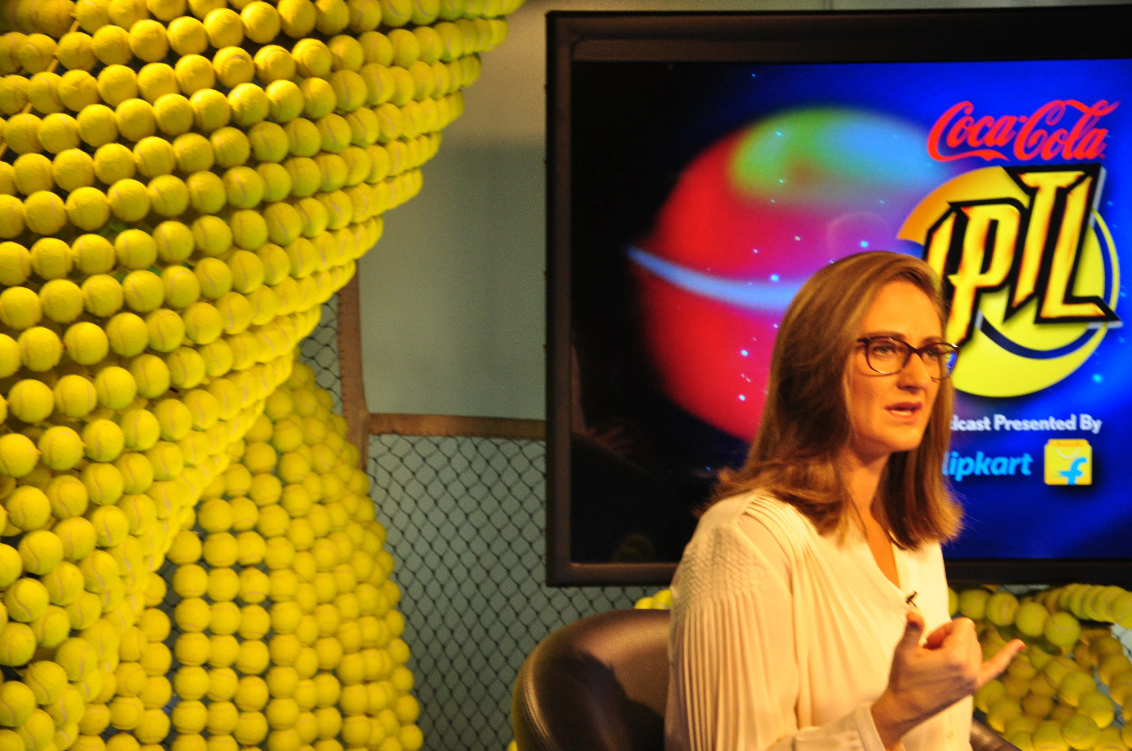
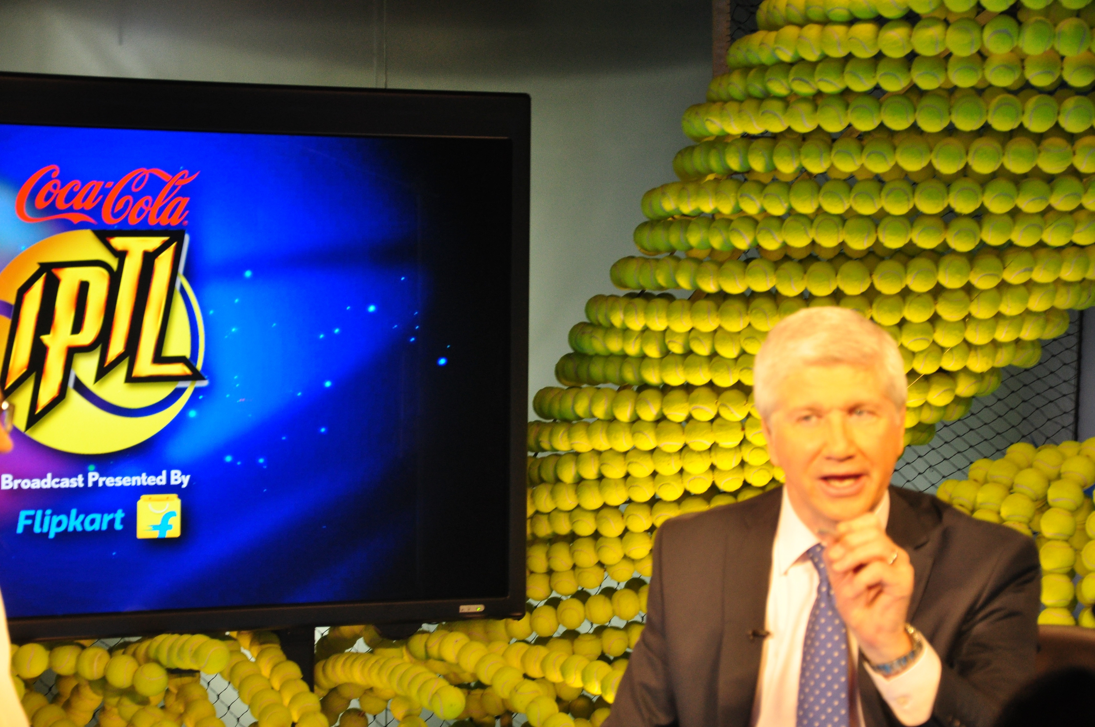
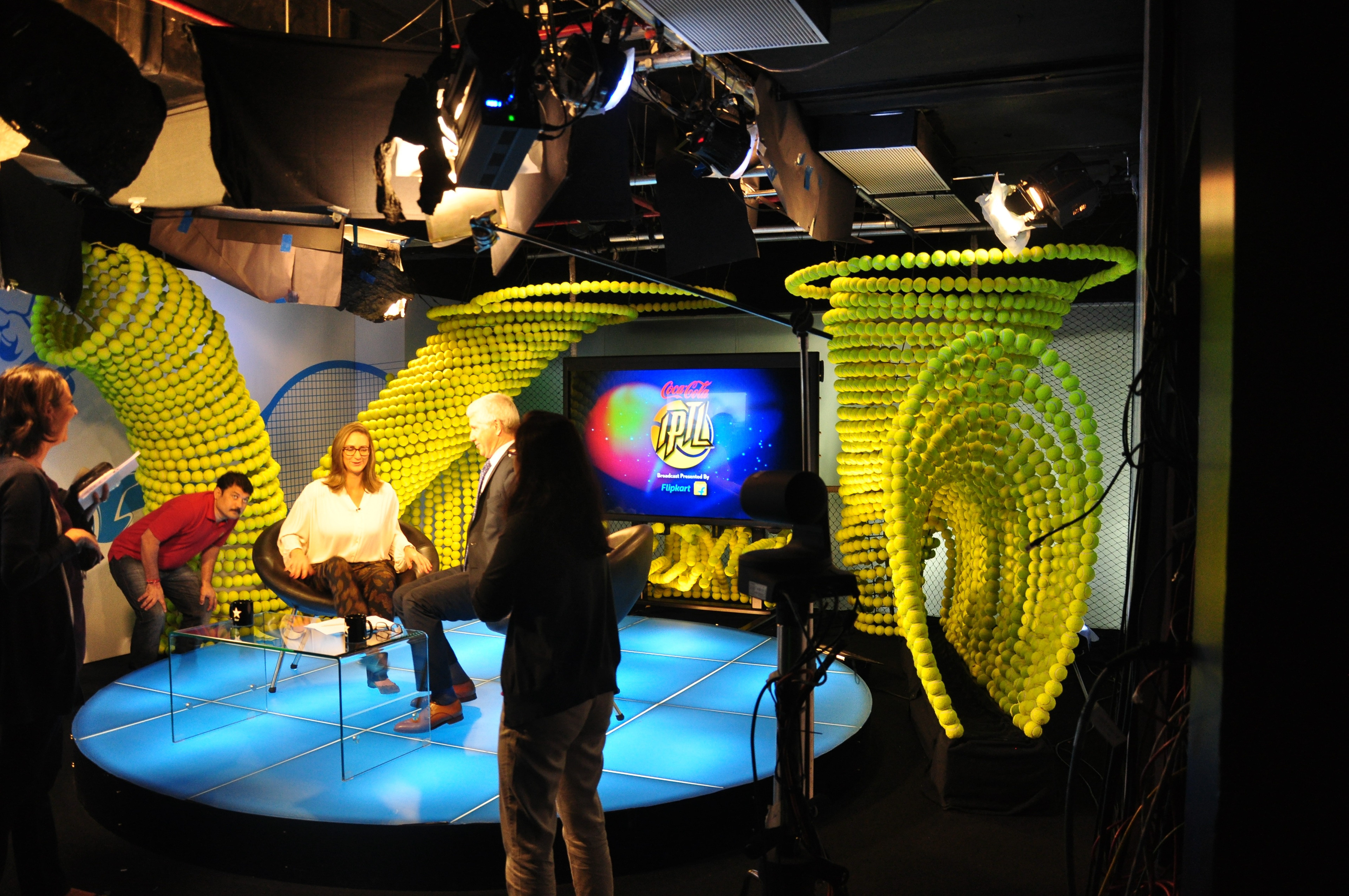
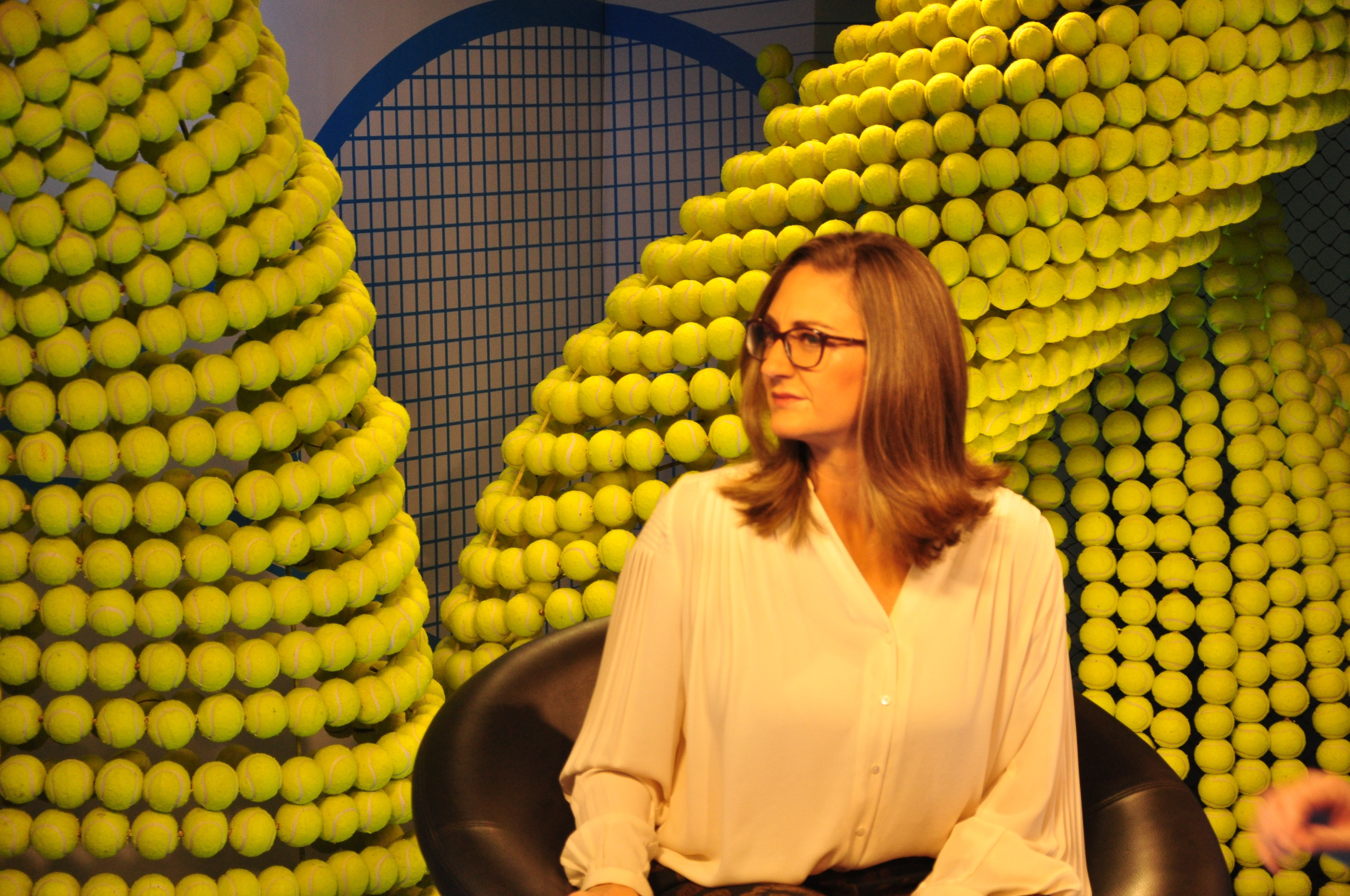
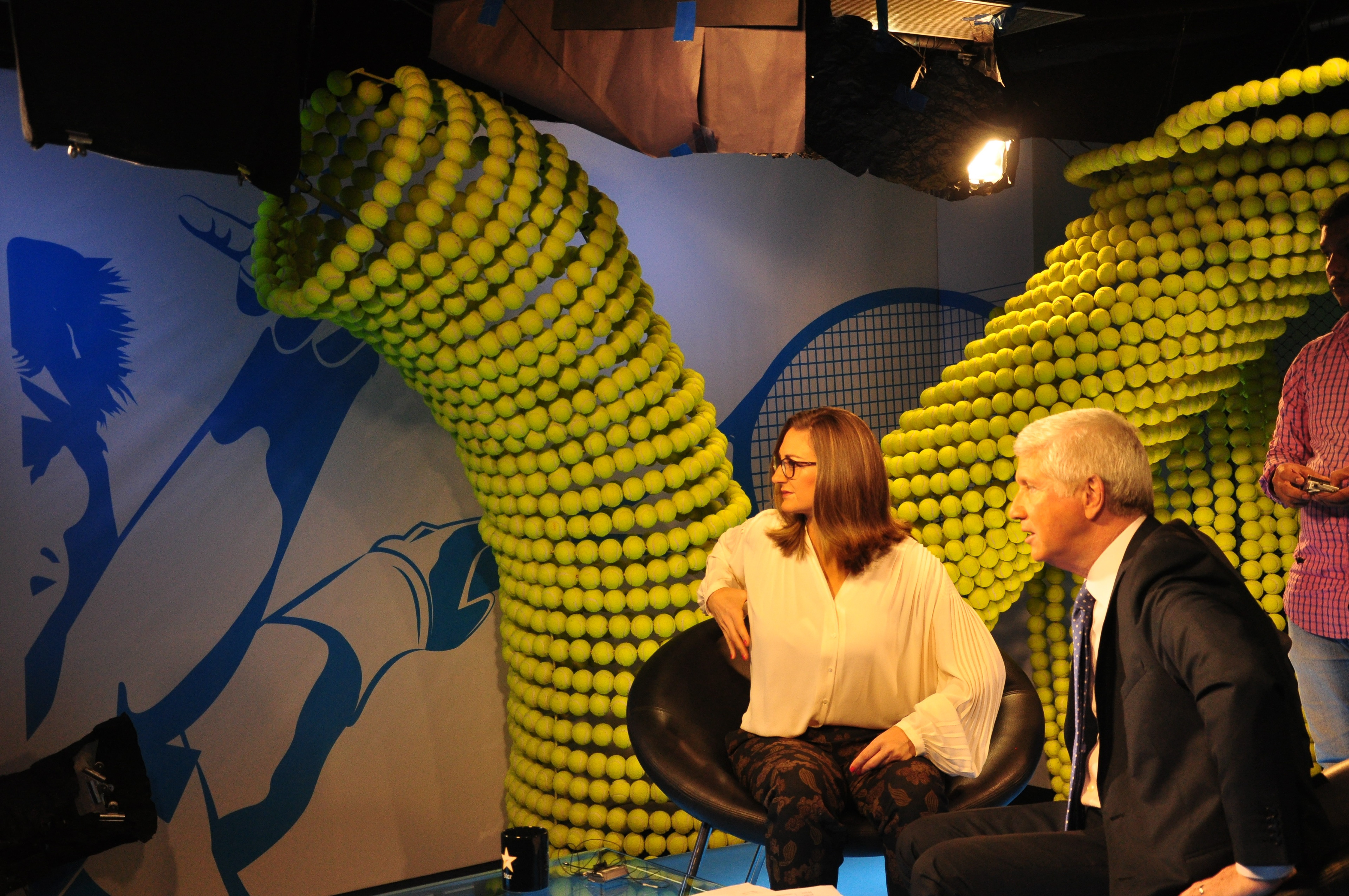
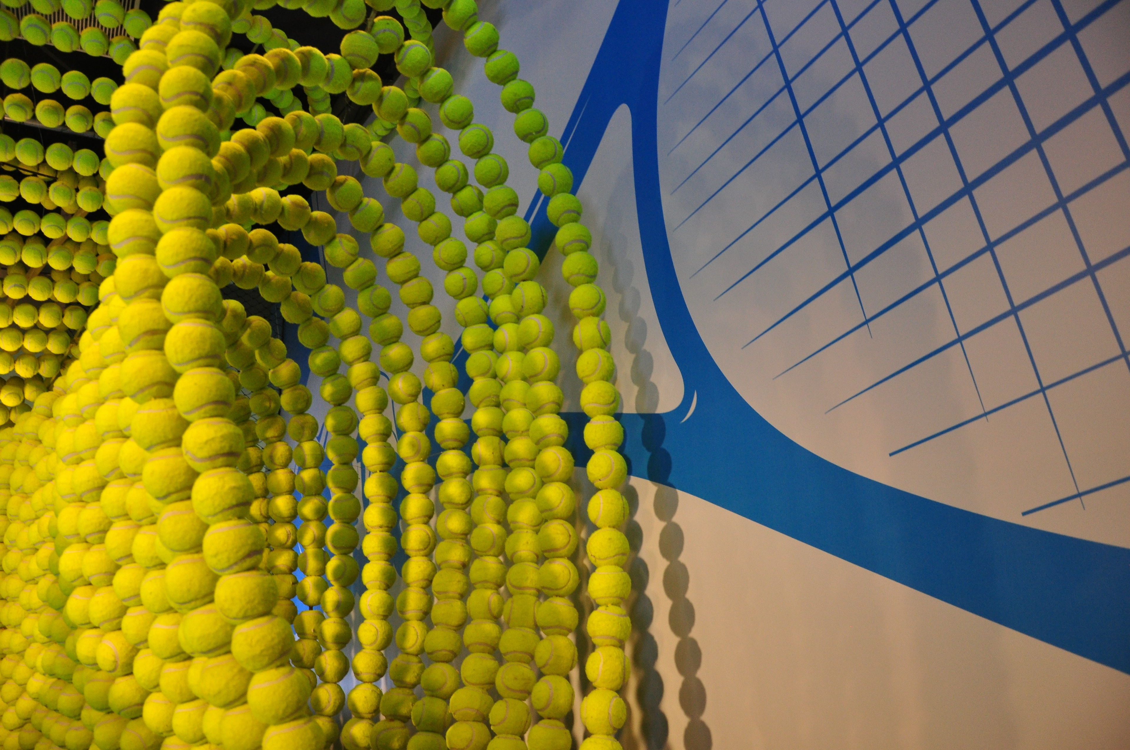
IPTL 2015


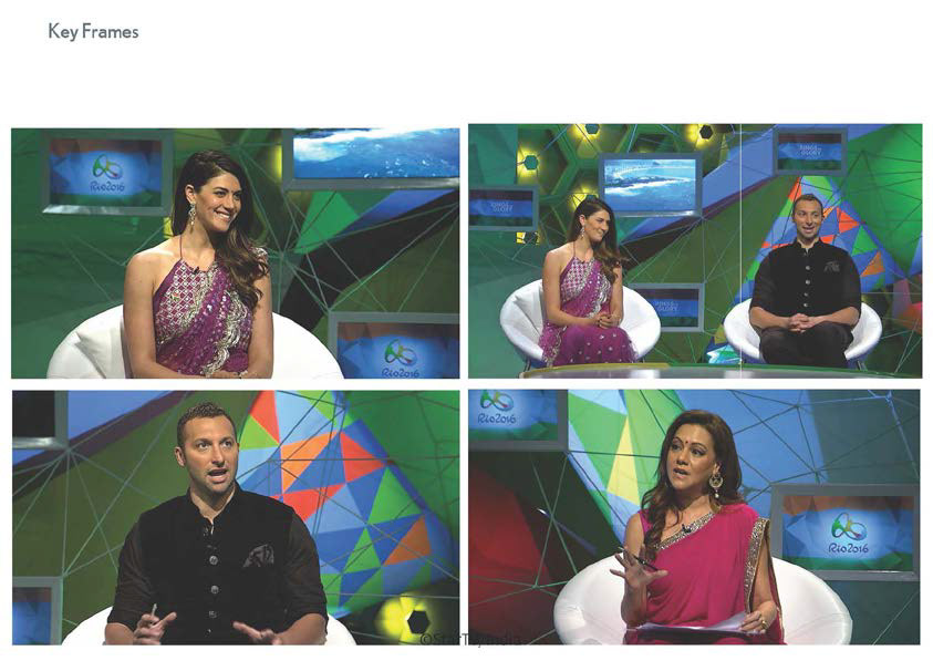
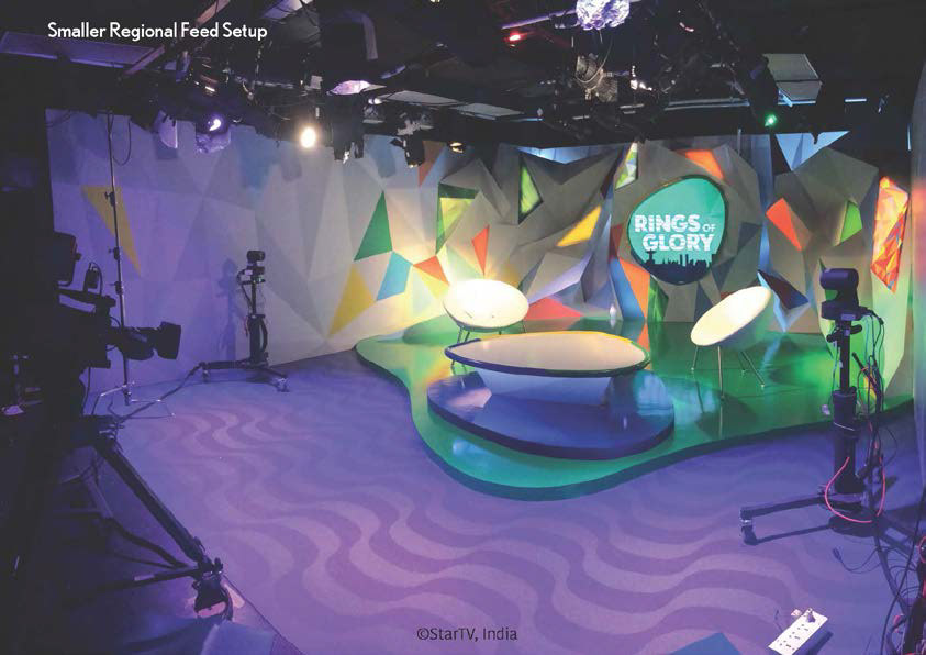
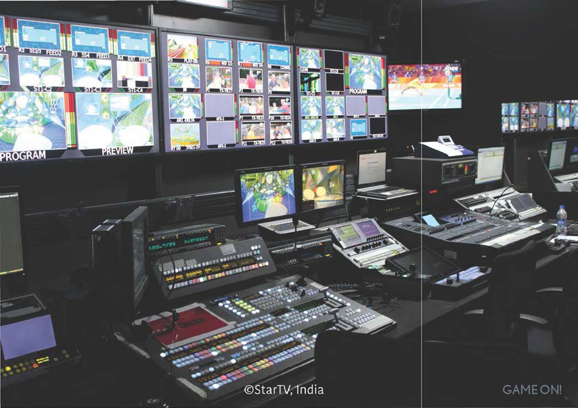
OLYMPICS 2016
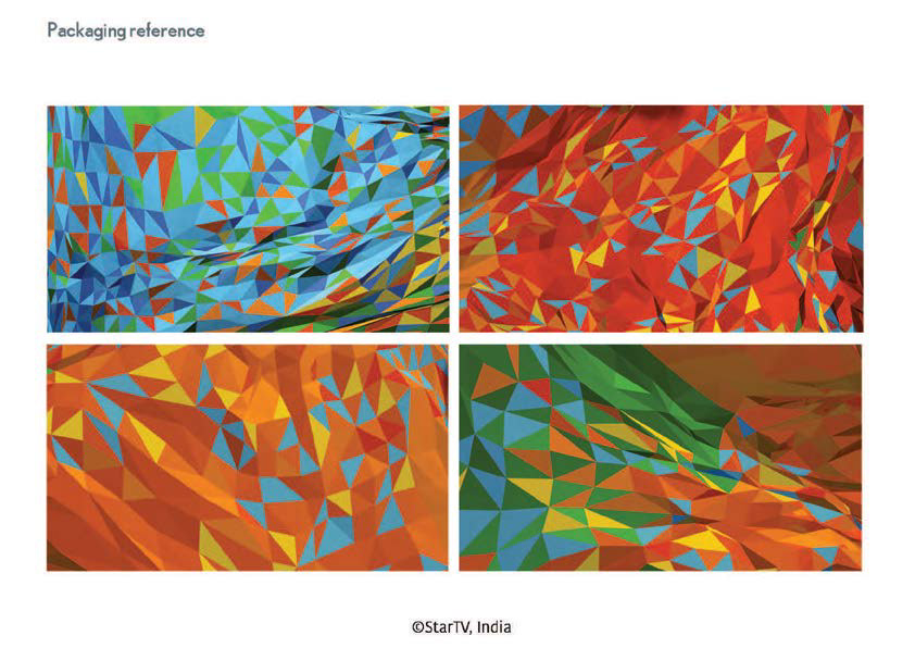
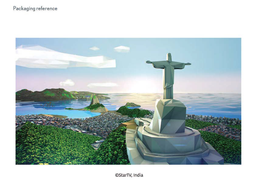
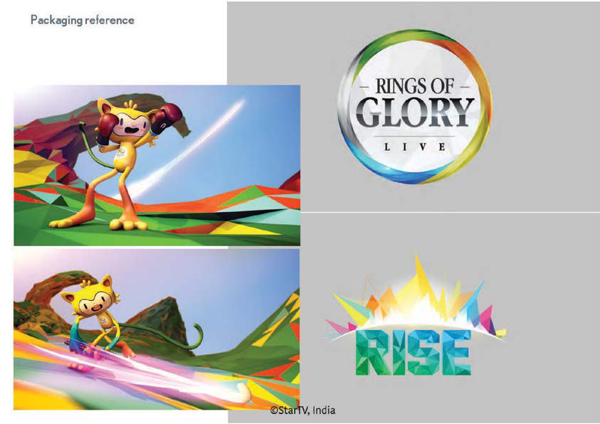
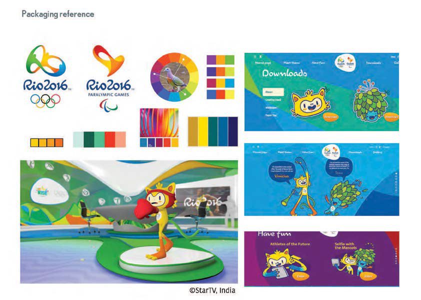
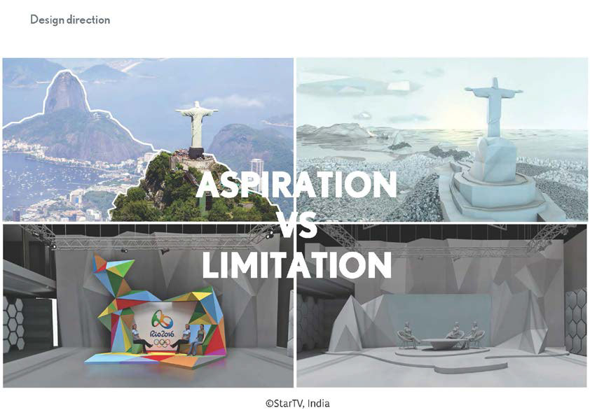
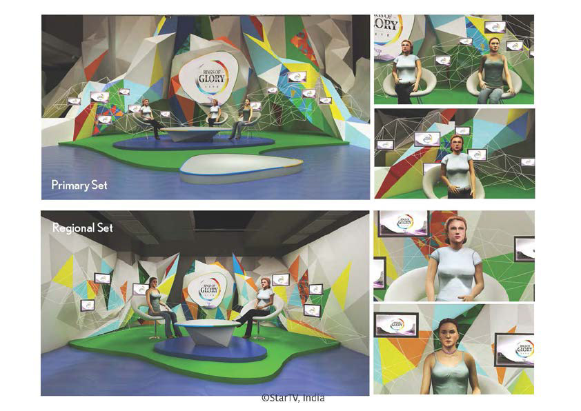
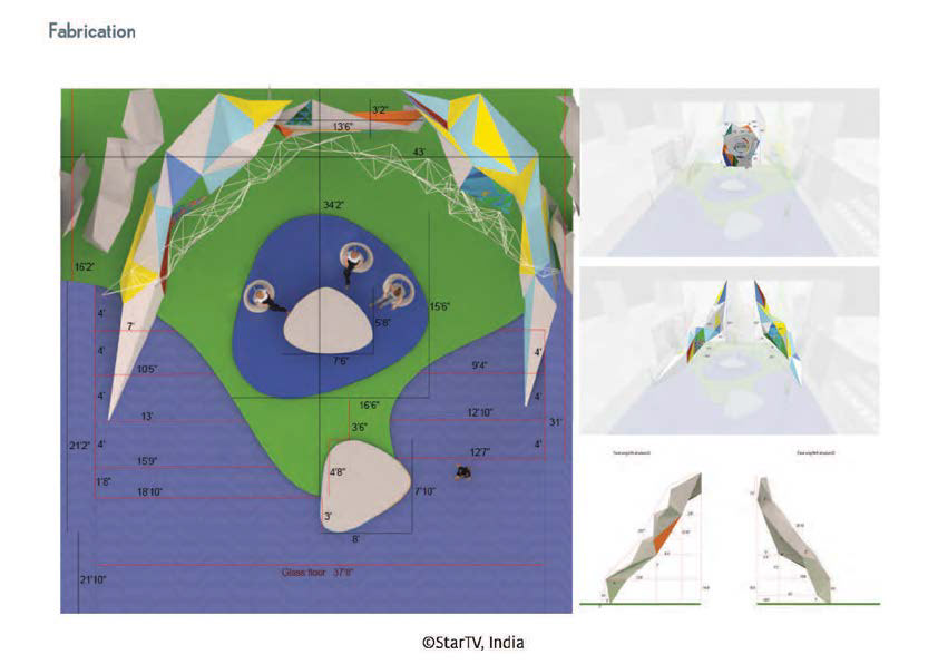
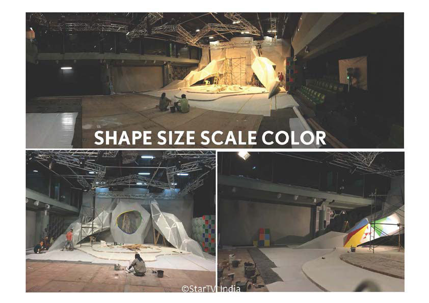
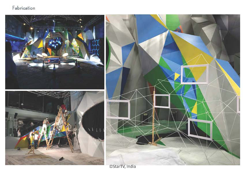
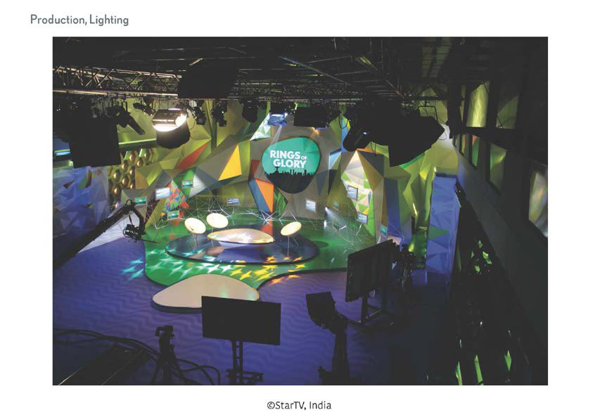
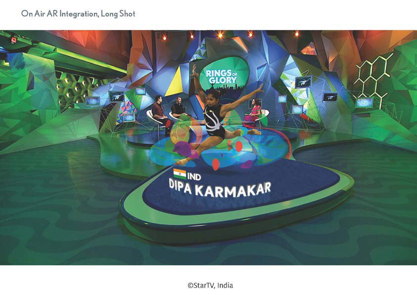
'Rings of Glory'(ROG) was the primetime update show and needed to celebrate grandeur and scale. 'Rise' was the morning show that needed to fit into the ROG set. The ROG set also needed a smaller version in a smaller studio for the south market. I simplified the SOW and picked up from the facetted design cue dictated by the packaging reference that lend itself to merge with the parent brand language. Physically, I built the concept around the existing 'big facetted wall' in the studio as the 'hero' set appeared to emerge from it. This was also amongst the bulkiest modular constructions the studio had witnessed, but delivered on the highlighted keywords - 'grand' and 'wow'
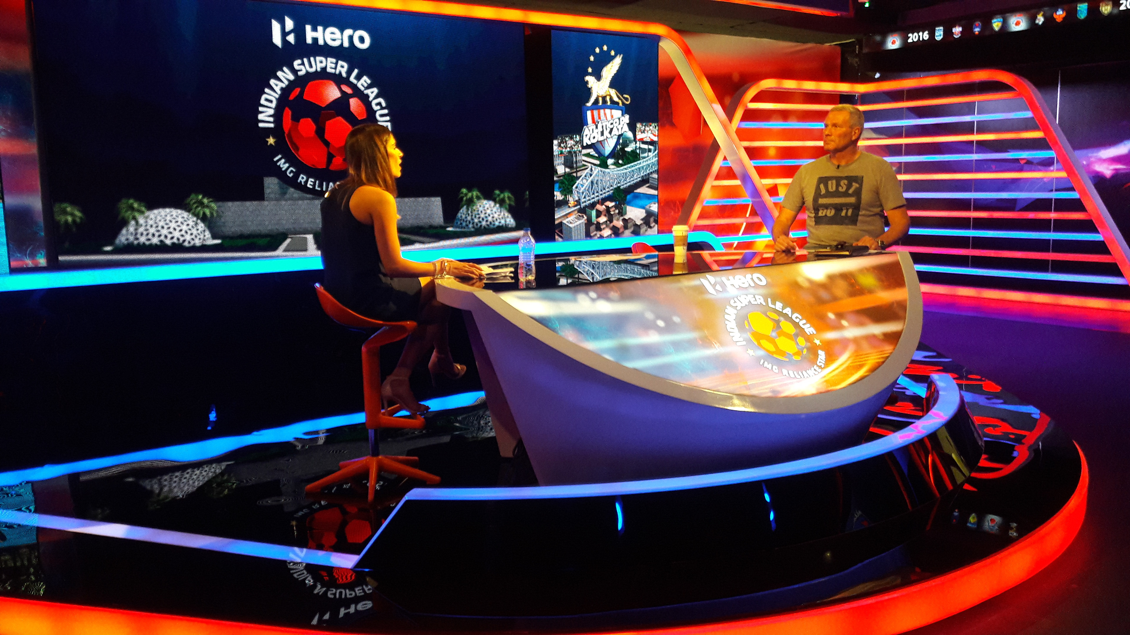
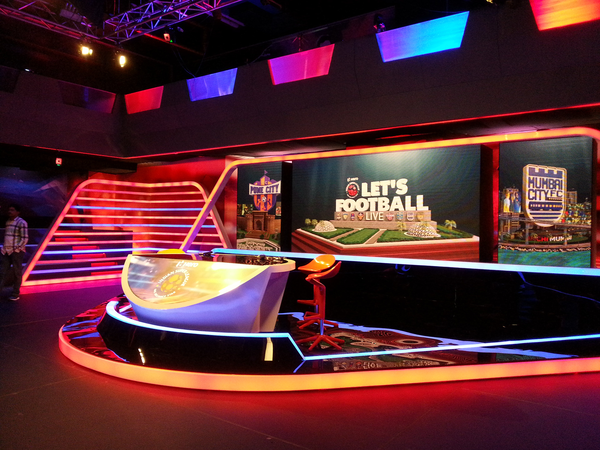
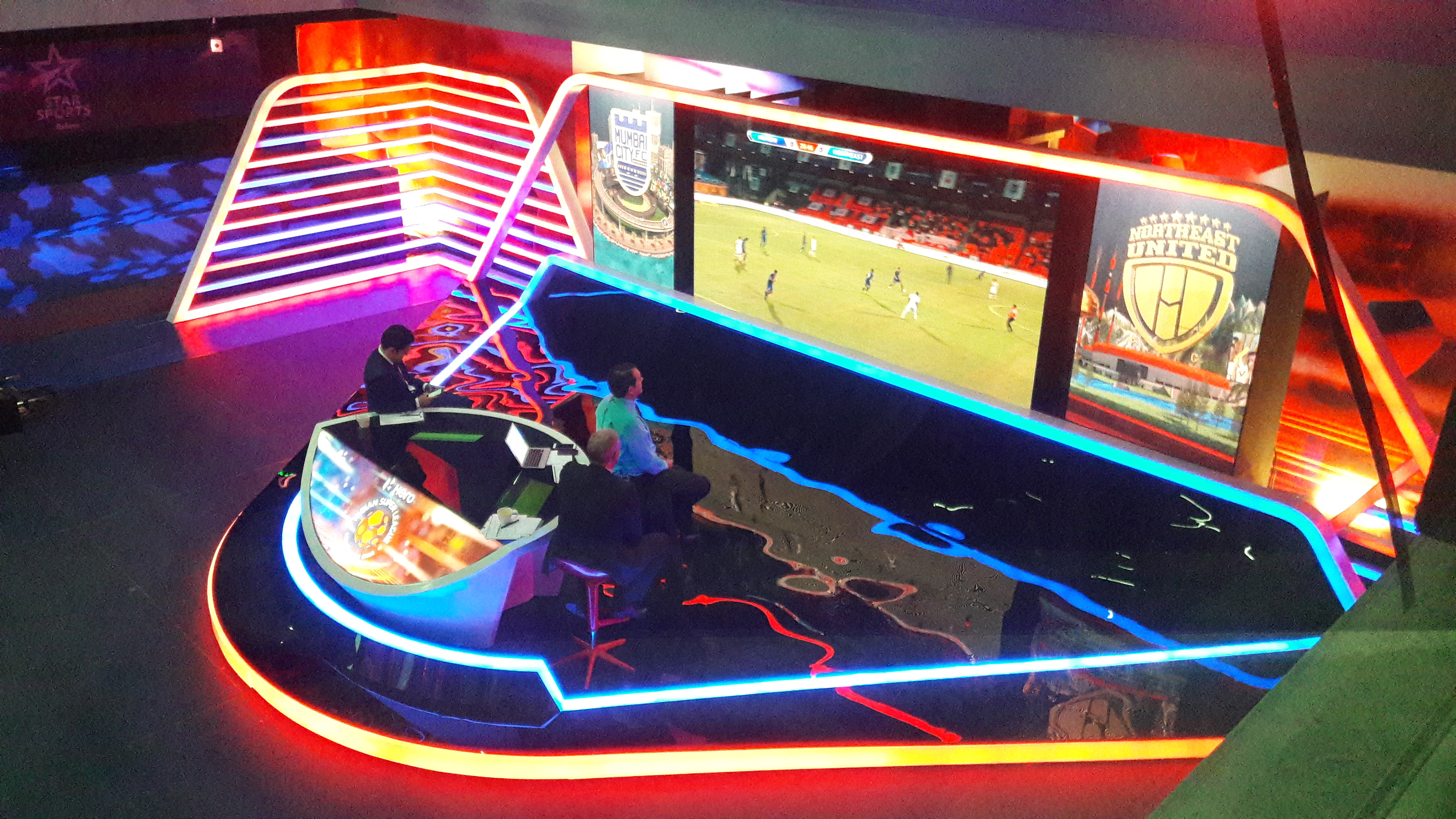
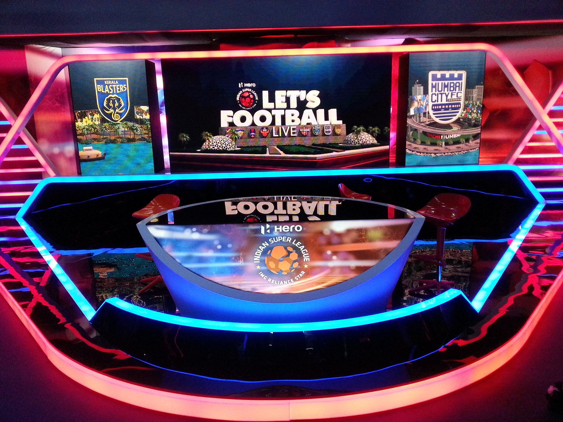
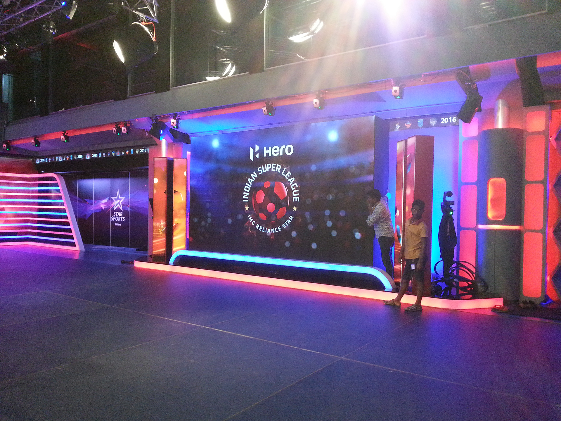
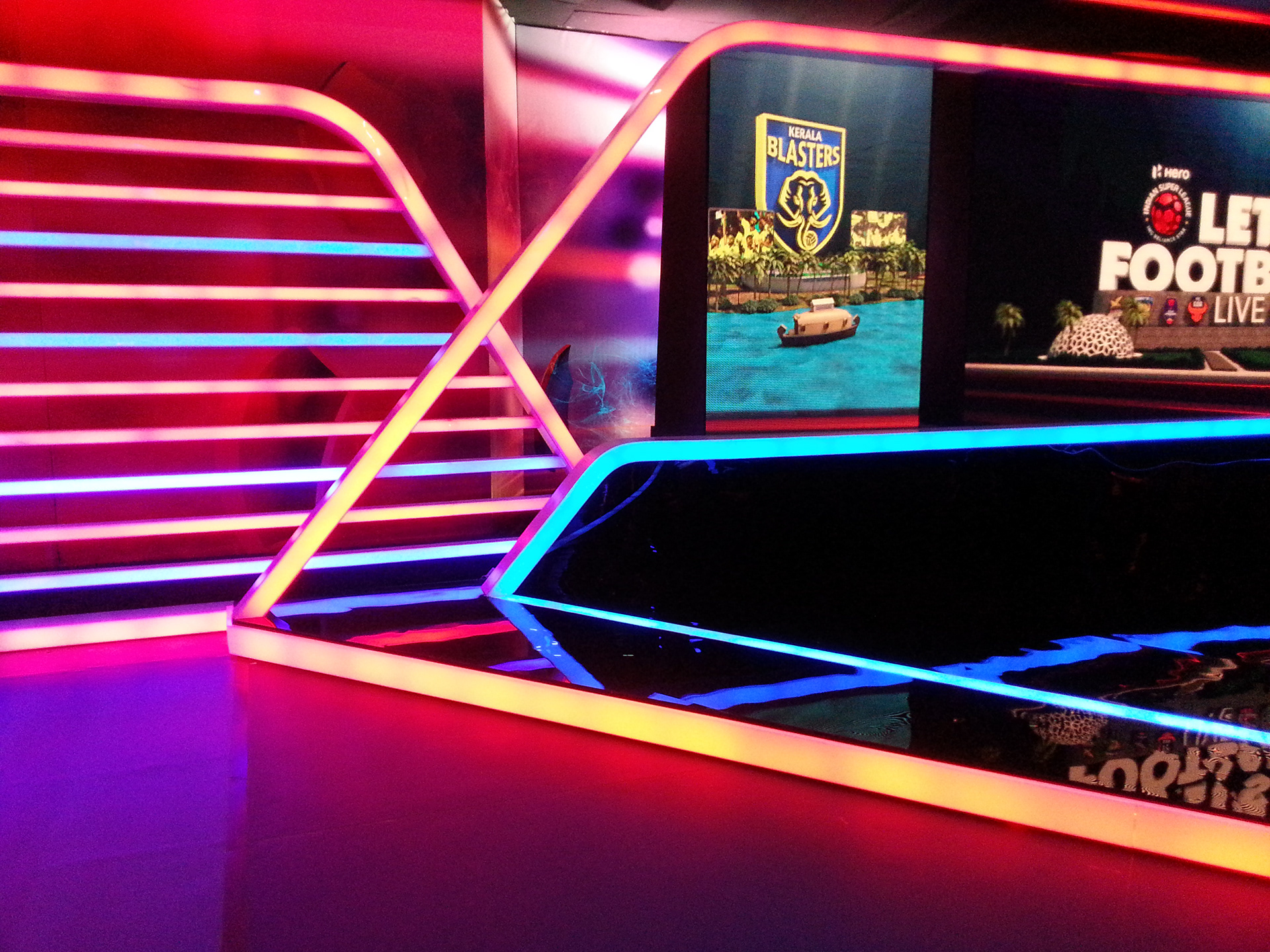
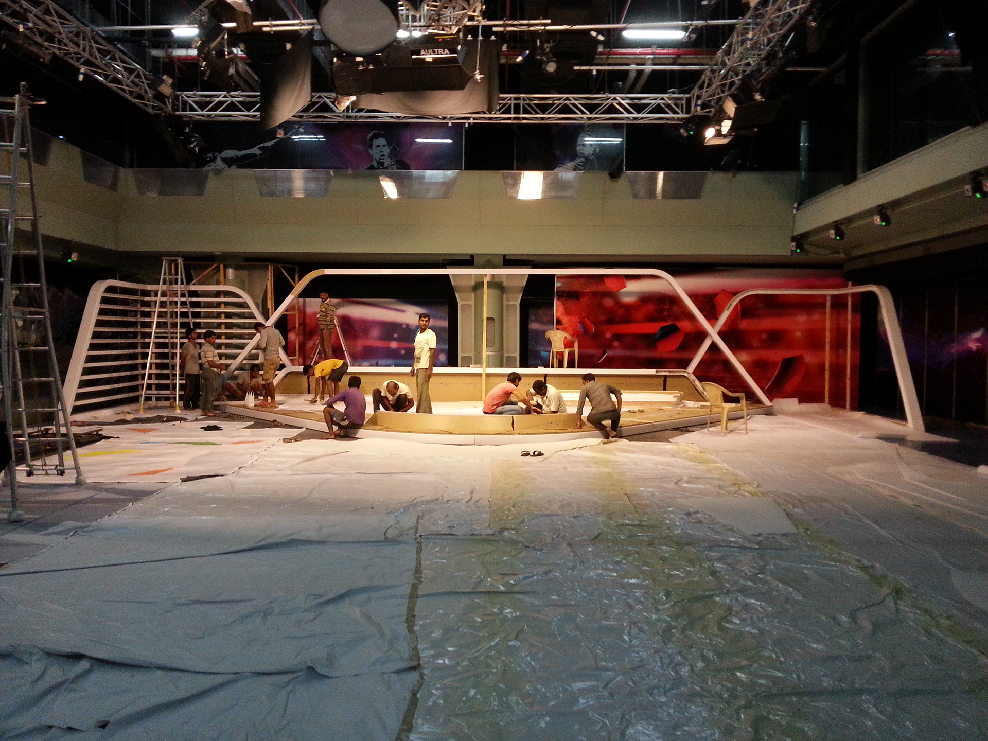
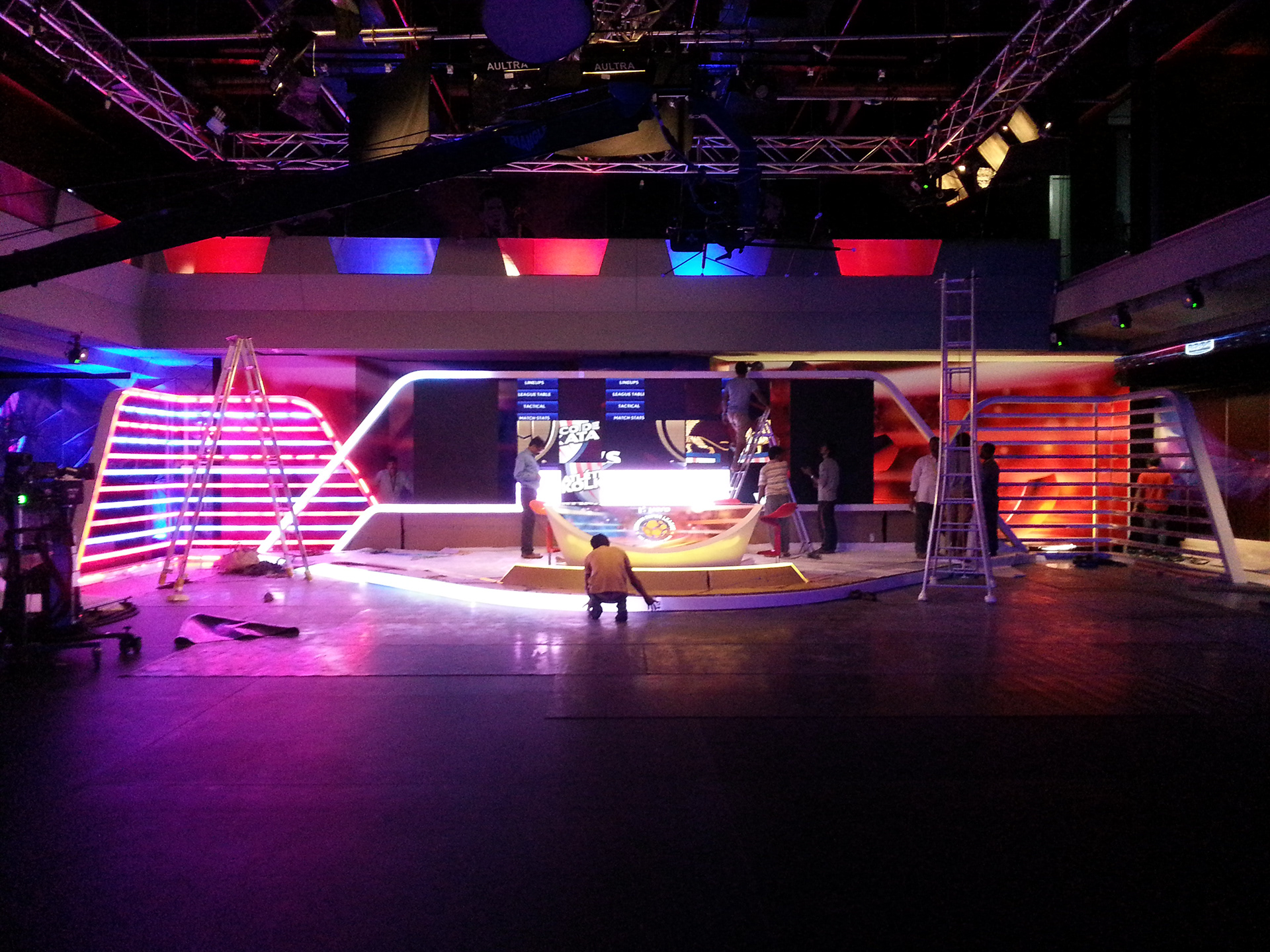
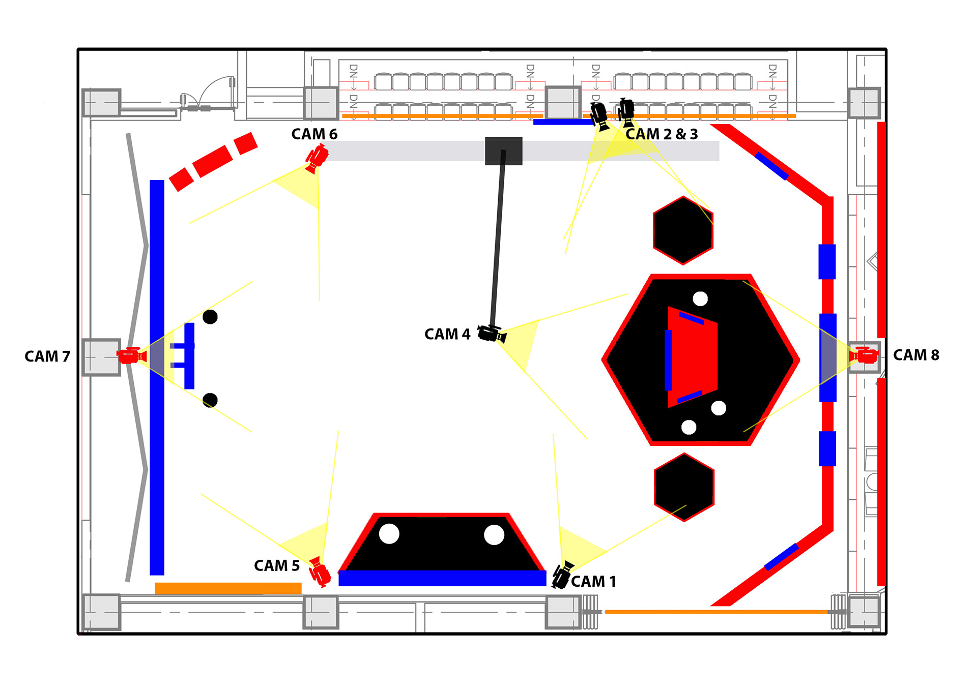
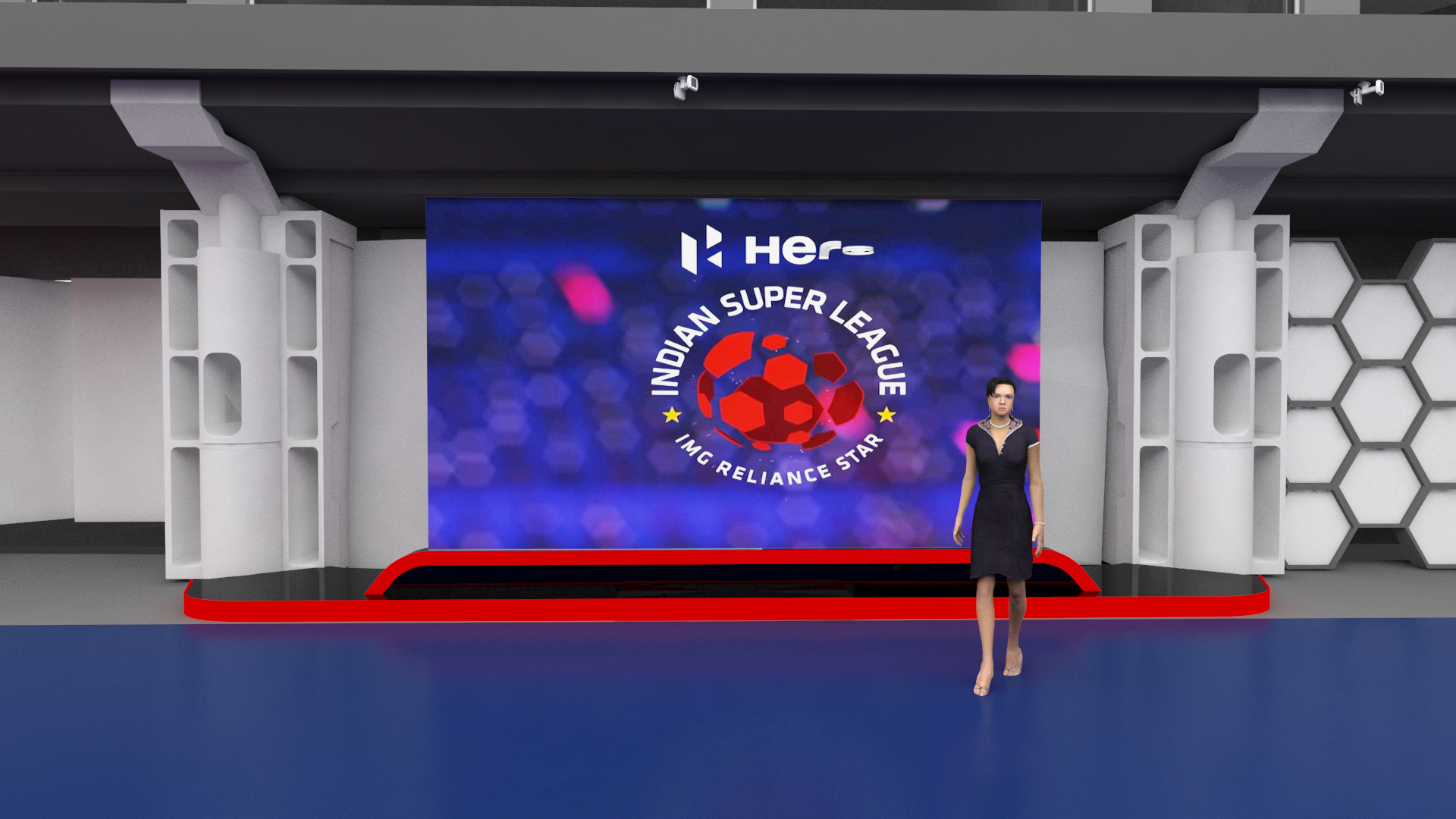
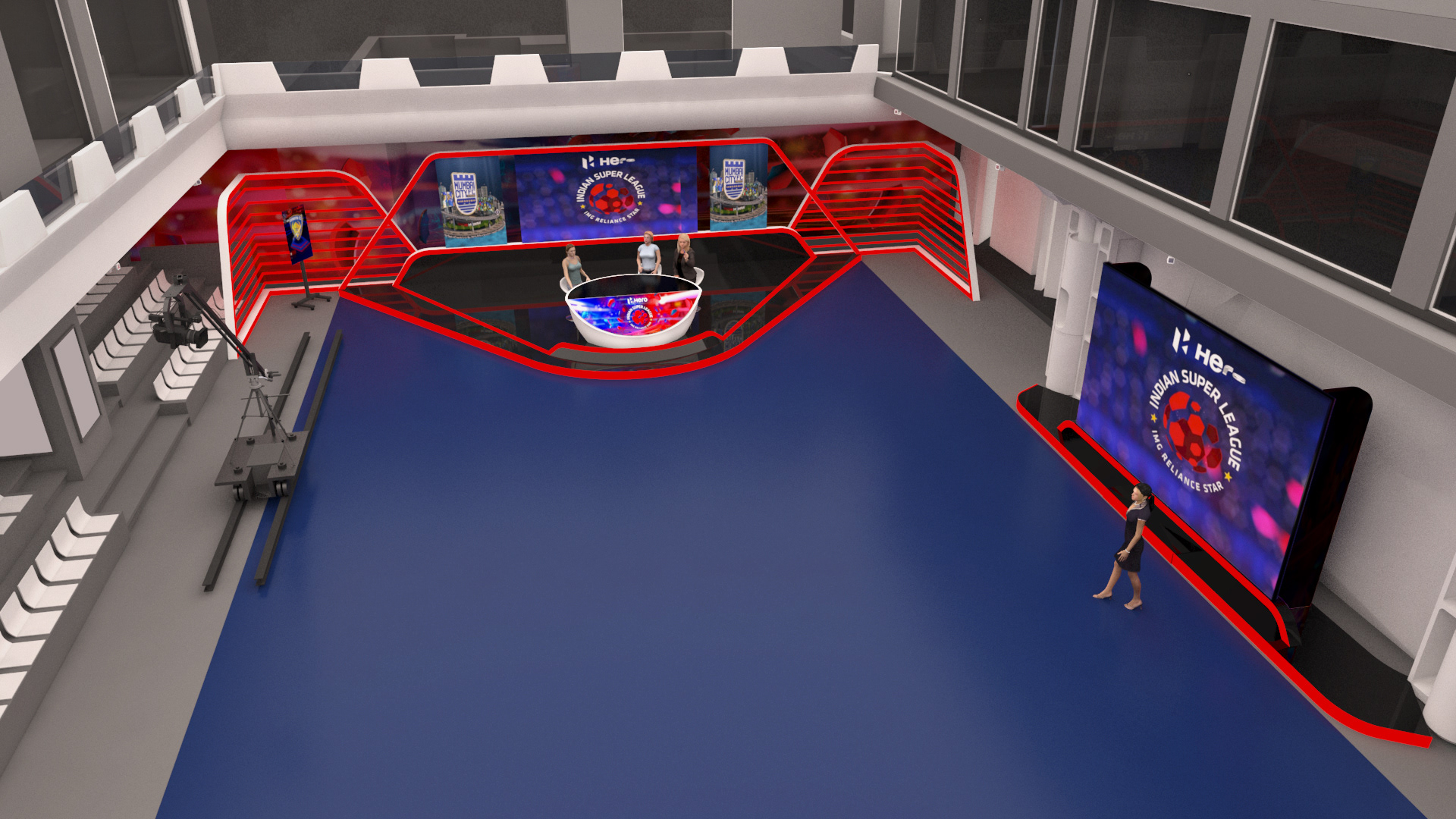
ISL 2016
My intent on this was to build elements with 'light' structures and explore a more formal setup keeping the frames dynamic. It was a huge learning for me and my team working with a mix of in-lit and front lit elements and how that effects the camera and the content that lives within the set. The project was delivered in one of the shortest turn around time, where design, production and installation were overlapping to stay on brand and maximise on quality.